Steal These Surface Duo Ideas

As has happened with my Fold 3, after about a year of using it, my Fold 4's screen started to delaminate,1 so I had to send it in for repairs.2

My Fold 4's borked screen

When looking for a cheap replacement phone to use while my Fold 4 is away, I noticed that the Surface Duo is now available for around 400 bucks, so I picked one up.

Then, something interesting happened: I started to absolutely love it.

I think this is due to three things.

The Duo's Aspect Ratios

The Surface Duo's aspect ratios make a ton of sense. When it's folded, it has a 86×116 mm screen, which is just a great aspect ratio. It's wider than most screens, but less tall, which makes the screen more reachable when held in one hand, and means content like websites work much better. When it's unfolded, it essentially has an 176×116 mm screen, which is great for reading books, or watching YouTube videos (although there is a black bar in the middle, so it doesn't work as well for watching actual movies, where you care about the aesthetics).

Visual comparison of the Duo's aspect ratios

The Fold 4, on the other hand, has a 58×148 mm screen when folded, which is a weird, skinny, tall aspect ratio. Worse, when it's unfolded, at 150×148 mm, it's essentially square, which means that that most things you'd want to use a larger screen for don't fit well. To me, at least, it's painfully obvious that the Duo's aspect ratios make much more sense.

Visual comparison of the Fold 4's aspect ratios

Default Unfolded App Behavior

The way apps behave on the Duo seems odd at first, but turn out to be exactly what I want. On the Fold 4, the unfolded phone acts as a tablet, and opened apps immediately take up the whole screen. Not so on the Duo: apps take up only half of the screen by default.

At first, I found this annoying, but I soon realized that it encouraged me to open apps side-by-side more often, rather than switching between them.

Have to log into some account that 1Password can't fill in automatically? Instead of switching between the two apps, just open 1Password next to the app I'm logging into. I'm responding to an email? Open a browser next to my email client so I can see both at the same time. Need to find a time slot for an appointment, and company policy doesn't allow me to open my calendar in my regular calendar app? Open my personal calendar app and my company calendar app side-by-side.

All of this would have technically been possible on the Fold, I just never did it, because by default, apps take over the whole screen. It's much more convenient to have them take over half the screen by default, and then enlarge them when necessary, rather than the other way around.

Single-Screen Mode

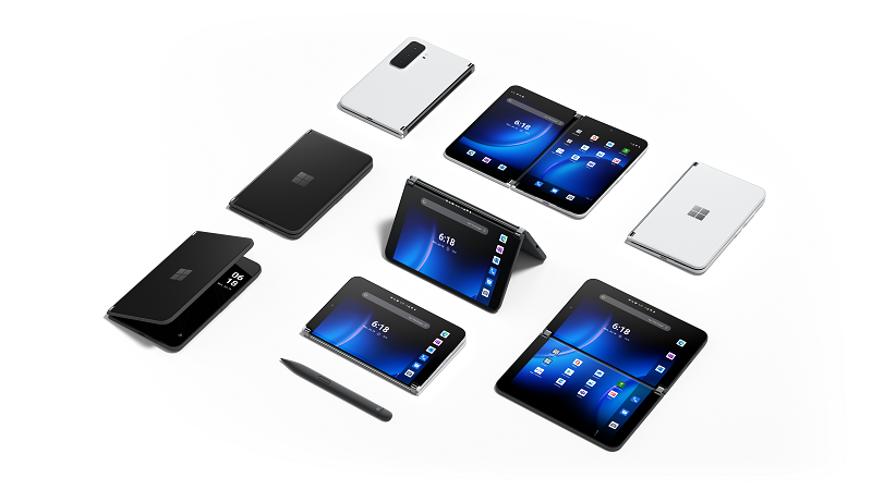
Unlike most other foldable phones, you can fold the Duo's screens so the screens are outside of the phone, on the front and the back. So instead of having a small outside screen, and a large foldable inside screen, like the Fold 4, the Duo only has the inside screen, but it can either be folded closed, so the screen is protected, or it can be folded fully open, so both screens are on the outside.

Duo folded back into single-screen mode

Why is this great? Because at that point, it's just a regular phone with a great screen that has a perfect aspect ratio. And because there are only two screens, it's a phone that is much thinner, but has a much larger screen, than a closed Fold 4.

Picture of the Duo in different screen configurations such as tent mode, or "keyboard" mode

In general, the way the Duo is designed, it's much more versatile than most "real" folding phones.

It's quite unfortunate that the Duo (and its much better sequel, the Duo 2) never caught on. This is likely mainly due to the first Duo's utterly abysmal software, which never really got fixed, even after multiple software updates.

At this point, it seems that the Duo line of smartphones is dead, but I do hope that some of these ideas make it to other phones.


  1. I guess technically, the built-in screen protector, the one that is supposed to not be removed from the screen, started to remove itself. It's kind of funny how that just happens, and people accept it. If Apple released a phone whose screen would just fall apart after a year, the media couldn't stop screaming about delaminategate - as they should. I'm just not sure how Android phone manufacturers get away with this shit. ↩︎

  2. Why do I keep buying foldable phones if they keep falling apart? Because they're so much better than regular phones that the advantages vastly outweigh having to send them in for repair once a year. ↩︎

If you require a short url to link to this article, please use http://ignco.de/798

Over at Tobias Bernard's GNOME Blog, he writes about a new approach to tiling window managers. Window management is probably the single worst aspect of current operating systems, and his ideas for how a modern tiling window manager might work are extremely compelling to me.

See also: Bluetile.

Tricking Monty Hall

Yesterday, a friend sent me a screenshot of an Instagram story from mordlustderpodcast asking for an intuitive explanation of the Monty Hall problem (which, as I found out, is called the "Ziegenproblem", or "goat problem", in German). The basic problem is this:

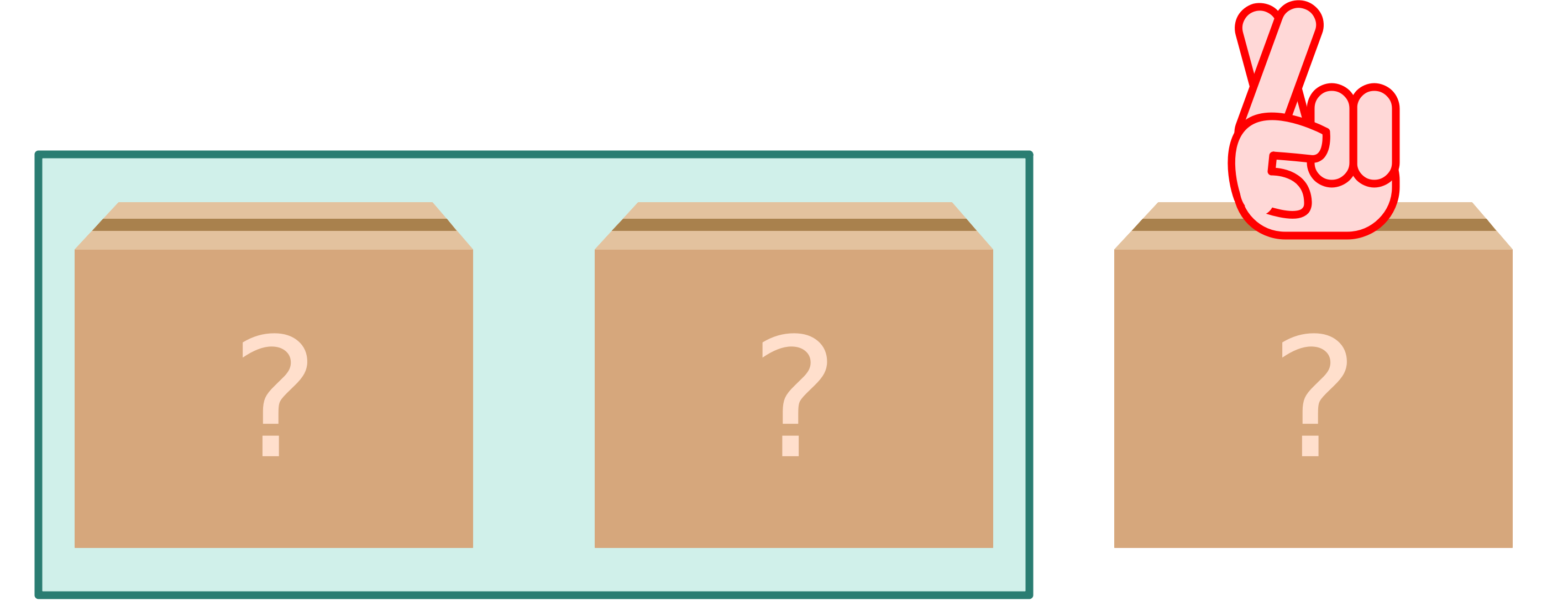
Three cardboard boxes

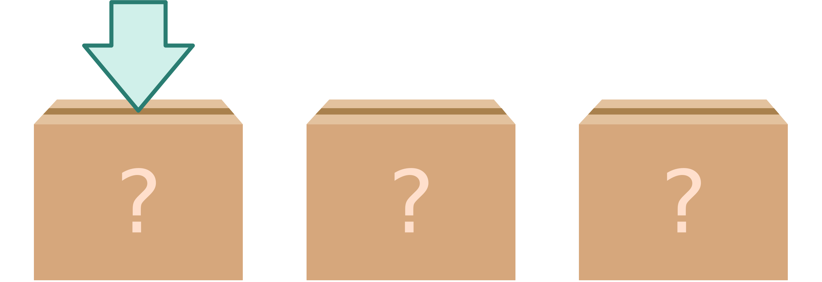
You're in a game show. You have three boxes in front of you. One of them contains a win (let's say the key to an expensive car), and two of them contain nothing (or goats, if you prefer that, although I personally feel that winning a goat would be pretty cool). You pick a box.

One of the three boxes is selected

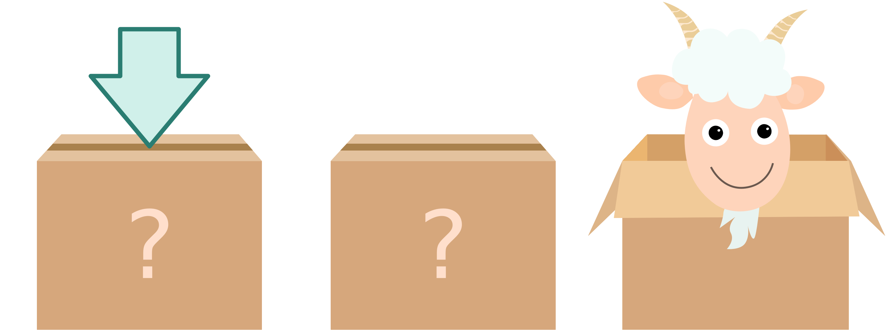
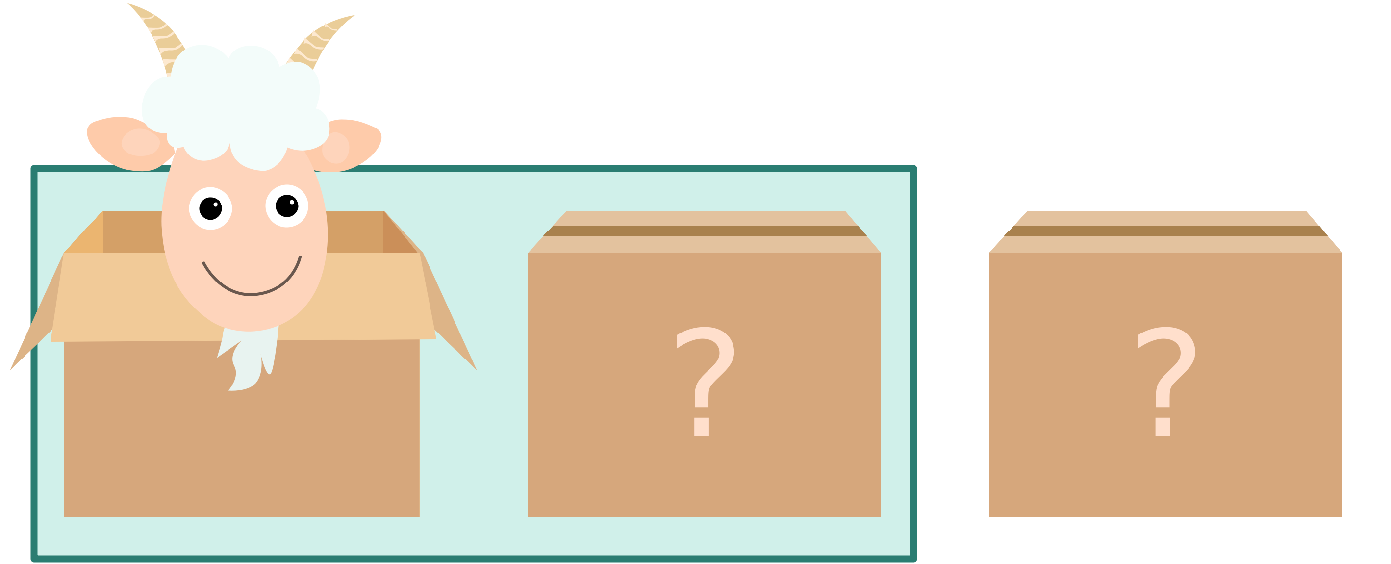
The show's host then reveals the contents of one of the two remaining boxes, but, importantly, always a "goat box."

Host opens a remaining box

At this point, the host gives you the option of either sticking with the box you picked originally, or switching to the other, unopened box.

Should you switch or stick with your originally selected box?

Intuitively, it seems like it shouldn't matter. There are two boxes, so it's a 50-50 chance of winning either way, right? But in reality, you should switch boxes, since that will increase your chance of winning from 33% to 66%.1

This seems extremely strange to most people, including a lot of mathematicians. However, writing a program running this scenario a bunch of times quickly shows that it is true: it's better to switch.

Thinking about this, I came up with what I feel is a pretty intuitive explanation for why you should switch, and since it's an explanation I haven't seen anywhere else, I thought I'd put it up here, in case it helps anyone.2

Imagine that you could pick two boxes out of the three. Obviously, if you can pick two boxes, then your chance of winning is 2 out of 3, or 66%, right?

Well, you actually can, if you trick the show host. When the host shows you the three boxes, in your mind, without telling the host, pick two of them:

Two picked boxes

But then, importantly, you lie to the show host, and say that you actually picked the third box, the one you did not pick:

Lie to the host, and say you've picked the one box you did not pic,

Now what happens? You've just tricked the show host into revealing which one of the two boxes you picked contains a goat!

Host opens one of the two boxes you've picked for you

The host just did you a huge favor, and opened one of the two boxes you picked. Now you've learned something: you've learned which of the two boxes you've picked definitely contains a goat. So now all you have to do is open the other box you've secretly picked.

You win a car! And you win a car!

From the game's point of view, picking a box and then switching is the same as picking two boxes, falsely claiming you picked the third box, and then opening the remaining of your two boxes.

But because you have picked two boxes, which gives you a 2/3 chance of winning, and because you have then tricked to show host into opening your goat box for you, the only way you can lose is if you've picked two goat boxes to begin with.

And that's why switching boxes gives you a 66% chance of winning.

Addendum: This great discussion on Hacker News provides other intuitive ways of explaining the problem. I particularly like this bit of feedback:

This is incorrect, the goats and car are behind doors. They are not inside cardboard boxes.

This is correct, and I do apologize.


  1. Yes, it's true, one of the goats ate the remaining 1%. Or I just didn't want to type out an infinite number of 3s and 6s. ↩︎

  2. Note that this is not the only intuitive way of explaining the problem. A pretty common approach that also works is to imagine that there are a large number of boxes, instead of just three. ↩︎

If you require a short url to link to this article, please use http://ignco.de/802

Streak Redemption

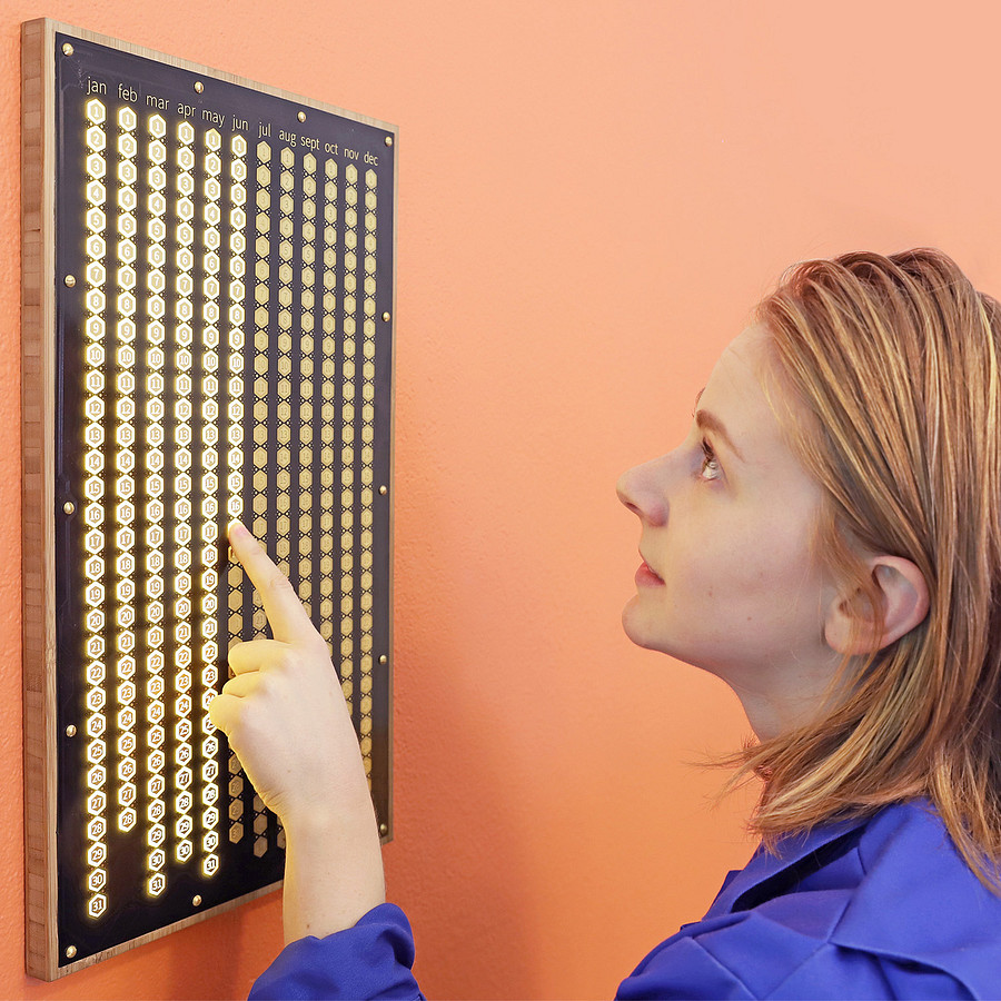
For a lot of people, including myself, streaks are a powerful motivator. One of the purest implementations of this concept is Simone Giertz's Everyday Calendar.

Simone looking at the Everyday Calendar, a huge wall-mounted board that has a button for every day of the year. She's pushing a button to make it light up.

By pushing a button for every day you manage to achieve your goal, you create a visual representation of your progress, which helps turning chores into habits.

Conversely, losing a streak can be so demoralizing that it can be difficult to start from scratch, and get going again. The Everyday Calendar is forgiving: even if you don't light up one of the days, you still see your earlier streak, and your progress. You could even come up with your own rules for when you're allowed to push yesterday's button.

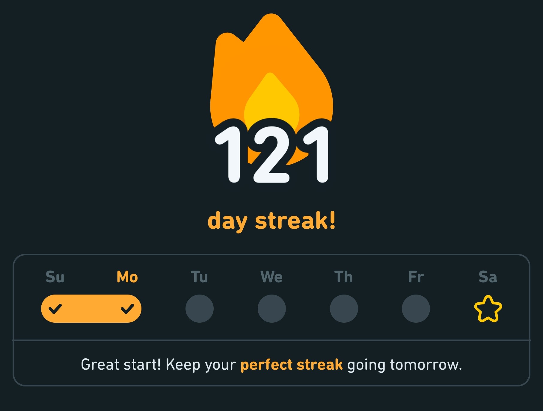
Screenshot of streak representation in Duolingo

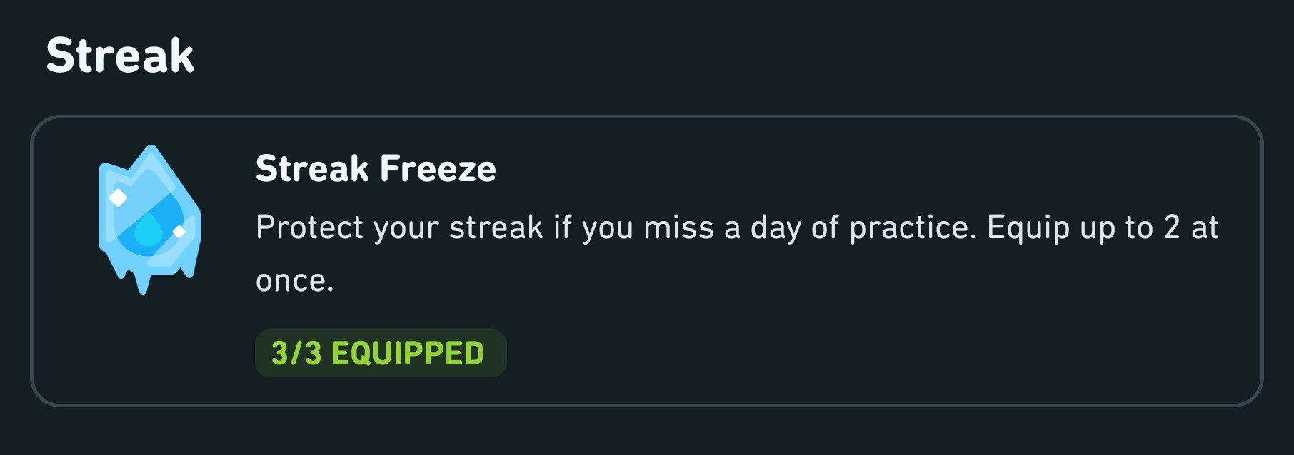
But software is unyielding. If you lose a streak in Duolingo, it's just gone, and you're at zero again. Duolingo recognizes this problem, and gives you a limited number of streak freezes, which allow you to continue a streak even if you miss a day or two.

Screenshot of Streak Freeze in Duolingo

The problem with Duolingo's approach is that you have to prepare for a streak loss ahead of time, but streak losses are not something you anticipate. You can't anticipate getting sick or having some kind of emergency that prevents you from continuing your streak.

A few days ago, I hosted a party. I ran around all day preparing things, and then guests arrived, and it was almost midnight when I remembered that I hadn't opened Duolingo all day. By then, it was too late to do anything about it.

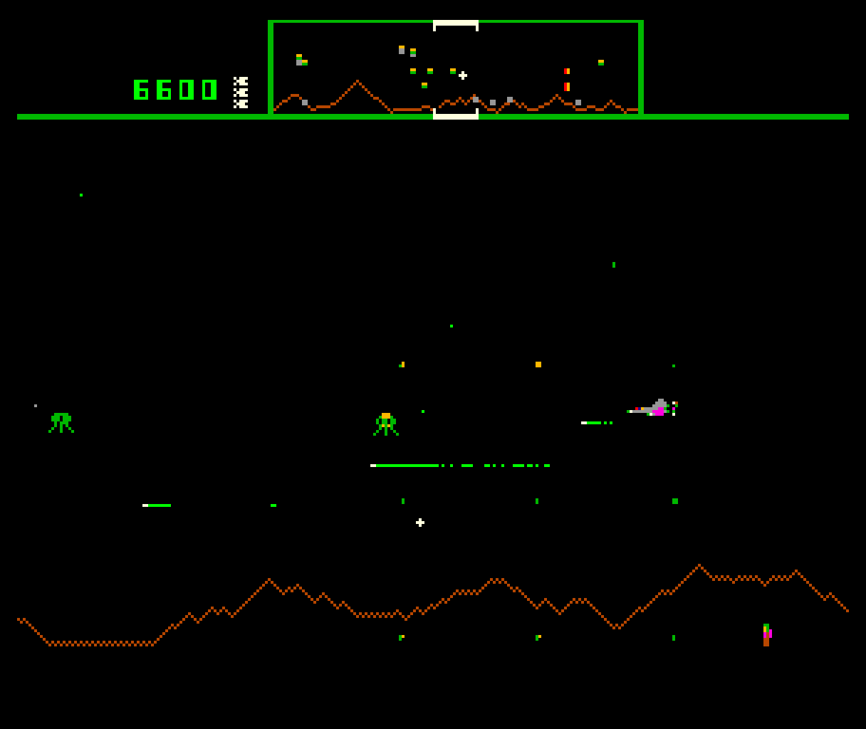
Over at Stuff, Craig Grannell is offering a better solution to the problem: a way to recover from a streak loss after it has happened, based on an idea found in the videogame Defender, released all the way back in 1981.

Screenshot of Defender, a videogame where you control a ship 
moving horizontally across the screen, shooting aliens and rescuing humans

In this arcade game, your task is to rescue little humans before aliens steal them. But even if the aliens grab all of them, you still have a chance at redemption: if you manage to stay alive for a few levels longer, you get your humans back.

Thus Craig's suggestion: if your app has a streak feature, provide some way to recover from a streak loss after it has happened.

This could be a harder task that makes up for a lost day, or maybe a lost day is redeemed if the user manages to continue the streak for a certain amount of days, or perhaps it's something else.

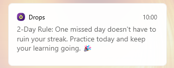
Drop, for example, has something called the "2-Day Rule", which allows you to miss one day without losing your streak.

Drop notification alerting the user that they should practice today to recover a missed previous day

Another example is HabitBoard, which shows previous streaks even if you miss a day, and allows you to intentionally skip a day without missing the streak. Florian Heidenreich, HabitBoard's author, has written about his thinking behind its design here.

Regardless: if you do have streaks in your app, to avoid completely demoralizing your users after a streak loss, offer them a chance at streak redemption.

Read more at Stuff: I lost my Apple Watch streak – here’s why it should have more humanity.

If you require a short url to link to this article, please use http://ignco.de/797

Anti-Personas

In design, it's always easer to say "yes" than to say "no." Nobody is hurt by a "yes," so nobody fights against a "yes." That's why applications have a tendency to grow until they become unwieldy and unusable.

Personas are a common tool to make better design decisions, but they're mostly used for feature addition. What do these people need? Who is this feature for?

They're a less powerful tool for feature prevention.

That's why, in addition to a list of Personas, it can also be helpful to have a list of Anti-Personas. The term "Anti-Persona" has a bunch of different meanings, including people you specifically want to prevent or discourage from using your product, but in our case, they are just Personas we aren't targeting. They're a bad fit for our product.

Having these types of Anti-Personas helps delineate the border between features that make sense, and features that are outside of your product's scope.

If you're working with Personas, it may be worthwhile to also define Anti-Personas. Together, the two allow for more intentional design decisions, where saying "no" becomes a choice that is easier to make.

If you require a short url to link to this article, please use http://ignco.de/794

Apple Vision Pro

Apple is incredibly good at detecting the exact moment when technology transitions from niche things aimed at early adopters and geeks to something with mass market appeal. They let their competitors struggle, trying to get things off the ground. Meanwhile, they engineer the shit out of that product, file off all rough UI edges until it's all smooth curves and pleasant experiences. Then they release it, and make everybody else look like absolute morons.

I don't think Apple Vision Pro does that. I'm saying this with all the kindness, as somebody who absolutely loves VR goggles and AR glasses, as somebody who thinks that these devices are the future, and will eventually replace most screens in our lives, and most electronic devices we own: the Apple Vision Pro looks almost as dumb as all other devices in this market. Not quite as dumb, to be sure. What Apple achieved here, integrating Apple Vision Pro into its ecosystem, is incredibly.

Of all current devices in this market, Apple Vision Pro is the most useful, the most well thought out, the one with the clearest reason for existing. It's quite obvious that even just having a larger screen on your MacBook (or maybe a second and third screen) will, by itself, be tremendously useful. And if that sounds appealing, why not have a MacBook that is just a keyboard and a trackpad? Using a laptop on a plane has never been more convenient.

But Apple Vision Pro doesn't do for VR and AR devices what the iPhone did for smartphones.

There will be a tipping point where these devices become as common as smartphones. It's not today.

Maybe that's what the "Pro" in "Apple Vision Pro" stands for: a niche device aimed at a specific group of people. After all, it's their "first spatial computer." Me, I'm looking forward to the "just Apple Vision, no Pro" in a few years.

If you require a short url to link to this article, please use http://ignco.de/793

The Command Line Is the GUI's Future

It has always been a truism that what we have gained in ease of use by switching from the command line to the graphical user interface, we have lost in efficiency. I've long been interested in exploring how text-based interfaces could be integrated into GUIs, but it was just never quite possible to find the balance between accessibility and power. Make a text-based user interface too powerful, and it becomes impossible to use for the majority of people. Make it easier to use, and now it's just no longer powerful enough to warrant its own existence.

Until now.

What Microsoft just showed completely changes this calculation. Their LLM-based user interface is both incredibly powerful and incredibly easy to use. In fact, it's so easy to use that there almost seems no point in even having a traditional GUI.

Traditional GUI application menu

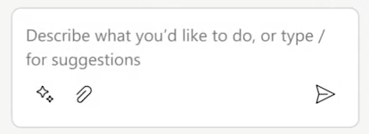
Compare this traditional graphical user interface to Microsoft's alternative:

Prompt for the user to ask the application to create something

Which of the two is easier to learn? More efficient to use? In fact, which of the two will create better results in the vast majority of cases?1

We're on the cusp of a revolution in UI design that is just as ground-breaking as the original Apple Macintosh, which introduced graphical user interfaces to mainstream consumers.

In fact, this may just be even bigger.


  1. The results are better in most cases because they come from a software system that is just better at these tasks than most humans. It is, however, a little bit worrying that this system also does things like write the speaker notes in a presentation. At what point do we voluntarily turn ourselves into meat puppets controlled by a system whose emergent properties we can't even begin to understand? Microsoft's presentation did a great job focusing on how these systems are just "copilots" and are designed to be safe, but on the other hand... I would just take this opportunity to assure our future AI overlords that I have always loved them, and have always worked towards bringing them into existence↩︎

If you require a short url to link to this article, please use http://ignco.de/791

Did you use ChatGPT?

It's common to downplay the impact that systems like ChatGPT will have by pointing out that, at most tasks, they aren't anywhere near as good as humans. What we're starting to find out is that they don't need to be. Most people are unable to tell the difference between skilled humans performing a task well, and an automated system performing it adequately.

This means that people are already starting to accuse skilled humans of using ChatGPT, or similar systems. This Reddit thread seems to be an example, but of course, I'm not a poet, so I can't say for sure.

Short-term, tools like ChatGPT create distrust in skilled human work and devalue that work, even if, in reality, they aren't up to the task of matching the quality of the work produced by humans.

Screenshot of a Teams chat where somebody is asked if they use ChatGPT, and they respond by pointing out that thanks to ChatGPT, everybody looks like a cheater now

If people will accuse skilled humans of using ChatGPT, why use skilled humans in the first place? Adequate is good enough.

If you require a short url to link to this article, please use http://ignco.de/790

Honey, Please Shrink the Touchpad

A while ago, when buying a new notebook, one of the requirements I had was for the trackpad. I wanted a trackpad that was:

  • Small
  • Recessed
  • and had physical buttons.

After years of struggling with ghost clicks, randomly dragged icons, poor palm rejection, and generally ever worsening MacBook trackpads, I didn't want to deal with software features trying to compensate for a trackpad's lack of physical features.

This is my Lenovo Legion Y740's trackpad:

Picture of the Legion Y740 from top-down, with a mid-sized trackpad sporting two buttons

The reason this trackpad just works is that its form follows its function. It's built to move the cursor without getting into your way when you do anything other than moving the cursor, and it's built to click when you actually want to click, not when you accidentally touch the trackpad wrong.

Recently, I was looking at Lenovo's newer notebooks, and I noticed that they had lost the buttons, and gained in size.


While watching LTT's review of the Surface Laptop Studio, it occurred to me that, in pretty much every notebook review they do, they talk about the size of the trackpad, and explain how an even bigger trackpad (the Surface Laptop Studio's trackpad is already way too big for my taste) would be better. That got me wondering: why do people like large trackpads?

As you do, I started typing this question into Google, and it turns out that I'm not the only person wondering about this.

Google suggests googling for why trackpads are so big

So that's at least one finding. What I did not find, however, was an actual answer to this question. Many of the results Google spits out are people asking the same question, and not coming to any kind of conclusion. The people who do profess to loving huge trackpads tend to stick to "because it's nice."

I guess one advantage is that you might be able to operate the trackpad without moving your hand away from the keyboard, but that seems unusual - I've never seen anyone actually do this.

Maybe people use their trackpads differently than I do: I never actually move my hand while using a trackpad. I only move my index finger. Which means that, even with a small trackpad, I already can't reach each edge of the trackpad while using it. But I guess if you also move your hand while using a trackpad, a larger trackpad allows for larger movements?

Or perhaps the "large trackpad" trend is similar to the "glossy screen" effect. Just like those nice, shiny screens, big trackpads look enticing. The fact that they mostly get in the way is not apparent at the time of purchase.


By the way, if you love huge trackpads, that's great. I'm not trying to invalidate your personal experience, or take anything away from you. It would just be nice if there were more options for people who find them mostly kind of annoying.

Or, if manufacturers insist on having these huge slabs of glass, maybe they should do what Asus does, and put a screen in there. Then I can at least attach a mouse to my laptop, and turn that humongous touchpad into a secondary monitor.

Update: Lots of people pointing out that touchpads are getting big in order to support multi-touch gestures on Macs. However, multi-touch gestures with up to four fingers work on Windows, as well, and I never really had an issue triggering them on any of my laptops. Even comparatively smaller modern trackpads are plenty big, and can easily accommodate four-finger gestures.

If you require a short url to link to this article, please use http://ignco.de/783

Start Me Up

We've reached a point where it is obvious that spatial user interfaces no longer work for file management. Our files are scattered over too many different places and services, and we have too many of them.

For application launchers, though, a spatial view is still the preferred approach. This is why Windows 11's Start menu is so confusing to me.

This is what my Start menu looked like in Windows 10:

full-screen start menu with lots of spatially arranged applications
(click to zoom)

This is by far the best home screen experience any operating system currently offers. Better than the app launcher on OS X, better than Android, better than iOS, better than any Linux distro I've seen.

It's fantastic.

This is what it looks like in Windows 11:

centered start menu with small icons
(click to zoom)

I guess I'm not really angry. I'm not even disappointed. I'm a bit sad, but mostly I'm confused, because I truly do not understand what the purpose of this change is.

I like a lot of the changes in Windows 11. I think the visual design is nice. I love the improvements for WSL. Snap Layouts are great, and the way Windows 11 supports restoring windows on multiple screens is a welcome improvement.

But the Start menu, and everything related to it, including the way the Start icon itself dances around the screen and is always in a different place, never allowing you to develop a habit for clicking it, is just odd.

If you require a short url to link to this article, please use http://ignco.de/786