Spatial Thinking
Most humans are used to spatial thinking. Even if - like mine - your desk is a huge mess, you can probably find your stuff pretty quickly because you just know where you put it. Each thing on your desk has a fixed place in space which does not change on its own. If you put something somewhere, it'll still be there the next day, and you'll know where you can find it.

When designing user interfaces, it's important to keep people's ability for spatial thinking in mind. People can easily find things based on position. If a human puts something somewhere, he'll probably be able to find it again if the user interface doesn't move it. If possible, the user interface should always display things where the user put them, and allow for spatial organization.
Unfortunately, most modern user interfaces don't accept this notion. Both Windows and Mac OS X like to move and resize Icons and Windows, which makes it hard to build a mental model of where your files actually are. Earlier versions of Mac OS did a much better job of this. Ironically, it's the often user-unfriendly Linux operating system which does this right. Ubuntu Linux ships with the Nautilus desktop, which was built by former Apple employees and supports full spatial navigation.
But Apple hasn't completely forgotten its spatial past.
Originally, the iPhone had a set number of applications installed.

Each application has a preset position. It's pretty easy to find an application if it's always on the home screen and never changes its position (unfortunately, not all cell phones have learned this lesson - there are many phones which use most of the home screen to show a clock or an image, and then display a small scrolling list of applications instead of using the screen real estate to facilitate the task the user actually wants to do).
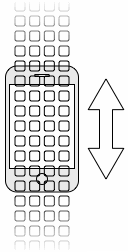
When it was hacked and users started to install additional apps, people started to run out of space to put them, and a solution was needed to get to these apps. What hackers did was implement vertical scrolling on the iPhone's home screen:

This seems like a neat solution. Unfortunately, it makes finding applications really hard, because they never appear in the same place, and while you might know that an application is "somewhere down on the right," it's hard to scroll to the exact position where the application is.
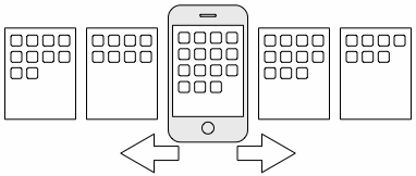
Apple's own solution to having more applications fixes this issue. With iPhone version 1.1.3, people can add icons to the iPhone's home screen. Instead of scrolling the screen vertically, Apple allows users to horizontally switch between screens:

The fact that you can swipe your finger across the screen to move between pages gives it even more of a "physical space" feeling.
This is a much better solution, as it allows for precise spatial reasoning. Users know where exactly their applications are ("the third icon in the second row of the first screen," for example).1 People also know which screen they currently are due to a number of small dots at the bottom of each screen, which indicate the number of screen and the currently active screen.
Instead of going with the most obvious idea, Apple took a step back and came up with a much more usable solution which is much more in tune with how humans think.
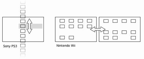
Another nice implementation of spatial navigation can be found on the Wii. Both Sony and Microsoft present downloaded games in a huge, one-dimensional vertical list which makes it cumbersome to actually find anything once the list contains more than a dozen entries. Nintendo, on the other hand, lets you arrange games on several two-dimensional screens.

-
Unfortunately, the iPad breaks this feature. Read my follow-up. ↩︎
If you require a short url to link to this article, please use http://ignco.de/7


