Oberon
Steven Frank's essay on the current state of the desktop UI1 reminded me of Oberon, a delightfully insane system I used back when I was studying computer science at ETH Zürich. The first thing you have to understand about Oberon is that it evolved entirely outside of the normal genealogy of user interfaces. Extremely simplified, the evolution of modern graphical user interfaces goes something like this:
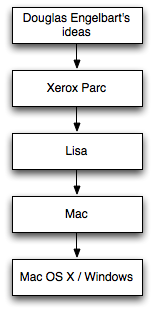
The Lisa marked the first modern user interface with windows, icons as objects, menus and mouse input. To this day, these concepts remain essentially unchanged. A person used to Vista or Mac OS X would immediately understand how the Lisa works.
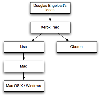
Oberon is not part of the "Lisa" line of user interfaces. The following part is based on what people at ETH Zürich have told me and may or may not be true. When ETH Zürich started its own computer science program in the 60s, buying computers from the US turned out to be a bit of an issue. They were expensive and often unsuitable for European use (what with our strange umlauts and stubborn insistence on speaking languages different from English). So ETH Zürich decided to start working on its own hardware and software systems. These projects were based on the Alto Niklaus Wirth2 had seen at Xerox PARC. In the early 80s, the strangely named Lilith Workstation was one of the world's first high-resolution computers with a graphical user interface.
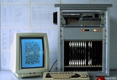
The software system developed for the Lilith was Modula-2 and later Oberon, which is both a programming language and an OS with a unique text-based graphical user interface.
Basically, Oberon ignored all that Lisa stuff and progressed from an entirely different branch of the GUI genealogy:
In some ways, the result is closer to the Canon Cat than to any other modern system. Obviously, Oberon has evolved a lot of weird features that are not found in any of the "Lisa-based" GUIs. Here are two of them.
Everything is a Command Line
Even though Oberon is a graphical, mouse-driven user interface, it is also very much text-based. It eschews icons in favour of words:
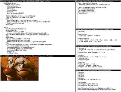
To launch applications or execute commands, you first type them somewhere (anywhere, it doesn't matter), and then middle-click them:

This may seem weird at first, but is actually extremely cool because it allows for some neat features. You need a program launcher? Create a new text file with the programs you need. Want to write a tutorial on a topic? You can include all kinds of commands right inside the tutorial and simply tell readers to click on them. Need to explain to your aunt what application to launch? Tell her to click on a word in the e-mail you just sent her.3 Working on something specific which requires you to execute the same commands again and again (such as compiling and executing an application)? Simply type the commands somewhere and you've essentially created your own ad-hoc user interface for your current task.
Everything is Zoomable
Oberon's "desktop" is an infinitely large two-dimensional space on which windows (and documents, since the distinction becomes meaningless in some ways) can be arranged:
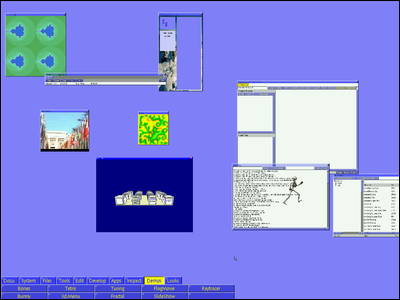
It's incredibly easy to move around on this plane and zoom in and out of it. Instead of stacking windows, hiding them behind each other (which is possible in modern versions of Oberon), you simply arrange them next to each other and zoom out and in again to switch between them. When people held presentations using Oberon, they would arrange all slides next to each other, zoom in on the first one, and then simply slide the view one screen size to the right to go to the next slide.
This essentially obsoletes concepts like virtual desktops, application switchers, or Exposé, since you have as much space as you need on your one desktop, and since you don't need to rearrange windows in order to get an overview of your open stuff. It's especially cool on netbooks with tiny screens.
In some ways, this also obsoletes the idea of opening a document. Essentially, all documents can be open all the time. All you have to do to interact with one is to zoom in close enough. A document can be its own icon, and its own window.
There's a movie on YouTube showing how zooming in Oberon works.
Sounds cool, can I play around with this stuff?
Sure. In fact, I recommend it. It's most likely unlike everything else you've ever seen.
You can get a recent version of Oberon on bluebottle.ethz.ch or from the Oberon Community Platform. I'm not entirely sure which versions contain which features. The version I've played around with most recently is the one found at bluebottle.ethz.ch; it contains the zoomable UI, which not all versions of Oberon have. I couldn't get it to run on VMware, but it runs just fine in Parallels.
To get started, click on "Docu" and "Tutorial" after you've launched Oberon. If you have a mouse with less than three buttons, try holding down modifiers while clicking and using the scroll wheel.
So, did you actually use this thing?
Yeah. Oberon is very much in active use at ETH Zürich. We used it as one of our main operating systems.
Update
You can find more current versions of A2 here. More information.
-
The article is no longer offline, but the Wayback machine has a copy. ↩︎
-
Of Pascal fame. I'm proud to say that I attended classes both by Niklaus Wirth and by Bertrand Meyer, the creator of Eiffel. Also, I once talked to Stroustrup, but please don't hold that against me. ↩︎
-
Yeah, let's ignore the security implications for a second :-) ↩︎
If you require a short url to link to this article, please use http://ignco.de/91

