Touchscreen Usability
During the last two months, I've been playing around with a new Sony camcorder. A lot of my friends have handled the device as well, and interestingly, not a single person was capable of independently figuring out how to use any of the camcorder's non-trivial features. The reason for this is that everyone tried to interact with the device using its buttons and knobs, even though most of its features are accessed using its touchscreen.
People simply did not discover that the device had a touchscreen.
Clearly, this is not an inherent problem with touchscreens. People instantly figure out how to interact with an iPhone, or with a Harmony 1100. The camcorder, on the other hand, makes a number of mistakes which keeps people from discovering that it has a touchscreen.
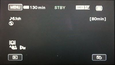
Touchable Icons Are Small and Flat
The user interface doesn't look touchable. The buttons are all incredibly small and flat. This causes the perception that you should interact with them using hardware buttons.

(Hover your mouse over the image to see the size of my thumb for comparison)
To encourage users to touch the screen, buttons should be large, and look like physical buttons.
The Screen Discolors Horribly When Touched
Some people eventually tried to interact with the device using its touchscreen, but immediately gave up. The camcorder's touchscreen requires quite a bit of force to register a touch, and since the on-screen elements are so small, people use their fingernails to hit them. However, if you press down on the screen with your fingernail, the screen promptly discolors horribly:
Since people are typically told that they should not push down on LCD screens, this discoloration causes them to assume that they are damaging the device by pushing on its screen. People immediately stopped pushing when they noticed the discoloration, long before the screen registered their touch.
Conclusion
Touchscreen devices can only work well if both hardware and software are uniquely optimized for touch interaction. Simply adding touch interaction to an existing device will make the user experience worse instead of better.
If you require a short url to link to this article, please use http://ignco.de/203


