Stripes: A Conceptual Operating System User Interface
In my post about Chrome OS, I noted that I was not sure why the system had both tabs and windows. Martin Gimpl's Stripes is a conceptual user interface that uses a zoomable window management model similar to the one found in Chrome OS, but foregoes tabs completely. Martin writes:
I pondered quite a long time about tabs and windows, and how to approach them in the most simple, approachable way. I ended up scrapping the tab concept in favor of a zoomable workspace, inspired by Exposé and Raskin's ZoomWorld. Instead of using tabs, windows can be freely organized into rows, effectively creating contextual groups.
Stripes contains a number of unique ideas. Here's a video showing how it works:
Martin has a prototype implementation of Stripes on his website. It's not a complete implementation of the concept; some features are missing. For example, you can only have one row of windows, and you can't see two windows side-by-side when zoomed in. But even so, it's very impressive and surprisingly complete. I encourage you to go check it out.
Things I love
I love how when you zoom in on a window, the surrounding windows are still slightly visible near the edge of the screen. This helps users grasp the spatial relationship between windows, and makes it obvious how they can switch between windows without zooming out. It's a very natural way of organizing windows and moving between them.
I love the idea of putting a textual user interface element front and center. As people have become more comfortable with interacting with sites like Google, it makes sense to put the same kind of user interface on desktop operating systems.
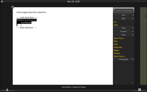
I love the menu bar. I especially like that a single user interface element is used to combine the global menu bar with the context menu.

(Large version of this picture)
That way, people don't have to learn two different menus. This also makes context menus obvious. In most other operating systems, context menus are hidden. People have to discover that they can open context menus with the secondary mouse button, and then they have to click on everything to find out what commands are available on which elements. In Stripes, this is obvious; as soon as the user selects something, the contextual commands become visible.
I also love that menu search is such a prominent feature. I use that all the time on my Mac.
Things I'm Not Sure About
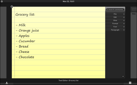
In Stripes, the menu bar is attached to each individual window.

(Large version of this picture)
If Stripes were running on a real computer, it might make more sense to attach it to the edge of the screen instead. That way, users could slam the mouse cursor towards the edge of the screen if they wanted to click on a menu; as per Fitts's law, clickable stuff on the edge of the screen is "infinite" in size and easier to hit. Martin writes:
I envisioned Stripes to be something that could potentially also be used with direct input (like touch), and in these cases the screen edges aren't as large targets as they are with cursor-based input.
He also notes that important UI elements such as the Launcher and Overview buttons actually are at the edges of the screen. At any rate, a decision such as where to best put the menu bar would be a prime candidate for A/B testing.
I'm also not sure about "promoting" files and commands based on popularity. Microsoft tried to change menus based on the popularity of individual commands; users generally tended to be confused by it, and it interfered with their "muscle memory". Something like "most recently used" is much more obvious to users; they understand how it works, and can anticipate how it will behave. Sorting items on popularity often yields unpredictable results. Martin responds:
Adaptiveness in interfaces is certainly a dangerous proposition, and I am fully aware of this. As a matter of fact, while the popularity concept in Stripes works in theory, I'm not 100% sure myself whether it would end up being something that people would appreciate or not. I practically made the bet that the adaptive features would, at the end of the day, contribute more pros to the overall user experience than cons.
I believe that adaptive interfaces have been stigmatized somewhat because of Microsoft's Clippy and IntelliMenus (the menus that used to hide certain options in order to make them appear simpler).
He's right. The problem with Microsoft's menus was that they removed menu items. It's likely that promoting menu items based on popularity would be more easily understood by users. Still not sure about the files, though. I think this would be another question that would have to be settled with user tests.
The Final Word
Stripes is a very impressive and inventive take on the operating system user interface. It contains a number of interesting and potentially awesome ideas, and mixes them into a coherent system. I would definitely love to have something like this on one of my computers; I think it's a terrific concept.
If you require a short url to link to this article, please use http://ignco.de/225


