Gestures
Way back when, computers used to only have command line interfaces. To get a PC to do anything at all, people had to memorize commands, and type them in correctly. But forcing people to memorize commands is not particularly user friendly. As a result, few people knew how to use computers, or wanted to learn.
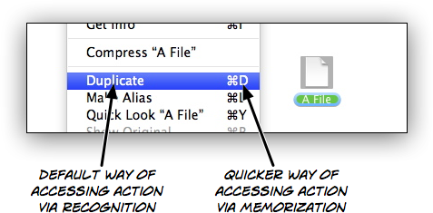
When graphical user interfaces became popular, people didn't have to memorize commands anymore. Instead, everything they could do was shown on their screen. "Memorizing" was replaced with "recognizing". No longer did people have to memorize "cp" if they wanted to duplicate a file; they just had to look through the "File" menu and recognize the "Duplicate" command.

Memorization was relegated to shortcuts. Instead of selecting "Duplicate" from a menu in order to create a copy of a file, people could use a keyboard command that they had memorized. But it was an optional, secondary way of achieving the same thing.

In a way, gestural user interfaces are a step back, a throwback to the command line. Gestures are often not obvious and hard to discover; the user interface doesn't tell you what you can do with an object. Instead, you have to remember which gestures you can use, the same way you had to remember the commands you could use in a command line interface.
This works well for something like pinch-to-zoom, which is reasonably obvious and used by many applications. Once you've seen somebody use pinch-to-zoom, you will remember how to use it yourself.
It works less well for other gestures; gestures that are not as obvious, and are used by only a few applications.1
Take a look at this list of gestures for Apple's iPad version of Pages. Here's how you move an object by one pixel:2
You can move an object in single-pixel increments by nudging it.
Touch and hold the object with one finger, and then use another finger to swipe across the page in the direction you want the object to move.
This is how you match the size of two objects:
You can quickly match the size of two objects on the page. You may find it easier to use both hands for this operation.
Select the object you want to resize, and then drag a selection handle.
As you’re dragging, touch and hold another object of desired size.
When you see the words Match Size appear, lift your finger from the resized object (the first object) and then the other object, or lift both your fingers at the same time.
Almost nobody is going to find these gestures simply by exploring the application, and trying out things. Even people who are shown how to use these gestures are unlikely to remember them immediately.
In part, this is because there are no conventions for many of the more sophisticated actions an application like Pages offers. Since there are no conventions, developers have to come up with new solutions, and we have to learn them; we don't know how something like Pages on an iPad is supposed to work, so we don't know what to try.
But partly, it's because these gestures are not obvious. There is no discoverability. As Duncan Wilcox points out, gesture-based user interfaces often don't have visible elements that represent verbs. The gesture is the verb. This works if the gesture is intuitive, but breaks down if there is no "natural" gesture for a verb. And since there is no intuitive, natural way of moving an object by one pixel (or skewing it, or mirroring it), we have to learn that command, and memorize it. The user interface doesn't tell you how to nudge an object by a pixel; in fact, merely from looking at the application, you wouldn't figure out that this feature even exists.
When natural user interfaces resort to non-obvious gestures, they essentially regress into a really pretty, modern version of the quaint old command line interface.

There are several solutions to this problem.
Modes, Quasimodes, and Inspectors
One solution would be to introduce modes. This would allow the same simple, obvious gesture to do different things, depending on which mode the application is in. By reusing simple gestures to do different things based on the application's current mode, you can avoid more complex, hard to learn gestures. OmniGraffle uses this solution for some of its features. This movie shows how the same simple drag gesture can be used both to move objects, as well as to draw connections between objects, depending on the application's mode.
Instead of offering a complex gesture for nudging an object by one pixel, Pages could offer a "nudge" mode, in which dragging an object would move it slowly, pixel by pixel. That way, you could reuse the simple "move" gesture for nudging.
Full-blown modes sometimes lead to confusion. If it is not always immediately obvious to the user what mode the application is in, a gesture might not produce the effect the user was expecting. A possible solution to this problem would be to forego modes, and offer quasimodes instead. For example, selecting an object could show a menu which would allow users to activate quasimodes for nudging and resizing, similarly to how the iPhone implements selecting and copying text: Touching a text area offers a menu that allows users to activate the "select text" quasimode.
Applications could also avoid gestures entirely for lesser-used features. One way of achieving this might be an inspector-like window showing possible commands, attached to the active object.3
Use Complex Gestures Only as Shortcuts
Instead of forcing people to learn complex gestures, such gestures could be offered as optional shortcuts, offering quicker access to certain features for those people who are willing to learn the gestures.
An example of this can be seen on the iPhone, when deleting an element in a list view. You can either touch the "Edit" button to activate the "Edit list" mode, which allows you to delete list entries. Or you can swipe across an individual entry and delete it this way; the gesture is not obvious, but this doesn't matter since it is not the primary way of deleting list entries, but merely a shortcut.
I've already written about teaching gestures, and I believe it should be possible to provide a system that teaches gestures similarly to how we teach keyboard shortcuts, by showing them in the context of the primary user interface.
For example, a simple animation of the corresponding gesture could be shown when the user selects an action from an object's inspector. That way, people could use the inspector to nudge an object by a pixel, but when they use this feature frequently, they will eventually learn the gesture from seeing it each time they invoke the action using the inspector.
This essay has been translated to Romanian by Alexander Ovsov. Read the translation here.
-
Given that there is a bit of a patent land grab going on in the gesture area, it's possible that different applications will use different gestures for the same action, so that a common, consistent language shared between different applications and devices will never emerge. ↩︎
-
By the way, it seems you can also nudge by more than one pixel. ↩︎
-
Robert Mohns points out that Endloop's iMockups actually uses this technique for its implementation of nudging. ↩︎
If you require a short url to link to this article, please use http://ignco.de/290


