Skype 5 for Mac
A while back, when Skype's group videochat feature was still free, a friend of mine sent me a Skype message, asking me whether it was possible to do videochat with more than one person in Skype. "Sure," I replied, "you can do that, but you need to install the new Skype 5 beta." I sent her the link. A few minutes later, she went offline, and came back shortly thereafter, apparently having updated to Skype 5. The first message she sent was
What the hell happened to Skype? Is this some kind of joke?
Apparently, it is not.
At work, we use Skype to communicate. A lot of the people here use Windows computers. More than once, a Windows user walked by my Mac, saw my version of Skype, and said something to the effect of "wow, this looks so much better than the horrible mess we have on Windows!" It seems Skype has noticed that there is a discrepancy in quality between the two versions, and has decided to make the two versions more similar to each other. Unfortunately, instead of making the Windows version of Skype better, they've decided to fix the discrepancy by making the Mac version of Skype more like the Windows version.1
Now, I have to point out that Skype has design constraints I do not know about. Maybe Skype had to do this. Maybe there was some serious problem with the previous version of Skype that I don't know about. When Twitter added the quick bar to its iOS client, they didn't do it because they wanted to mess with their users; they did it because they had to find a way to make money. Similarly, Skype probably has good reasons for why Skype 5 looks the way it does.
Having said that, I really don't like Skype 5.
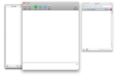
The previous version of Skype was a pretty brilliant piece of user interface design. In its initial state, it was extremely simple. This is what Skype used to look like:

A simple window showing a search field, a counter for unread notifications, and a list of your friends, with the ones who are currently online at the top. It's easy to understand, doesn't take much space so I can always keep it visible, and it shows me all the information I need to know. Who's online? Did I miss something? Is it okay to contact a friend, or does he not want to be disturbed?
With an active chat, Skype used to look like this:

Again, easy to understand, simple, but still giving me everything I might need. I can add more people to the conversation, go back to earlier messages, or call people.
But the previous version of Skype wasn't just simple; it also was flexible enough for advanced users. At work, my Skype needs are quite different from most people's. There are eight people I talk to all the time. I often refer back to earlier conversations. I often chat with more than one person at the same time. To make all of this as efficient as possible, I've dedicated a full virtual desktop to Skype. Here's what it looks like:

Merely by switching to this virtual desktop, I can immediately contact the most important people, and at a single glance, I can see who has written to me, and what they have written (which is important: to avoid being constantly interrupted, I sometimes turn off notifications while I'm working).
This is a far cry from how most people use Skype, but the point is that Skype used to support both kinds of users. If you were a casual user, Skype used to be simple and easy to understand. If you had more demanding needs, Skype used to be able to grow alongside your needs.
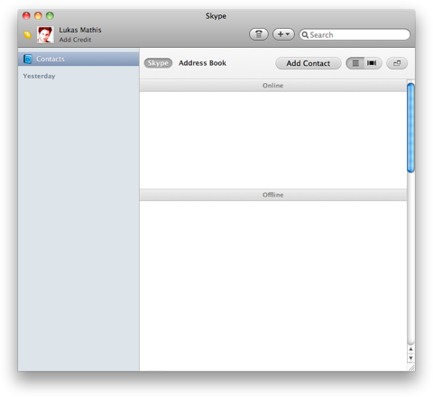
Let's fast-forward to Skype 5. This is what it looks like:

The panel on the left lets you switch between a view that shows your contacts, and individual chats. The panel on the right either shows a list of contacts, a chat, an active video call, or information about a contact.
Immediately, there are problems with this. And not just problems for advanced users, but also problems for casual users.
It's Too Complicated for Casual Users
The window no longer looks simple. Instead, it looks overwhelming. On the plus side, it's now easier to add a new contact, and I can decide whether to call somebody or start a chat by hovering over a contact. On the minus side, everything else. Since every Skype feature is crammed into a single window, that window feels overloaded. No longer do I see a simple list of contacts. Instead, I have a complex multi-paned window whose right panel shows entirely different things, depending on the application's mode.
No longer can I easily see who's online. Instead, I probably only see the people I've talked to most recently, regardless of whether they're online. More than once, I've waited for a friend to show up in the sidebar, expecting it to work like the old buddy list. It doesn't. Unless you switch to the "contacts" mode, which then causes Skype to show two lists of contacts next to each other (which behave differently), you don't actually see who's online.
There's too much extraneous stuff in the main window. for example, right next to the important "Add Contact" button, there's a button that allows you to see the pictures of the people in your address book in a Cover Flow view. What is this good for? Why would anyone ever want to do that? To add insult to injury, it's not merely useless, it's also poorly implemented, only showing you three pictures at a time. And it includes all of the people who don't even have a picture.

Something I've noticed even casual Skype users do is to send URLs by text chat during a videochat. Well... How do you do that in Skype 5? If a video call is active, it occupies the right panel, which is also where the text chat would be; so you can't do both at the same time. Actually, there's a way, but it's not obvious. During an active call, if you move your mouse over the call window, you'll see a bunch of tiny icons pop up at the bottom:
![]()
Clicking on the second one splits the window horizontally, and adds a chat view below the call view. Which, on a modern screen with a wide aspect ratio, is usually not where you want it. So the feature is hidden, and poorly implemented, but at least Skype allows you to type chat messages during a call if you can figure out how.
It's Not Flexible Enough for Advanced Users
But Skype 5 isn't just harder to use for casual users, it's also less flexible for advanced users. Earlier versions of Skype were simple to understand and easy to use, but they allowed users to grow. As users grew, they were able to learn and make use of Skype's advanced features. Skype 5, on the other hand, is a shallow app that doesn't allow its users to grow.
With Skype 5, I can't see two chats at the same time. At first, I thought that I must be missing something. Surely, chatting with two people at the same time is a rather common use case. I can't be the only person who does that, can I? Skype seems to think I am. There's no way to see two chats next to each other.
The default window is too large, and it can't be made small without destroying functionality. I like to keep Skype running all the time. The older version's window was small enough that I could fit it at the edge of the screen; if I need to know if somebody is online, I can see that at a glance. Skype 5's window is way too big. Even if I don't hide the app intentionally, it eventually gets covered by other windows.
I can't see who's online when a chat is active, unless I open a second window with a list of users. Now I'm duplicating functionality across two windows; I end up with three different user lists in two different windows that all behave in slightly different ways. I guess it's good to have the option, but why replace something that works perfectly well with something that doesn't work particularly well, and then, to cover the fact that the new version of your feature doesn't work well, also re-introduce the earlier version?
Public Response
When Skype launched the new user interface, response from users was overwhelmingly negative. Now, new software versions always get negative responses. People don't like change, even if it's for the better. But I can't remember any other case where people responded negatively to a new software release in such numbers and with such consistency.
Maybe Skype made the Mac version look more like the Windows version because a lot of people use both; if the two look the same, users only have to learn how to use Skype once, and can then apply their knowledge to both platform versions. However, I don't buy that explanation. The two versions look more similar, but they still behave differently. As a result, making them look similar is actually confusing, since it creates the expectation that they will behave the same when they don't.
Skype is a tool used both by casual users, and by experienced users who use it every day in a professional context. It's incredibly hard to get this kind of user interface right. The old version did an admirable, elegant job serving both audiences. The new version, unfortunately, is a huge step backwards.
I have to repeat what I wrote earlier: Skype has design constraints I do not know about.2 I'm sure there are good reasons for why Skype 5 works the way it does. Maybe Skype even plans to fix the issues I mentioned, but simply hasn't gotten around to it yet. Unfortunately, none of this makes Skype 5 work better for me. Fortunately, Skype 2.8 still works — at least for the time being.

Update: I've written a follow-up with some ideas for improving Skype.
Update 2: TidBITS has published an edited version of this article.
Update 3: Skype has responded.
-
The design studio's website says: "Skype saw the need to consolidate its product development efforts and drive user experience consistency across platforms." ↩︎
-
Perhaps something like this. ↩︎
If you require a short url to link to this article, please use http://ignco.de/340


