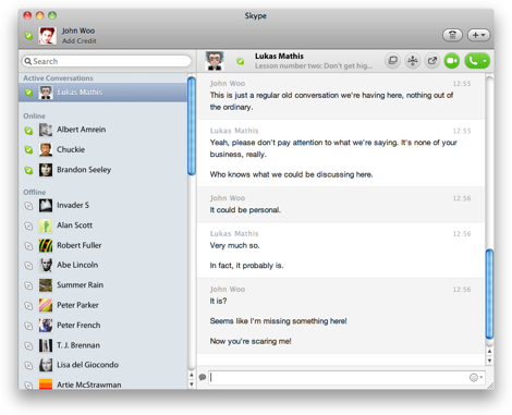
Skype 5 Ideas
After complaining bitterly about Skype 5, I should probably offer some suggestions on how to improve it. Redesigning somebody else's product is always a tricky business. You don't know why they made the decisions they made. You don't have the data they have. You don't know what constraints they had. So this is not meant as a "here's how Skype should look like" article. Instead, these are five ideas that might make Skype better. In order to find out whether they would actually work, you'd have to do extensive user testing, and iterate on the design until you get it right.
Again: this is not a "here's what Skype should have done" post. Instead, it's a "I've complained, and now I'm offering some ideas" post.
First of all, defaulting to a single window is a good idea, as long as that single window is designed well, and doesn't overload the user with options. So I'm going to retain this idea from Skype 5.
Here are my five ideas:
1. Get Rid of the Stuff That Doesn't Help Anyone
Like Cover Flow. It just adds unnecessary clutter. Nobody ever said "gosh, if only there was a Cover Flow view of my contacts so I could figure out who to call!"
If it doesn't solve any problems, kill it.
2. Unify "Contacts", "Contacts Monitor", and Active Chats
One of the problems with Skype 5 is that it splits "Contacts" and active chats into two different lists. Together with the "Contacts Monitor" popup, that's three different places that all show your contacts in three different ways. This adds unnecessary confusion. The three lists all look similar, but don't behave the same way. More than once, I've waited for somebody to show up online, only to eventually realize that he was online all the time, I just looked at the wrong list.
So let's get rid of the "Contacts" entry in the sidebar, and let's get rid of the "Contacts Monitor" popup. Instead, let's show all contacts in the sidebar:
At the very top, have a group of "Active Conversations" showing people you've talked to today.
When Skype starts, sort online contacts by the time of their last conversation. When somebody's status changes to "Online", add that contact at the bottom of the "Online" group.
This solution means that the people in your sidebar will move from "Online" to "Active Conversations" when you first talk to them, which can be disconcerting. Of course, this already happens in Skype 5, so while it's not good, it's not a disadvantage compared to the current Skype 5 design.
3. Allow People to Open Chats in Individual Windows
Chatting to more than one person at the same time is a common use case. Constantly switching between different chats is annoying. Hence, it makes sense to let people open chats in individual windows. Simply add a button to each chat that opens that chat in its own window.

4. Default to a Single Window, but Let People Collapse It
If the user shrinks the window down, remove the right panel, and switch to a single list view.

In this mode, default to opening chats in their own window, and show possible actions when the mouse hovers over a contact: click once to start a chat, call, or video call.
5. Don't Hide the Text Chat During a Call
This should be pretty self-explanatory. When people start a chat, only use part of the window, and allow the text chat to still be visible.
That's It
These changes would retain the single window, but simplify its contents and make it easier to understand for new and casual users, while adding depth that would allow advanced users to get more out of the application. It is, of course, entirely possible that Skype considered all of these ideas, and had very good reasons for not implementing them. But from over here, it's hard to see what these reasons might have been.
Further Reading
Matthias Kampitsch has a different approach to a Skype redesign that is also worth checking out.
Sacha Greif notes some of the same issues, and others that I didn't catch. Jaanus Kase also has some thoughts. Andrew Borovsky disagrees with me.
Keith Lang offers another idea on how to organize the contacts list.
There's another approach at a redesign at aaytch.com.
Voice on the Web also discusses the topic.
If you require a short url to link to this article, please use http://ignco.de/352


