iA Writer
I'm not a fan of productivity tools.
If you aren't productive, it's probably not because you don't have enough tools. Getting yet another one is unlikely to magically change your behavior. In fact, following productivity blogs, reading "how to get things done" books, and installing yet another distraction-free writing environment just seems like another kind of procrastination. Indeed, it's a more insidious kind of procrastination, because it feels so productive. When you watch an episode of Game of Thrones or browse through stories on Reddit, you know you're wasting time. When you fiddle around with the settings on your writing tool, however, it feels like you're making an investment: you're investing time now so you can be more productive later.
Productivity tools are a more evolved, more seductive form of procrastination. So I'm not a fan of this whole industry.
I am, however, a fan of iA Writer. Because it's not just another one of these distraction-free writing environments, it's also a damn good text editor. I especially like two features: Markdown support, and "Reading Time."
Writer's Clever Markdown Support
Most apps that support Markdown show two different views at the same time: a text-only view, and a fully rendered view. Writer, on the other hand, renders some Markdown formatting inline.

In most cases, I prefer this to the split view. I can see the formatting right where my focus is. I don't need to switch between two different views to make sure everything looks right.
Of course, Writer doesn't display every Markdown feature. Pictures and links, for example, aren't rendered at all. Which is fine, as long as the structure itself — headers, emphasized text, lists — is rendered.
Writer Tells You How Much You've Written, and How Long It'll Take People to Read It
I find this useful, because it's something I'm bad at. I have no idea how long it'll take most people to read a typical essay on this site.
Having some way to assess this helps me decide when to write more, when to cut stuff, and when to split an essay into several parts.
Of course, there are also things I don't like about Writer. Here are two of them: Focus Mode, and Writer's font size.
Focus Mode1
Writer allows you to enter into a mode where you only see one sentence at a time. Which is nice if you think in terms of sentences, but I don't. I tend to think in terms of paragraphs and sections.
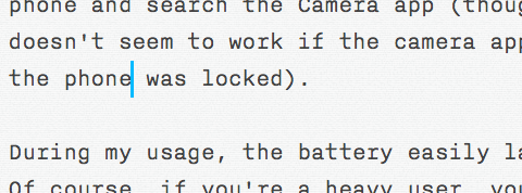
"But," you tell me, "there are people who really like Focus Mode! If you don't like it, just ignore it!" Well, I do ignore it, but the feature's existence has some unfortunate repercussions. For example, it seems that focusing on sentences as the main building blocks of text has caused iA to change how Cmd-→ And Cmd-↠work. Let's say you're writing a paragraph, and you need to go back to change a sentence. After changing the sentence, your screen may look something like this:

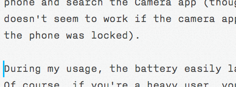
At this point, you want to move the cursor to the end of the line, to continue writing. Usually, on a Mac, you'd just hit Cmd-→ to do that. However, Writer's focus on sentences means that Cmd-→ will jump to the next sentence. As a result, the cursor doesn't move to the end of the current line, it moves to the beginning of the next paragraph:

I'm so used to how Cmd-→ works, and I'm spending so much time in other text editors2 that I'm not sure I can get used to how Writer changes Cmd-→.3
The Default Font Size Is Too Large, and It Can't Be Changed
I applaud Writer's insistence on avoiding settings altogether. But the default text, while set in a beautiful, monospaced typeface reminiscent of a typewriter, is so big! I guess this, too, is related to Focus Mode. If you expect people to only look at one sentence at a time, you want to make that one sentence look substantial. So you need to make the default font size large.
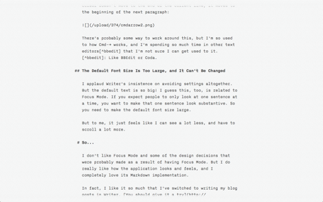
But to me, it just feels like I can see a lot less, and have to scroll a lot more. It might work well on a large screen, but on my 15-inch MacBook Pro, even though it has the hi-res screen option, and Writer is in full-screen mode, this is all the text I can see:

That's around thirty lines of text.4 This makes it hard to move around in my text, to scroll to a specific point, or get an overview of what I'm doing. I feel like I'm wearing blinders.
Verdict
I don't like Focus Mode, and some of the design decisions that were probably made as a result of having Focus Mode. But I do really like how the application looks and feels, and I completely love its Markdown implementation.
In fact, I like it so much that I've switched to Writer for writing blog posts. You should give it a try. Maybe you'll even like Focus Mode.
-
Patent pending. For what it's worth, iA claims that the patent would only be used for defensive purposes. Obviously, I don't like the idea of patenting software. ↩︎
-
Like BBEdit or Coda. ↩︎
-
Here's a solution to this issue. ↩︎
-
For comparison, in a regular old BBEdit window set to a font size that feels comfortable to me, I see more than sixty lines of text. ↩︎
If you require a short url to link to this article, please use http://ignco.de/374


