iPhoto's Mystery Meat Gestures
Back in 1998, websites would often force visitors to aimlessly move their mouse around, trying to reveal hidden icons or pieces of text that would explain where to click. Frustrated with these hidden, obscure navigation elements, web designer Vincent Flanders coined the term "Mystery Meat Navigation".1
After downloading and playing around with Apple's new iPhoto for iOS, I felt like I was teleported back to 1998. Touching and gesturing in different ways would make seemingly random things happen. I regularly unintentionally activated features, changed views, opened or closed pictures, and got iPhoto into states I wasn't sure how to get out of again.
Hidden Gestures
It was only after I watched Apple's Keynote, where Apple's Randy Ubillos explains some of the gestures and features of iPhoto, that I finally started to understand how the application is supposed to work.
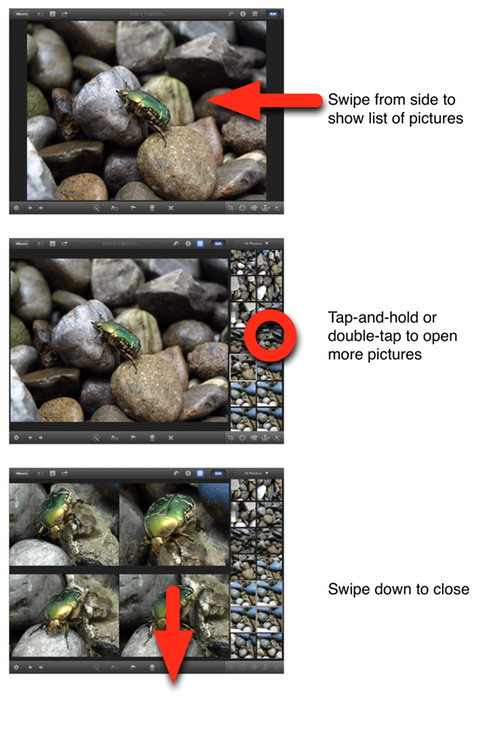
Apple can't expect every iPhoto user to watch its Keynote, just to figure out how to use the app. It should be accessible to anyone.
While playing around with iPhoto, I didn't discover most of the features shown in the Keynote. For example, you can darken or lighten the sky in a photo, but you do that by touching the sky, waiting for new ui elements to appear, and then sliding your finger. How is a novice user supposed to find this feature?
There's some on-screen help, but it's mostly useless. For example, Apple's help tells you to "touch and hold with two fingers to use the magnifying loupe."
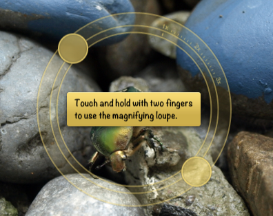
But once you do that, there's no further help or information!
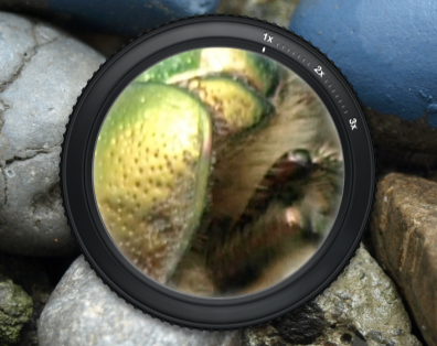
The loupe seems to support different zoom levels. How do you access them? I don't know.2 Are there other features the loupe supports? I don't know. Can you access the help system again, to get additional information? Nope, trying to do that just closes the loupe.
It's okay to have a few gestures that aren't easily discoverable, if they are simple, universally applicable, and fun enough that people will teach them to each other. Pinch-to-zoom is one such gesture. Most people probably won't discover it on their own, but it's such a fun gesture that the people who know it will show it to those who don't. It's also easy to learn and remember, and it works pretty much everywhere, so pinching pictures quickly becomes second nature.
Unfortunately, iPhoto's hidden gestures aren't particularly fun, and they only work in iPhoto. iOS's built-in "Photos" app is a completely different application, despite doing essentially the same thing as iPhoto, running on the same device, and coming from the same company. Almost nothing you learn in iPhoto can be applied to Photos, or to any other iOS app. In fact, being proficient at using iPhoto will probably make you worse at using Photos.
Button Overload
Not every feature in iPhoto is hidden behind a gesture. Many other features in iPhoto are exposed using buttons, but they don't fare much better. Almost none of the buttons have text labels, just (sometimes rather inscrutable) icons; it's reminiscent of Microsoft Word's insane toolbars.


There are so many unlabeled icons that I really have no idea what most do.3

In fact, there are so many buttons in iPhoto that when you run it on the iPhone, many of them become tiny. You can barely hit them with your finger.
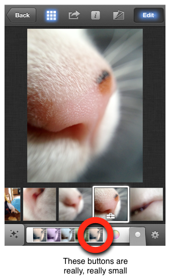
And even if you realize what the buttons do, and manage to hit them with your finger, it's often not clear how they work. Sometimes, you tap a button to activate a mode, but then you also have to do some other gesture (like sliding your finger over the picture) to trigger the actual effect.
Feedback
In addition to having many hidden gestures, iPhoto also commits the mortal sin of only showing the effect of many gestures once the gesture is finished. For example, iPhoto allows you to see a number of pictures side-by-side. You can remove pictures from this list by swiping down. On webOS, which offers a similar user interface for its cards view, swiping a card immediately gives feedback; the card moves with your finger, and you understand that something is happening.
In iPhoto, on the other hand, there's no feedback. You need to finish the gesture; once you've done that, the photo disappears. A bunch of times, I tried closing a picture by swiping in the wrong direction, wondering why nothing happened. This mistake would have been immediately obvious, had there been any kind of feedback for making the correct gesture.
This kind of interaction design problem simply shouldn't happen in one of Apple's flagship products.
Something I like
But I want to close with something I really like about iPhoto: it looks distinctive and unique. But apart from a few examples (like the fanning-out brushes), it doesn't fall into the skeuomorphism overkill trap — unlike many other recent Apple apps.
This Stuff Is Hard
It's easy to find flaws in iPhoto, but it's important to remember that Apple is sailing uncharted waters here. There are few (if any) other iOS applications that offer anywhere near the functionality that Apple managed to cram into iPhoto. In some way, Apple is trying to define a new language for touchscreen user interfaces. Perhaps they're going too far with iPhoto: a little close button is much more obvious and easier to figure out than a hidden "swipe down to close" gesture. But then, if you have hundreds of rather complex features, you just can't add a new button for every last one of them.
Microsoft's Windows 8 has similar issues,4 but over there, users just have to learn a small number of consistent, system-wide gestures. I've recently used a BlackBerry PlayBook running OS 2.0 (which I really like). The PlayBook has two different system-wide gestures that you need to know in order to be able to use the device. BlackBerry teaches its users these gestures by sending them through an interactive tutorial the first time they turn on the device.
iPhoto, on the other hand, has so many different hidden features and gestures that this approach doesn't really seem feasible.
This stuff is hard. iPhoto has many flaws, but I'm pretty sure the same could be said of the Xerox Alto's UI. We're new at this, but as we get better at designing for touch user interfaces, and as a common language starts to be established, designing touchscreen versions of complex applications like iPhoto will get much easier.
-
No, I didn't steal this article's title from Craig Grannell! It's a complete coincidence! ↩︎
-
Reader Jana F. solves the mystery. She writes: "Use two fingers on the black edge of the loupe to twist, like you would on a focus lens of a camera." ↩︎
-
A reader notes that you can activate VoiceOver. Afterwards, tapping a button will tell you what it does. ↩︎
-
As an aside: from the video, it seems like Pirillo's dad couldn't figure out how to go back to the Windows start screen. You do that by hitting the Windows key. So it's a bit like people using an iPad for the first time, trying to figure out how to get back out of an app to the home screen, and nobody telling them that they simply have to hit the hardware home button.
Yeah, you have to be told that this is how it works, but once you know, it's hardly a major usability issue. ↩︎
If you require a short url to link to this article, please use http://ignco.de/433


