Does Your Application Create Value?
So you've spent a lot of time polishing your application's usability. And you got it right; your application is easy to figure out for new users, and pros can use it efficiently. That's great; it's great to have a usable application, but here's the bad news: usability is only one part of what makes a application compelling to its users. Another important part is the value it provides to its users. Your application could be the most usable application in the history of applications, as long as it doesn't do or produce anything of value, it's effectively worthless.
An important part of making a great application is thinking about the value of its output.
Here's an example. We've all used two popular and similar applications, Microsoft's Powerpoint and Apple's Keynote. On the surface, the two applications are very similar. They do essentially the same thing. Keynote may be a bit easier to use while PowerPoint provides more features. The real difference, though, is in the value of their output.
Let's look at what the two people who probably have the most influence in the development of each application can do with their respective app.
This is what a Powerpoint presentation given by Bill Gates looks like:
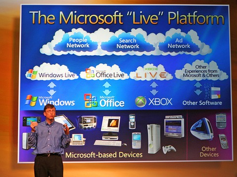
(Image by Niall Kennedy, licensed under Creative Commons Attribution-Noncommercial 2.0 Generic)
The slide is cluttered and unreadable, full of small, low-contrast type and garish colors.
Here's a similar slide, this time taken from an Apple Keynote given by Steve Jobs:
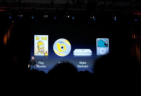
(Image by Marcin Wichary, licensed under Creative Commons Attribution 2.0 Generic)
The artwork is beautiful, the slide's content is clear and obvious, there's little text, and the images reinforce the text's meaning and the slide's intent instead of just decorating it.
The reason for the difference isn't just that Jobs has a different taste than Gates. Another reason is that the first slide was designed in Powerpoint, while the second was designed in Keynote. Keynote values its output. Powerpoint does not.
This is what Keynote looks like:
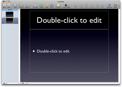
Like the slides it produces, Keynote is clean and organized.
This is Powerpoint:
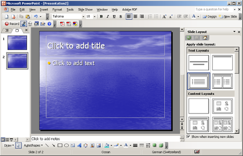
Like the slides it produces, Powerpoint is cluttered and full of tiny buttons and icons and labels.
These are some of the templates Keynote offers:
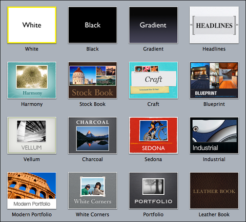
They are beautifully designed, have great typography, a clear structure, and are presented in nicely rendered thumbnails (the image shown here is scaled down from the original).
And here are the ones my copy of Powerpoint has:
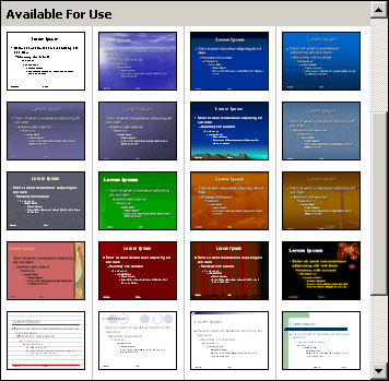
They are full of tiny text and rendered as small thumbnails (this image shows their actual size), as if Powerpoint was ashamed of their ugliness. They contain a ton of nested bullet points, as if that was a good way of designing slides.
In all fairness, I do not own the most recent version of Powerpoint. Perhaps newer versions have better templates. However, these templates were ugly even back in 2003, when my version of Powerpoint came out.
It is of course possible to create crappy presentations in Keynote, and it's possible to create beautiful presentations in PowerPoint. But Keynote provides much better templates; Apple really spent a lot of time creating beautiful, compelling templates. And Keynote's user interface steers its users towards creating simple, beautiful, clear slides containing few points, pictures and little text, set in large type.
Powerpoint's templates are crowded and garish to begin with, and its cluttered user interface pushes its users towards cluttered slides.
The lesson here is obvious: your application shapes its output. You can make it easy for your users to create awesome things, or you can make it easy for them to create crappy things. It's not only your job to make your application usable, it's also your job to make sure that the things your users build with your application are valuable.
Do You Value the Things Your Users Create?
Think about the output your users create with your application. Is it valuable output? Is it beautiful? Is it compelling? Is it awesome?
Do you put time into creating well-designed templates, into an UI that helps users create significant, valuable, clear output?
The Bigger Picture
There's one additional thing to consider: As programmers, we can have a huge impact on society. The things we create change how people think. Pagemaker changed publishing. Powerpoint changed presentations. Napster changed music. YouTube changed video. Even if your app doesn't change things on such a large scale, it changes the lives of the people who use it. Perhaps it's only a small change, but it's still a change. If your application changes things, is it a change for the better? Does your application improve people's lives, or does it just waste their time?
What's your application's impact on society? Can it improve our society?
If you require a short url to link to this article, please use http://ignco.de/61


