On Tabs and Docking and Title Bars
I have three confessions to make.
1. On Title Bars
This is my first confession: I never liked window title bars, lazily sticking on top of all windows, wasting space on my screen, doing almost nothing useful at all. Most of the title bar isn't actually used for anything; the only thing it does is let me move windows.
I picked up a netbook a few weeks ago, and that made it painfully obvious that title bars are a waste of space. On an 1024x600 pixel screen, vertical space is precious. Wasting 22 pixels on something that is essentially an empty grey area on my screen just seems distasteful. Vertical space is precious.
Granted, since Apple doesn't actually sell any computers with such small screens, it's not much of an issue. It's still wasted space, though. Window title bars seem like something that could be solved in a better way.
2. On Tabs
I have something else to confess: I never liked tabs. I never liked them in browsers. I never liked them in Photoshop. I just generally dislike them. They hide things from me. They break Exposé. Each application implements them differently: not only do tabs look different in each application, they also behave in subtly different ways.
3. On Clickthrough
I have a third thing to confess: I never liked clickthrough. It constantly makes me hesitate when activating windows. I'm never entirely sure whether I'm going to do change or break something by bringing a background window to the foreground.
What's going to happen if I click here? I'm not sure, actually.
Which is why I usually only ever click on title bars to activate windows, never inside the windows themselves. Title bars are the safe zone; they are empty, useless space. Clicking on them will never break anything because they don't actually do anything.
Except that now, they do.
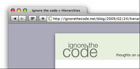
Safari 4
When I was talking about Safari 4, I called putting tabs into the menu bar a "terrible idea". I'm not so sure anymore. A proper implementation of Safari's idea would fix all three things mentioned above. But first, let's look at what's wrong and what's right with Safari 4's tabs as they are implemented now.
What's wrong with Safari 4's tabs?
They still don't work with Exposé. This is actually getting slightly ridiculous.
They make activating windows a painful action. It used to be that I could just thoughtlessly click on title bars to bring windows to the foreground. Not anymore; as Daniel Jalkut points out, the title bar has become a minefield.
What's right with Safari 4's tabs?
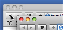
Title bars are no longer wasted space. They actually implement a useful feature.
Tabs are where they belong. They change the window's content, so they're at the top of the window.
If you think about what tabs are...
In Safari, tabs switch between different windows. Manton Reece called it first: Safari's tabs are essentially docked windows. Reece writes:
In the last 4 years the problem has only gotten worse. Developers are rolling their own tab solutions and there is no consistent behavior or keyboard shortcuts that I have seen. Worse, coding fully-featured tabs with the ability to drag windows in and out of a tab group is very difficult, and most apps don't go that far.
The Safari 4 tabs are conceptually the right way to go. It's not "tabs" at all. Instead, think of it as an efficient way to dock multiple windows together.
If tabs in Safari are essentially docked windows, and since you can undock an individual window by dragging its tab away from the other windows, then each tab is its window's title bar.1
The tab is the title bar!
Let's generalize!
First, If tabs in Safari 4 essentially represent docked windows, then this kind of feature should not belong to Safari; it should belong to the operating system. Safari is redefining how window title bars work. Window title bars are a property of the OS. Safari has no business messing with title bars. Changes to such a fundamental user interface element should be part of the operating system, not part of an individual application. Also, I'm looking in your general direction, Adobe.
Second, there's no reason why individual windows should have title bars which look different from the tabbed version. Let's go Be on the title bars.2
Third, kill clickthrough for actions. We've tried it. It's not doing any good. Clickthrough is only acceptable when it is clearly indicated by a visual change when the mouse hovers over the interface element accepting clickthrough, or when it's doing something absolutely non-destructive (i.e. selecting something, rather than executing an action). It's the rare exception, not the rule.
Fourth, fix Exposé. Since this window docking would work on the operating system level, it could be integrated into Exposé. Activating Exposé would temporarily break up the tabs and show each individual window.
Fifth, as Chris Clark demands, let me move windows using multitouch. I move windows a lot. Moving windows using the title bar is not very efficient. If three- or four-finger gestures moved windows, Fitts would be happy, and the decreased size of the window's title bar wouldn't matter as much.
What does it all mean?
Using dockable windows, we'd be able to get rid of application-specific tab implementations. Every application would get tabs for free. We'd solve Exposé's hidden windows problem. We'd get back the 20 pixels of vertical space which applications use to display tabs. We'd prevent other apps from poorly aping Safari, introducing their own kind of clutter into their own title bars.
I'm still not sure if I like Safari's tabs. I actually like the general idea, but the implementation is currently quite broken, mainly due to the fact that clickthrough turns the simple act of moving windows into a game of russian roulette. Safari 4's tabs have some very obvious advantages and some painful disadvantages.
But I do believe that implementing dockable windows on the operating system level would solve a ton of problems and offer tremendous advantages, from a better tab implementation to more consistency between applications. I do not know whether all of this would be a good idea. But it would certainly be an interesting idea.
-
A reader points out that some Linux/X11 window managers already implement this. Examples are ion3, fluxbox or pekwm. ↩︎
-
Actually, as Erik K Veland points out, Apple started out with this title bar style. ↩︎
If you require a short url to link to this article, please use http://ignco.de/70


