Context Menus and Sub-Menus
In recent years, web applications have become more and more powerful, growing features rivalling those of native applications. To allow access to all of these features, menus and context menus similar to those found in native applications have started to appear in web applications and on "normal" websites.
These two interface elements can be useful, but they do have issues. Let's take a look.
Context Menus
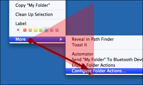
I like context menus because they dramatically cut down on mousing,1 and because using a context menu removes one target you have to hit with your mouse: the menu bar. Here's how you change a folder's Label using the menu bar in Mac OS X:
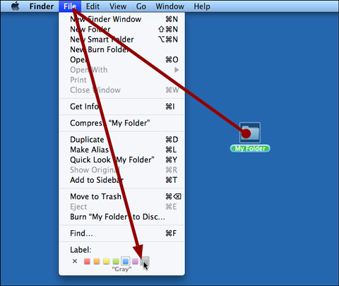
You need to first hit the folder, then hit the menu bar item, and finally hit the Label. Here's the same action using a context menu:
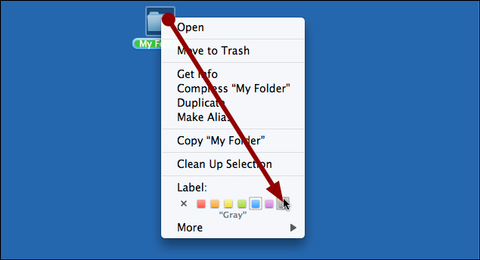
Not only do you need to move the mouse less far, you also have one target less you need to hit. So this is a clear win.
On the negative side, context menus hide features. If the context menu is the only way your users can access an action, a lot of people will never discover that this action exists at all. Context menus can only ever be a secondary way of accessing a feature; think of them as shortcuts, not as a primary way of exposing features.2
Submenus
Once applications grow too many features, menus alone are not enough to contain them all, so developers start to add sub-menus.
Sub-menus are bad.
They are bad because they require users to learn a deep hierarchy. Menu hierarchies are hard to learn because most people actually have different ideas of where specific menu items belong. Okay, "Quit" is in "File", but where exactly was that "Downloads" menu item again? "Window"? "View"? "File"? "Tools"? It actually depends on what browser you use. The issue becomes much larger when you can't just cycle through the menu bar, looking for the menu bar item you want, because each menu has sub-menus with additional sub-menus.
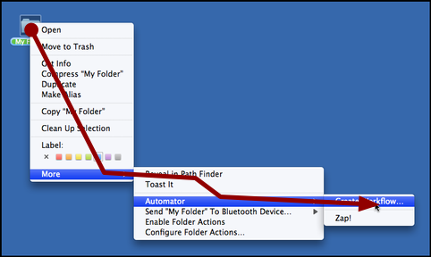
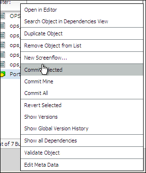
They are bad because they require precise mousing. Getting to this sub-menu is pretty hard for most people:
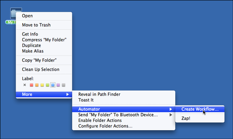
It requires quite precise mousing. Most people have trouble with this kind of mousing precision:
Mac OS X
There are ways to make selecting sub-menus easier. OS X tries to figure out whether you're moving your mouse towards a sub-menu or towards a different menu item and keeps the sub-menu open if it thinks that you intend to select a sub-menu. You can actually move your mouse over other menu items without selecting them, as long as you move your mouse towards the open sub-menu:
Windows
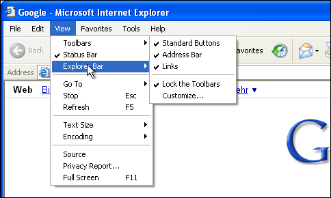
Windows has a similar, but hilariously worse scheme. It simply delays closing sub-menus, keeping them open for a while even if you move your mouse away from the parent menu item. This leads to weird situations like this one, where I moved the mouse straight down from "Toolbars" to "Explorer Bar", but the "Toolbars" sub-menu remained open:
The Web
On the web, all bets are off. Most sites simply don't care. On amazon.com, for example, you are absolutely not allowed to move your mouse in any but the most precise fashion.

If your mouse as much as touches the "Digital Downloads" menu item, the "Movies, Music & Games" sub-menu closes. So on amazon.com, you really are forced to move your mouse very precisely:

On a somewhat different note, using menus on content sites hides the site structure and makes it hard to figure out what exactly a site offers. It's usually best to avoid menus on sites which aim to provide access to content; people who are looking for a specific item or piece of information are unlikely to browse through your site's menus in order to find the menu item most likely to match their goal. If your content hierarchy requires sub-menus, it's probably a better idea to simplify the content hierarchy than to add more UI complexity to accomodate the complex hierarchy.
Back on OS X...
Admittedly, whenever using Mac OS X, I tend to avoid this whole menu dance and simply go to the "Search" menu:

That, however, is not an option on most systems.
New Ideas
When the context menu in one of our web application started to grow a bit too long, I started to think about this problem.
I could add sub-menus and emulate either the Mac or Windows behaviour for sub-menus, but then, I would never get it precisely right, and Mac users would find the Windows way strange, while Windows users might find the Mac way strange.
I also don't really like the linear way in which context menus present actions. Once the user activates the context menu, it's very likely that he wants to actually start an action. So we could potentially go into a mode3 where we temporarily take over the whole screen to show actions. So why show a tiny linear menu when we have all the space we need? In the worst case, the menu item the user actually wants to select is as far away from his mouse as it can possibly be given all the actions in the context menu. Furthermore, a linear list is poor for spatial learning. Why use only one dimension when we could use two?
Researching this on the web, I found a ton of non-linear context menus. I really like the idea of radial context menus, because they cut down on mousing. Each menu entry has the same distance from the cursor. Here's an example of a radial context menu, RadialContext for Firefox:
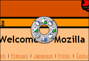
Something like this is quite useless in our case, though, since the radial layout makes it hard to have text entries, and if the number of entries increases, the wheel will start to become too large.
Instead, I went with a two-dimensional arrangement of menu items. There's hierarchy here, but instead of showing the hierarchy as sub-menus, it's shown as grouped menu items. The arrangement is spatial; each time the context menu is opened, the same action appears in the same two-dimensional place. There's less vertical mousing and more horizontal mousing.
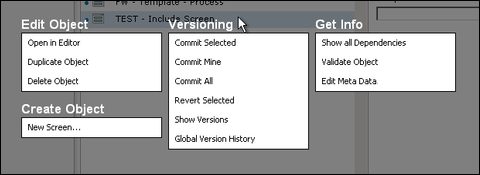
This is just a prototype. I haven't done any formal usability testing, and I don't know whether it'll make it into a release version of our product. I've been using it for a few weeks, though, and I really love using it. To me, this feels much better than a long linear list, or a context menu with sub-menus.
-
Using the mouse is hard. While it may not be an issue for you and your friends, most casual PC users have huge issues hitting small targets with a mouse. Remember when you first held a mouse? Perhaps you bought a Mac and it started that little treasure chest mouse tutorial? Or you had a Windows PC with the Mouse Tutorial? That wasn't easy! A lot of people never develop mousing skills anywhere near what you can do. Or maybe they're really good with a mouse, but have issues with trackpads or these small Lenovo mouse joysticks. Either way, we should not require users to execute precise mouse actions in order to use our applications. ↩︎
-
Modes are bad - if they are non-obvious. In this case, the "select action" mode would be very temporary and very obvious. ↩︎
If you require a short url to link to this article, please use http://ignco.de/75


