Inventing the Lisa User Interface
It's always interesting to see when and why the UI paradigms we take for granted were discovered. Knowing why our systems look the way they do, what motivated the decisions made by their designers, allows us to more easily see which parts should be changed for more contemporary requirements.
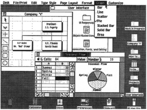
An important source of a lot of these concepts is the Lisa, developed in the early 80s by a small team at Apple.
As part of a whole series of excellent articles on the user interfaces of vintage and contemporare user interfaces, GUIdebook has a fascinating article on how the Lisa UI was designed.
A lot of the requirement are even more relevant today than they were back then:
The system will adhere to the concept of “gradual learningâ€... A user must be able to do some important tasks easily and with minimal instruction or preparation... The more sophisticated features will be unobtrusive until they are needed.
A lot of feature-rich modern applications fail miserably at this.
On the origin of the desktop metaphor:
The job of the user interface was to portray this multitasked environment in a manner that would make sense to the user.
(…)
We called he work performed within the windows “documents†– to use a concept already familiar to the user. We decided that the user should not have to worry about which application went with which document.1 Instead, users would select the document they wanted and the Lisa would determine which application was needed. Switching between different documents was as obvious as pointing at the window containing the desired work. The window appearance was spruced up to look more like a file folder as we sought to create an electronic equivalent of the user’s real desktop. The Lisa desktop would have objects already familiar from a real desktop such as documents, folders, calculator, and other handy tools; everything short of an electronic paperclip to mangle.
The desktop metaphor was chosen because computers were unfamiliar to people, and so it was important to provide a familiar concept. Today, as computers are more common, people are starting to rethink the concept of a "virtual desktop" as a useful metaphor for data on a computer. In fact, the article describes a number of alternative "file management systems" that were considered by the team, including a zoomable interface:
Bill [Atkinson] recalled a trip to the M.I.T. Media Lab in which he saw a futuristic data navigation system called the “Spatial Data Management Systemâ€. In this system, a person sat in a chair with two hand controls and faced a large screen, referred to as Dataland. The controls allowed you to “fly†over some data space projected on a large screen in front of you, in this case the Boston area, and then to zoom in to very fine levels of detail, or zoom out to see a huge geographical area.
Bill adapted this idea to the filing problem by creating an enormous virtual desktop, perhaps a mile square, and then providing methods for very quickly moving around and zooming in or out. Documents were represented as small icons that could be organized spatially, with related documents placed near each other. The idea was incredibly simple but placed quite a burden on the user’s memory when the number of documents became large. It also did not work well when multiple disks were online, representing several flat filing spaces.
We were drawn to the simplicity of M.I.T.’s Dataland but thought that we needed something more familiar to the office worker.
Again, familiarity was a guiding principle for a lot of decisions made by the Lisa team.
Another interesting aspect of the Lisa is how the team employed user testing:
Controversy surrounded a number of decisions that were made on the user interface, the introduction of the mouse being a good example.
(…)
Normally, the user interface wars would end in a stalemate of opinions. We found it best during these times to test our opinions on the users for which we were designing. We would use as test subjects new Apple employees who had no previous computer experience. The first tests were conducted during Summer 1980 by Larry Tesler, the applications software manager, and were observed by psychologists as well as ourselves. Many of the observations were recorded for later review and served as a form of détente between the warring factions.
In addition to simply testing new ideas. user testing was employed as a way of getting team members to agree on an idea. Instead of arguing endlessly, user interface questions were decided with user tests.
The whole article is well worth reading.
-
Something Snow Leopard, ironically, fails miserably at. ↩︎
If you require a short url to link to this article, please use http://ignco.de/171


