Flatland
I have nothing but the utmost respect for Bruce Tognazzini. His work on the Mac was groundbreaking, and Tog on Interface provides fascinating insights into the kinds of problems people had to solve at the dawn of the graphical user interface era.
However, I can't agree with his recent essays in which he talks about Apple's modern UI design. Essentially, he thinks that Apple's software has become too simple.
In February of this year, he wrote Apple's Flatland Aesthetic, Part 1: The Mac. He outlines the crux of the matter at the start of this essay, writing:
20 years ago, there was a simple application on the Mac for doing basic edits on photos. It was called Photoshop. Today, Photoshop is a powerhouse of sophistication, capable of working miracles in the hands of a professional. Adobe has been in lock-step with their users, increasing Photoshop’s sophistication even as their users increased in theirs.
Apple, on the other hand, nowadays comes out with an initial, visually-simple model, and then just sticks with it as their users quickly outgrow it, resulting in their software appearing, over time, to lose power, instead of gaining it.
The solution, according to Tog, is to have "scaleable" user interfaces that work for beginners as well as experts. One example of such an interface element, Tog writes, is the folder:
In some case, you can design a single object that scales from the simple case to the highly complex. The Folder is such an object. A folder with 20 documents is visually simple, but so is a folder with 20 folders, even though each of those 20 folders, in turn, may contain another 20 folders, each with 20 documents, for 8000 documents in all.
The opposite of this is what Tog calls "Flatland": The Dock, Safari and iPhoto all either default to flat lists of elements, or don't provide hierarchical structure at all. About iPhoto in particular, Tog writes:
I currently have 522 events holding more than 13,000 photographs total. It takes 19 clicks in the scroll bar to view all 20 screenfulls of them and an average of 38 clicks to find the one I’m looking for, since I usually miss it the first couple of times around. Apple provides no alternate view other than giant thumbnails, and, in keeping with Flatland, no way of dropping groups of events into folders.
His first proposed solution? "Allow nesting of events."
In the followup essay, Apple's Flatland Aesthetic, Part 2: iPhone, iPod Touch & Apple TV, Tog writes about Apple's non-Mac devices. Again, Tog bemoans the lack of complexity and hierarchies, proposing this solution:
Remove the Flatland limitations in the iPhone, Touch, and AppleTV by supporting a hierarchical structure for all media
In his most recent essay on the iPhone, titled Restoring Spring to iPhone/iPod Touch Springboard, Tog goes even further, asking for five specific changes to the iPhone's home screen:
- Allow users to name each screen
- Add vertical scroll to screens
- Allow users to position icons freely in each "slot" instead of filling each screen from the top left to the bottom right
- Add folders
- Add Aliases (i.e. allow the same app to appear in several places)
This is the first time I've ever said this, and I hope it's the last time, too: I believe Tog is wrong. Here are the three reasons:
Simplicity Is Good
At first, his criticism of Apple's applications seems to be true. Instead of adding features to its applications, Apple often prefers to keep them simple. In some cases, Apple actually regresses applications. Apple completely rewrote iMovie, replacing its user interface with a different, simpler interaction model more suitable for iMovie's most common use cases. Similarly, QuickTime Player lost many of its features in its Snow Leopard version.
However, the problem I have with with Tog's idea is the premise that people use the majority of their applications the way Photoshop users use Photoshop, growing up alongside their applications. In my experience, this is simply not true. Most people remain very basic users of most applications, and become "experts" at only a small number of them – if any. iMovie in particular is an application that many of its users probably use only a few times a year (namely after coming home from a holiday trip). People typically don't become experts at using iMovie. Each time they use the application, they have to relearn parts of it.
The kinds of people who use iMovie regularly and outgrow it advance to Final Cut Express or Final Cut Pro sooner or later. This is true for many of Apple's consumer-level applications. People who regularly work with photos don't use iPhoto, they use Aperture or Lightroom or Bridge. People who regularly create DVDs use DVD Studio Pro instead of iDVD. People who work on websites every day don't use iWeb, they use Coda or BBEdit.
Tog implies that it is possible to support pro users without making an application more complex for beginners. While this is true in some cases, the example he provides to support this point – Photoshop – doesn't really convince me. He writes:
Properly-designed interfaces scale, so that they support the new user as well as the expert. One of the beauties of Photoshop is that, even after all these years, with all its increased complexity, it still is able to be a simple application for doing basic edits on photos. (A new user can become productive in Photoshop in 10 minutes, even if it takes another 10 years to learn everything.)
I first used Photoshop when it was a lot simpler, around version 3. And I distinctly remember that I did not become productive in 10 minutes. Every new feature adds some amount of complexity to an application, however minuscule it is – this is the reason why pro users and casual users don't use the same applications.
Asking for more complexity in "casual" applications puts the needs of the few ahead of the needs of the many.
Conclusion
Not every application must be suitable for every type of user. Instead of trying to create an application that works for everybody, it's often better to create an application that is either specifically targeted at casual users (who use an application rarely and have to relearn it every time), or at professional users (who use an application regularly and become better at it as they and the application they use progress).
Hierarchies Are Often Problematic
As a software engineer, Tog is very familiar with hierarchies. Programmers work with hierarchies all the time. Scopes, namespaces or class hierarchies are just three examples for the kinds of complex hierarchies we have to understand and recall at a moment's notice. We relish ontologies and taxonomies and trees.
But most people don't, especially when they have to maintain these things themselves.
If you look at the computers of casual users, at best they use the predefined file structures and put documents into the Documents folder, movies into the Movies folder and pictures into the Pictures folder. At worst, they store everything on their desktop or in their home folder.
It is hard to find relevant studies on the usability of hierarchies; the ones that exist mostly concern themselves with file systems. For example, the paper Towards Semantic File System Interfaces (PDF) from Sebastian Faubel and Christian Kuschel puts it like this:
Conventional file system interfaces require users to interact with a hierarchical classification of their files (taxonomy). In this sense, the user of a hierarchical file system is confronted with most of the disciplines in knowledge management, which includes creating and maintaining a consequent vocabulary and naming conventions in order to be able to remember where to look for files in the hierarchy. This is opposed to the natural approach of memory, knowing what to look for.
Similarly, Mark Shuttleworth points out that one of the most pertinent usability issues encountered by the GNOME folks is that people are unable to locate files in their local file system. Here's the slightly out-of-context slide from the presentation on the topic (PDF) that Shuttleworth refers to:
In a paper called Improving the Usability of the Hierarchical File System (PDF), Gary Marsden writes:
Whilst most advanced computer users have occasionally had to struggle through the hierarchy on their hard disk, this inconvenience does not seem to warrant redesigning how files and folders are stored and retrieved. However, anyone who has studied how application users store files realises that the file system is quite a large barrier to all but the most advanced users. The interface designers for Windows 95 realised that most users did not understand the folder/file hierarchy and those that did had a hard time making it work for their filing needs [Sullivan 1996].
(…)
Furthermore, it is not at all clear that a strict hierarchical classification of files is always appropriate [Dourish 2000]. Symbolic links, aliases, shortcuts and other patches have been added to most operating systems in an effort to allow users to make the same files visible from multiple places in the file hierarchy. (Of course, these mechanisms work differently in different operating systems). This kludge clearly points to some more systemic problem.
In a Bachelor's Thesis, Robert Freund writes:
But in recent decades, technological innovations have created a modern information crisis. This is characterized by an ever-growing abundance of easily accessible information. Additionally, the user is able to create and store continuously increasing amounts of digital data. This data is usually managed on the user’s personal computer. Conventional file systems, however, which constitute the most important systems for document management tasks, impose a strict monohierarchy onto the user’s document collection. The user is constrained by the file system’s inability to represent multiple categorizations of documents without utilizing band-aid solutions such as shortcuts.
It seems that hierarchies work well for a minority of users, but present problems for most. The added complexity encourages behavior that eventually turns out to be frustrating and confusing for many people; the investment made into organizing files eventually turns out to be futile.
The goal of a "filing system" is to make it easy for people to store things, and then allow them to quickly find what they are looking for. Hierarchies don't seem to do either for a lot of people.
Interestingly, while iPhoto doesn't provide a way of creating hierarchies, it does actually provide a way of letting users find what they are looking for1. When I'm looking for a specific image, it's usually for four different reasons:
- I'm looking for a picture of a specific person
- I'm looking for a picture I took at a specific point of time
- I'm looking for a picture from a specific event
- I'm looking for a picture taken in a specific area
iPhoto provides ways of finding photos based on these criteria without forcing me to create and maintain hierarchies for them. In addition to that, iPhoto also has a simple tagging system, which allows for additional organization without having to maintain a hierarchy.
Before I leave this topic, I want to point out that hierarchies can be tremendously useful. Especially when hierarchies can be generated automatically and are very obvious to most humans (such as music organized based on an Artist > Album > Song hierarchy, or devices organized by manufacturers), they can help users quickly find what they're looking for. In those cases, hierarchies work more like a list of consecutively applied filters than a true hierarchical tree of unambiguously classified elements.
Conclusion
Instead of allowing users to create arbitrary hierarchies, it is better to predict what users will be looking for, and then automatically create the structures or features users require to reach their goals.
Spatiality Should Be Preserved
When I want to play Monkey Island on my iPhone, I know exactly where the icon is: Bottom left on the fourth screen. I need to look up when a train leaves? Bottom right on the first screen. Check mail? Top left, first screen. Check the weather? Top row, second screen.
I find iPhone applications based on their spatial placement. And this works really well. Whatever Apple does, it's important for them to keep this intact.
Having said that, let's look at each of Tog's proposals for the iPhone's home screen.
- Allow users to position icons freely in each "slot" instead of filling each screen from the top left to the bottom right
I agree with this. It actually supports the spatiality of the iPhone by allowing users to more easily group icons spatially.
- Allow users to name each screen
While I don't have a huge problem with this idea, I think it's not necessary. I already know that the fourth and fifth screens of my iPhone contain games, for example. What's more, most my iPhone screens have no obvious categories. The top part of my third screen contains apps related to space - Starmap, Google Earth and similar applications. The bottom part contains applications related to the Internet such as Inbugz, Dropbox, Fever or FTPOnTheGo. It would make little sense to label this screen, or most other screens on my iPhone.
This leaves the following three suggestions:
- Add vertical scroll to screens
- Add folders
- Add Aliases (i.e. allow the same app to appear in several places)
In my opinion, these features would destroy the elegant simplicity of the current home screen without adding anything that a majority of iPhone users would find useful.2 Vertical scrolling and folders would harm the simple and obvious spatial organization of applications that the iPhone currently provides. Aliases would only be necessary because folders without aliases force users to create a single hierarchy; without folders, Aliases are not necessary.
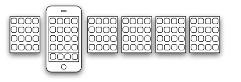
Tog's ideas would turn this simple concept:
Into this complex system:
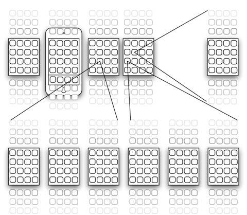
Even with few folders, complexity increases tremendously. Applications are hidden above or below the current screen, or inside folders. The simple, natural, spatial way of organizing applications is lost.
All of this is not to say that the iPhone's home screen can't be improved. But I agree with Chris Clark, who writes:
As for the rest of Tog’s ideas—vertical scroll, labels with a random-access dropdown, and containers?—I think Springboard Exposé (or any sort of proto-ZUI, like Flower Garden’s flowerpot array) would be a far more elegant solution.
I've mentioned Springboard Exposé before, but it's worth including the video again:
Instead of breaking the current simple system, this solution actually helps reinforce the user's mental model of the home screen as a spatial arrangement of individual screens and applications.
In order to increase the number of screens without adding complexity, Apple could arrange screens in two dimensions instead of one. This would also match Springboard Exposé beautifully, and it would decrease the "distance" between individual screens (in a four-by-five arrangement, the user could go from screen 1 to screen 20 in 7 swipes3):
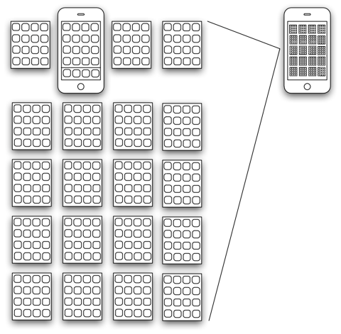
This kind of two-dimensional spatial user interface can grow easily. Adding only one more element in each of the two dimensions increases the number of screens from 20 to 30; adding yet another results in 42 screens; however, this increase by 22 additional screens only increases the "longest path" between the first and the last screen by four swipes, and of course, using Exposé, each screen can be reached by two taps regardless of the number of screens (one tap on the home button, one on the screen the user wants to see).
A Note on Search
Tog mostly4 ignores search in his essays. While it is true that search often replaces the need for organization, I believe that this is not a complete answer to his criticisms, for three reasons:
- Sometimes, search doesn't work as a replacement for browsing. Searching for photos that were taken at a specific place is not a replacement for a map showing where you took your pictures.
- Search requires data to be searchable. So either the data you're organizing is inherently searchable (e.g. text files), or you have to enter the metadata you're looking for ahead of time.
- Some people don't seem to like search. In a column on useit.com, Jakob Nielsen writes:
Our usability studies show that more than half of all users are search-dominant, about a fifth of the users are link-dominant, and the rest exhibit mixed behavior.
This study is about websites, but it is probable that people who use native applications like iPhoto exhibit similar preferences. Forcing people who don't default to using search to abandon browsing and use search instead may not result in an enjoyable experience for them.
Still, modern computer systems are becoming better and better at search, especially when the Internet is involved and our own data can be enhanced by data from other people. The reason a lot of people don't organize their bookmarks anymore is that it's just easier to Google for things; finding links again is quicker than keeping them organized locally. Similarly, systems like delicious help with tagging links, so we don't have to do the hard work of coming up with all possible words we might want to search for in the future. Facebook integration in iPhoto makes sure that more faces get tagged, which helps us search for photos without having to manually organize the pictures.
Traditional hierarchical organization is becoming less relevant as search improves.
Having Said All Of This…
As always, it's absolutely possible that I'm wrong, and that Tog is right. In order to find out, usability tests would have to be done on these systems.
-
Note that this is the actual goal the user is trying to achieve. Users don't want to organize data; they organize data because their eventual goal is to find things. If your application can satisfy this goal, it doesn't matter how you do it - this is the difference between what users ask for ("I want to be able to organize data") and what they actually want to achieve (they want to be able to find things). ↩︎
-
Yes, I know that some of you guys would probably love these features. But you're reading this blog, so you're clearly not representative of the average Apple customer :-) ↩︎
-
Even better, Josh Blacker points out that using diagonal swipes, it would be possible to go from the first to the last screen in a mere four swipes. ↩︎
-
As Dan Evans points out, he mentions and discounts search in the iPhone article, correctly saying: "[Apple] enabled users to have invisible apps they can call up using Search as long as they can remember the app’s exact Name. For example, if you have the American Automobile Association app, you have to type in "AAA". Oh, wait! It's not called "AAA", it's called "Roadside"! What are the chances you're going to remember that two years from now when your car breaks down?
"Note to programmers: The only people with a good enough abstract memory to use this hack are other programmers."
I absolutely agree with Tog on this one. People are likely to put apps they use often on the first two or three screens; if they use search, it will be for apps they use rarely. In other words, they are most likely to use search for apps whose names they are least likely to remember. ↩︎
If you require a short url to link to this article, please use http://ignco.de/197


