Google Wave's Scrollbars
In spite of some of the reaction to it, I find Google Wave to be surprisingly useful. One thing I don't really understand, though, is its scrollbars. They behave quite differently from regular scrollbars, and I can't discern any overwhelming advantages of Google's implementation. It seems I'm not alone. The unofficial Google Wave manual deems it necessary to explain how the scrollbars work. Google's own support site for Wave has an entry titled What's the deal with the scrollbar?, Google has a video explaining the scrollbars, and there's even a Chrome extension and a Greasomonkey script which replace Google's scrollbars with native scrollbars.
As a general rule, there's nothing wrong with replacing native widgets with different-looking versions; visual consistency is overrated. As long as people can clearly and immediately recognize your widgets, usability won't suffer. However, if you're going to change how people interact with your widgets, you should have a really good reason. People have been using scrollbars for decades. They work the same on every popular platform. Unless there's a compelling reason, it's a bad idea to change how scrollbars work in your particular application.
Let's look at what Google has changed.
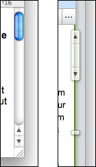
The picture on the left shows Mac OS X's native scrollbars. On the right, Google's scrollbars. The two scrollbars provide the exact same functions, but use different means of achieving them.
Indicating Document Size
Google indicates document size using the little horizontal "stopper" at the bottom of the screenshot. The further down the stopper, the longer the document. On most systems, document size is indicated by the size of the thumb (the little draggable element inside the scrollbar). Since the thumb represents the visible part of the document, a smaller thumb indicates a larger document. This system makes the length of the document intuitively obvious; if the thumb's size is a third of the scrollbar, the document is three times as long as its currently visible part.
Waves change in size while you use them. Google's system has the advantage that it won't move the thumb too much when that happens. Typically, waves grow at the bottom, which simply moves the stopper.
Scrolling by clicking
Most systems make it possible to scroll by clicking the scrollbar's arrows. Here's how this looks using Mac OS X:
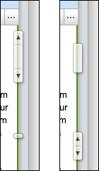
Using Google's scrollbars, it's also possible to scroll by clicking, but since the arrows are attached to the thumb, that creates a bit of a problem. Typically, the thumb indicates the scroll position. But since you can't move the thumb while the user is clicking on it, Google has introduced a second element, a "shadow" that is displayed below the thumb. This shadow indicates the current scroll position:
If the user moves the mouse away, the thumb will eventually move to the shadow.1
Additionally, clicking the arrow in Google Wave scrolls exactly one screen. Using most other systems, this is achieved by clicking the "empty" part of a scrollbar. Google Wave does not have a clickable scrollbar.
Scrolling by Dragging
Again, here's how Mac OS X does this:
It works similarly using Google Wave, but there's a noticeable lag. Again, the shadow is used to indicate the actual scroll position, because scroll position lags behind thumb position:
Google's implementation performs noticeably worse than the native implementation.
Advantages
The unofficial Google Wave manual claims that Google's scrollbar works better on devices with a limited mousing area:
Google's intention is to benefit people accessing Wave on mobile devices or netbooks with a limited mousing area.
I'm guessing the idea is that thanks to the stopper, you typically don't have to move the mouse very far to scroll through the whole document. However, at least on some mobile devices with small touchscreens (such as Android2 devices or the iPhone), Wave uses a completely different UI that sports native scrollbars.
Google's implementation also uses less space than a normal scroll bar, since it sits on the edge of each scrollable area. And it's extensible. If Google wanted to use the scrollbar to, say, indicate changes to a wave, they could easily add that feature.
Even so, the disadvantages of Google's scrollbar are obvious. The main cause of problem seems to be the arrows. They are attached to the thumb and require Google to split "scroll indicator" and thumb into two different interface elements. Google could retain the advantages of its implementation while also creating a solution that works naturally for people who are used to native scrollbars by simply removing the arrows from the thumb and replacing the stopper with them, and removing the separate scroll indicator shadow altogether.
One problem this design has is that when the content size changes, the arrows will move, which may potentially cause the user to miss them if they move in the exact wrong moment. Another solution fixing this problem would be to keep the stopper and put the two arrows at the top of the scrollbar.
However, without knowing exactly what problem the people at Google were trying to solve with their scrollbar, it's impossible to say whether this change would work for them.
Update
This text has two follow-ups which look at scrollbars in OPEN LOOK and Picasa.
-
I did not notice this until a commenter on Hacker News pointed it out. He also notes that the scrollbars seem to perform poorly with longer waves. ↩︎
If you require a short url to link to this article, please use http://ignco.de/217


