Picasa's Scrollbars
After writing about Wave's scrollbars, a number of people told me that Picasa, another Google project, also uses quite peculiar scrollbars. Indeed it does. Here's a picture:
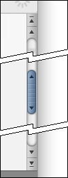
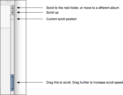
It looks pretty much like a regular scrollbar. But it isn't. As with the Wave scrollbar, Google has split the thumb and the scroll position indicator into two different elements. A faint shadow acts as the scroll position indicator. The thumb, meanwhile, always sticks to the center of the scrollbar. Pulling it scrolls the view; the further up or down you pull, the faster the view scrolls.
It's also possible to scroll using two of the arrows. The other two arrows are used to scroll to the next folder, or to switch between albums. Unlike in Wave, the arrows on the thumb itself don't do anything.
Scrolling using Picasa's thumb is best explained with a short movie:
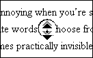
This is very similar to the "autoscroll mode" that is used in some Windows applications:1
This type of scrollbar works quite well if you're just browsing pictures, and it avoids changes to the scrollbar if the document's size changes (for example, when using websites with "infinite" pages).
However, once your collection of images in Picasa grows too much, it becomes impossible to quickly scroll to a specific point. If you know that the picture you're looking for is about two thirds of the way down, you can easily drag the thumb to that position in iPhoto. In Picasa, however, you're forced to scroll there at the maximum scroll speed granted to you by Google.
Interestingly, Picasa also uses a traditional scrollbar in some places:
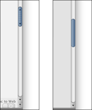
In fact, switching between folders and albums also switches between the two scrollbar types. As a result of this, in some situations, clicking on one of the arrows on the non-regular scrollbar will replace it with a regular scrollbar.
While Picasa's scrollbar has some advantages for browsing pictures, I suspect its unfamiliar mode of operation combined with the fact that Google uses two different, but similar looking types of scrollbars in the same application may be a considerable source of user confusion.
-
On Twitter, Ben Sargent points out that Aperture has a similar "autoscroll mode" widget attached above a regular scrollbar, which might be a good solution, satisfying user expectations while still providing the advantages of an "autoscroll mode". zx writes that Evernote on Windows also uses a similar custom scrollbar. ↩︎
If you require a short url to link to this article, please use http://ignco.de/219


