Opinions vs. Data
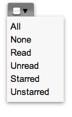
Gmail's recent update brought us a strange new UI element:1

Clicking on the checkbox selects all emails. The arrow, on the other hand, allows you to make more specific selections:
This is a pretty unusual UI element. Gmail may be the only application using anything like it. This has caused a lot of people to question its usability. Gmail lead UI designer Michael Leggett eventually chimed in, writing:
[The new widget] is odd. And yet, both the checkbox and the menu part tested very well in the lab. The people who hated the widget outside the lab also understood how to use it but promised others wouldn't because it was so "weird." There were some optimizations I wanted that didn't make it in (highlight the current selection state in the menu, show keyboard shortcuts, etc). But it tested fine without those things.
What Leggett described is exactly how I felt about the widget when I first saw it. I immediately figured out how to use it, but my gut reaction was "most people are not going to get how this works." It seems I was wrong. This is one of the reasons why I don't put too much trust into opinion-based usability reviews: There's a lot of guesswork involved, and guessing how humans behave is an endeavor fraught with peril.2 Expert reviews can be helpful, but they are no substitute for actual testing.
Jakob Nielsen has written about this:
In my two examples, the probability of making the right design decision was vastly improved when given the tiniest amount of empirical data.
If there's one thing we should all take to heart, it's that humans are strange: They rarely behave the way we expect (or want) them to. Testing often reveals issues we would never have found out by merely thinking about a design. Conversely, something that looks wrong might actually work perfectly well.
-
It's to the left of the "Archive" button in Gmail's new UI, if you want to see it in context. ↩︎
-
This is not to say that you should keep a UI element if people are able to use it, but consistently dislike it. The point is merely that you should not discard anything based on an untested assumption that people won't be able to use it, and that you should not avoid testing something if it seems obvious that people will be able to use it. If a sizable portion of your users consistently dislikes a UI element, by all means get rid of it even if it is perfectly usable. ↩︎
If you require a short url to link to this article, please use http://ignco.de/323


