Chris Clark
As part of an ongoing series of interviews with designers, I’ve talked to Chris Clark about his design process. Chris is the designer and chief nitpicker at iOS app-house Black Pixel. His degree in Computer Science and Linguistics from the University of Western Australia helps him communicate with developer folk, but the UX and UI part of his job is largely self-taught. Chris blogs intermittently on design at Release Candidate One, and runs his mouth on Twitter under the schoolyard nickname Clarko.
Lukas: Tell me about your design process. Where do you start, and what kinds of techniques do you use at which stage of the process?
Chris: The process is really just Iterate, Iterate, Iterate: from sketches to mockups to code. After a few meetings with a client we’ll have a lot of ideas and a lot of avenues to explore for an iPhone or iPad app. My job is to narrow the field to the right ideas: the intersection of utility, usability, technical feasibility, and cost. So I start with fast, crude drawings, trying different flows, breakdowns of screens, breakdowns of tasks, just to see what fits. Before the iPad came out I’d use a ton of paper for this, but I can do a little sketching on the touchscreen now, too.
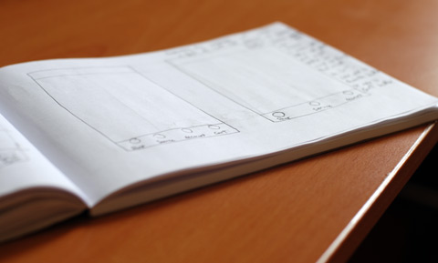
The level of detail in sketches like these is very low, so demoing them to coworkers involves a lot of hand waving and sound effects from my mouth. But every discussion reveals new information, new problems, and new constraints. The great thing about crude drawings is that nobody gives a second thought to throwing them away and starting over. When they’re so fast, they’re cheap. The whole app is malleable.
Anything I cut from a sketch generally requires a note describing why. I’ve found that every fiftieth thing I dismiss comes back to haunt me later in the project, so when somebody wants to know why I didn’t go with a particular option it helps to have it documented. After some more back-and-forth with the team and the client, when I start reaching for a ruler to make a sketch more precise, I know that the app’s frame is hardening up. That’s when I’ll switch to OmniGraffle or Photoshop… anywhere I can draw some rectangles with precision. Space is at such a premium on touchscreen devices that any poorly sized element in a sketch will reveal itself when pixels get involved.
Often people use something like Keynote or Quartz Composer to mock up interactions and animations for desktop software, and that’s still common for iPhone software, but it’s really crucial to try this stuff out on the device with your fingers. At the last C4 conference Rob Rhyne introduced Briefs as a tool for interactive mockups. I started using it for work as soon as I could, and in the process got to know Rob and even added a few lines of code to the open source project. It’s a fantastic tool, even if it is terminally stuck in App Review. It’s an alternative to paper and HTML prototypes, a bit of a tangible deliverable for a client, and something you can use in ad-hoc usability testing.
So with the flow and the layout of the app generally nailed down, I head back to Photoshop for pixel perfect mockups. With those assets the Brief gets higher and higher fidelity with every revision, to the point where it’s indistinguishable from the final product. LiveView is indispensable here; a pre-Briefs sanity check for color and font size, since the export-compile-install cycle of Briefs is still a bit long just to check the contrast of a background image. And eventually we can say the design is complete. Or as complete as it can be before we get to use it for real.

At Black Pixel I have the pleasure of working very closely with the team who is implementing my design, so anything I haven’t documented precisely enough, or any error state I haven’t dreamed up, weird edge cases, technical limitations… they come up during development and I can amend them on the fly. I imagine there are designers who don’t get so much face time with their developers in a real waterfall-model organization, who have to write ninety page specs for everything, or have to cede those inflight emergency design decisions to the dev team. I’m happily free from that, and I’m using the nightly builds and filing UI bugs from the first line of code.
You hinted at using the iPad for sketching. Any iPad apps that work well for this?
Every sketching and painting app handles the basics—I can definitely doodle with any of them—but there’s nothing out there really well suited to my needs yet. Most of them are made for artists and have infinitely configurable brushes and color palettes. Great for that guy painting covers for the New Yorker, but too much fiddling for me. Plus everything is modal as all hell, and nothing is multitouch except for zoom. It drives me nuts.
Cocoa Box’s Penultimate and 37signals’ Draft both stand out for everything they don’t do. They’re doodlers and nothing more, and I appreciate them for that, but I’m still looking for that sweet spot between an art supply store and a napkin.
Do you sketch with your fingers on the iPad, or do you use a pen?
Just with my fingers. And a sausage, this one time. I tried a stylus with my first generation iPhone and it wasn’t very encouraging, but that was like twenty years ago. I’m sure there have been amazing technological advances in the industry.
You’ve mentioned demoing sketches to coworkers and clients, and creating prototypes in Briefs. Do you do any user testing with these, like showing sketches to people to see whether they understand what they see, or letting them interact with prototypes?
I haven’t really formalized a process, testing-wise. It’s one of very casually foisting Briefs upon clients and roommates and coworkers, and later seeding alpha and beta builds to people. In the case of Bistromath, our restaurant check splitting app, we built a few functional prototypes with sparse UI before really knuckling down on the final product. Field testing those rough builds revealed a lot of things that just never came up on paper or with Briefs in a contrived setting.
For instance, my earliest plan was to have the app auto-populate a table with fictional names, rather than having to write every dinner guest’s name yourself. You could edit these auto-names of course, but most never did. They’re sitting around a table saying "OK James, you’re Mr. Pink, and Laura, you’re Mr. Blonde" and forcing everyone to remember their code names, double-checking at every step because they’ve forgotten the mapping. For a feature designed to save time, it was really hard to watch.
Now we force you to name the guests yourself, so people enter their real names or choose from the address book, and there’s no confusion. It’s one of those weird things where you can point to a GOMS model or a tap count and see that this design is inferior, but in the real world it’s less confusing and is eventually faster. Which I think is a bit of a theme running through iOS as a whole.
Yeah, especially on the iPhone’s small screen, tap count is a really poor measure of usability. Trying to reduce the user’s interactions entices you to put way too much stuff on individual screens. How do you run these ad-hoc tests?
I’ll start by describing the premise of the app, I ask the subject if they can perform a few tasks for me, and I just watch and keep my mouth shut if they flounder. I’ll record it or take notes if I can, depending on the setting. I doubt anyone could wring a doctoral thesis out of the data I collect, but that’s not really the goal. I walk away with insights into how real people are stumbling over my design, and that’s gold.
One thing I’ve tried to be really anal about, a problem I saw as a research subject in my university’s Psychology department long before ever doing any research myself, is language. Language is a trap: you have to avoid instructions or requests that will lead someone to the desired outcome. You see tests where a researcher says "OK, now how would you export this video to share it online?" so they search through the menus for the key words "export" and "share", and if they find either one of them they’re home free. Never mind that the majority of people in the real world might be looking for the words "upload" and "YouTube." Using the language of the app to pose questions about the app—getting the subject to think the same way you think—is the antithesis of what you’re there for.
Right, you want to see what they would do when on their own, so it’s important to avoid giving any hints. Once the app is done and shipped and you start getting feedback, how do you deal with this? How do you deal with negative feedback, and how do you use user feedback when planning new versions of the product?
I’m kind of weird, I love negative feedback. Unsolicited complaint means somebody cared enough to write it down, and then when you fix their pet peeve they transform into a fan. Plus you got to fix a real problem for a real person, which is pretty rewarding. The oft-bemoaned fact that iOS developers can’t reply directly to App Store commenters is all the more reason to fix the root of the problem.
Customer comments do ease the planning of future software releases a little. They’re the squeaky wheels. It’d be foolish to ignore your own ideas and priorities in favor of being 100% feedback-driven… you’d find yourself in the Henry Ford "my customers wanted a faster horse" situation pretty quickly, but it’s helpful nonetheless. Popular feature requests jump up the queue, others languish.
Some negative feedback just isn’t helpful, but that’s life. The world has its share of caustic assholes with nothing better to do than give 1-star reviews on iTunes, but if mean words really bother you, you have no business making things and selling them to the public. Don’t be a musician, either. Or a writer. Or a chef.
So we shouldn’t get upset by negative feedback, especially if it doesn’t contain some kind of useful criticism.
Totally. I’m told I’m an unnaturally laid-back person, so maybe saying "don’t be upset by rude people" isn’t advice everyone can follow. Maybe "don’t take them seriously" would be better. People treat feedback forms like they’re a black hole; they don’t really expect a human to read or respond to their problems, so they just vent. Learn to ignore those negative sentiments if nothing else.
The black hole mentality isn’t surprising, though. Companies of all sizes—even sole proprietors—spend a lot of time saying "we" and hiding behind the face of the company, dehumanizing themselves. I’ve been guilty of it too, but earlier this year I tried an experiment at Black Pixel and made our support page say very explicitly that support mail goes to my personal inbox. It puts my name and my face right on the page. I can definitely say the tone of the incoming mail has changed for the better.
I’m guessing there are a number of things you’ve tried in your development process that ended up not yielding good results. Any examples of the kinds of things we should not do?
That’s a dangerously open-ended question, but here goes…
I’d say to avoid having the same person coding the project design the project, because they’ll compromise the design to make it easier to develop… unless they’re a saint. I was certainly never a saint when I had to wear both hats. If you can’t avoid that, avoid thinking about the implementation while you design. Imagine somebody else is doing all the hard work and it’s your job to make the user experience as wonderful as possible.
Avoid copying other people’s designs until you understand why they are the way they are, and definitely avoid trashing other people’s designs until you understand the same. I was very critical of iWork for iPad’s document manager until I had to design one of my own, and discovered for myself all the perfectly good reasons Apple’s design is the way it is. I still ended up with something different to theirs, but the decision came from my audience’s requirements, not from ignorance and distaste for Apple’s approach. I just made an entirely different set of compromises.
Avoid beta operating systems on mission-critical systems. Your phone is absolutely a mission-critical system.
Avoid reimplementing standard controls from scratch, since you’ll miss some subtle behavior that a lot of people depend on. Accessibility for the visually impaired is usually the first to go, but you don’t have to look too far to find custom scroll bars that don’t support support scroll wheels or multi-touch trackpads, custom text fields where spell check doesn’t work, custom ON/OFF switches that don’t let you tap to toggle, custom keyboards that break copy/paste in subtle ways… that last one is one of our bugs.
Avoid raster graphics if you can, or use shape layers and layer styles in Photoshop so you can enlarge your graphics in a jiffy. Not just for iPhone 4’s double-resolution assets, but for the day somebody wants to put your app on a forty foot billboard and you need to give them a faux screenshot that doesn’t look like ass in print.
And finally: never get involved in a land war in Asia, and never go in against a Sicilian when death is on the line.
It's one of the classic blunders. Thanks for talking to me, Chris!
To find out more about Chris Clark, go to Release Candidate One, or follow him on Twitter.
If you require a short url to link to this article, please use http://ignco.de/320


