A Machine for Reading Books
If you were to design a piece of hardware that was only used for one single task, to read books, how would you design it?
If you look at the iPad, it's clearly a device that is not meant for one specific task. It's just a frame; the application you run on it defines what the device does. That's why the iPad barely has any hardware buttons. What buttons would you add that would be useful to most iPad apps? Even the volume buttons are of questionable use; most apps don't need them, or provide their own on-screen volume control.
But a device you use for one very specific thing, and one thing alone, is an entirely different proposition. Since you know exactly what people will do with it, you can design the hardware specifically for that task.
So why, then, do the new Kindle Touch devices look like small, grey iPads?
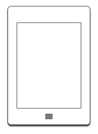
Again: if you were to design a piece of hardware that was only used for one single task, a machine specifically made for reading books, how would you design it?
What's the one single thing Kindle owners do the most? I'm guessing it's turning to the next page. While reading a book, every Kindle Touch owner will do this at least once a minute, probably hundreds of times in a single session.
With a button, it's simple. You don't have to move your finger. You don't cover the screen with any part of your hand. You push down a bit, and you get tactile feedback, a little "click" that tells you that you've successfully initiated a page turn.1
Now, compare this to turning pages using a touchscreen. First of all, the Kindles don't have resistive screens. This is usually an advantage, but in this particular case, it means that you can't rest your finger on the screen. You have to physically lift it before you can turn the page.
Turning pages using a touchscreen also means that you have to cover part of your screen with your thumb.
And it means that your screen will get really dirty, really quickly. This doesn't matter too much with something like an iPad. When an iPad is turned on, the screen is bright enough that you usually don't notice the dirt that has accumulated since the last time you wiped it down. The Kindle's reflective screen is different. I immediately notice when I accidentally touch my Kindle's screen.
To be clear, none of these issues are particularly egregious. But all of them are entirely needless.
So how would you design a piece of hardware that is only used for reading? One where people do a very specific thing — turn a book's page — hundreds of times a day? Would you remove the physical button for turning the page?
Touch Is Good, but Doesn't Preclude Buttons
I'm not against having a touchscreen on an ebook reader. Tapping on a book to open it makes perfect sense, even if it does mean that the screen gets dirty. But having a touchscreen doesn't preclude you from also adding a hardware button that makes the one single thing people do the most often with your device as easy and seamless as possible.
I'll probably wait until the next revision to replace my Kindle. I'm sure Amazon will see the light, and add a smaller keyboard-less 3G touchscreen Kindle with physical buttons to the lineup.
Further Reading
I’m not sold on the touch interface for this kind of device: I like the Kindle buttons, and getting fingerprints all over the screen doesn’t seem like a great prospect.
I actually prefer the hardware page-changing buttons to touch. They feel natural and don’t lead to fingerprints on the screen.
John Gruber disagrees, mostly because the page-turning buttons on the Kindle 3 are a bit crappy:2
The new Kindle Touch seems exactly right. No more needless keyboard. No more junky buttons for page-turning. A touchscreen. Everything good about last year’s Kindle remains, everything bad about last year’s Kindle is gone.
But if you don’t do a lot of text entry on your Kindle, I’m not sure just how crucial that touch interface is to the enjoyment of books. Clicking the next button works pretty well. I don’t have to move my finger to tap on the screen (and get my finger grease on that screen).
I admit that in the long run using a square of directional buttons to navigate around will feel about as modern as stone knives and bear skins. Yet I find myself wondering if I might actually prefer the fourth-generation Kindle to the touchscreen model—it’s a bit smaller and lighter than the Kindle Touch.
Jin Kim and Riccardo Mori have also written about this.
-
Tactile feedback is especially important on slower e-ink screens, where you don't immediately see whether your action was successfully recognized by the device. ↩︎
-
I agree that the buttons on the Kindle 3 aren't great. I preferred the page-turning buttons on the Kindle 2, which could only be pushed down at the inner side, the one next to the screen. So you could hold the Kindle on its edge without accidentally pushing the buttons. When I say "page-turning buttons are a good idea", I'm talking about good page-turning buttons. ↩︎
If you require a short url to link to this article, please use https://ignco.de/418