Back Button Placement
Reader James Chen asks:1
I've been trying to decide whether an iOS "Done" button would be more suitably placed at the top-left or top-right corner of the screen when it's the only button in the navigation bar and used to close the current view.
Most apps tend to place the "Done" button on the right in this situation. Popular apps such as YouTube and Facebook, however, have also trained users to tap a "Done" button on the left to dismiss videos or photos (although in both of these cases, they are accompanied by another button on the right-hand side).
I think a good argument can be made for placing the "Done" button on the left when it's being used to dismiss a view, since in these cases it's effectively acting as a "Back", "Close", or "Cancel" button.
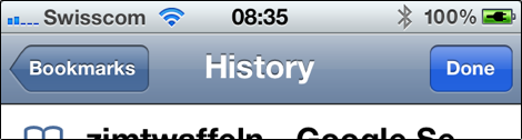
At first, I was inclined to agree with you, but then I spent some time looking at different Apple apps, and something occurred to me: apps often show both a "Back"2 and a "Done" button at the same time. For example, in Safari, when you open your bookmarks, you can go into folders and back out. But you can also hit "Done" to close the bookmark view entirely.
You can also see this in the Messages app, when you pick a photo from your camera roll: the "Back" button on the left is used to navigate, and the button on the right (in this case "Cancel") is used to close the modal view. Similarly, in an email app, you could use a modal view to edit your accounts; you would use "Back" to navigate between accounts, and "Done" to dismiss the "edit accounts" view.
This is reinforced using animations: if something slid in from the right (the user moved further into the currently visible information hierarchy), use "Back" (the button on the left) to move to the left. If something slid in from the bottom (a modal view), use "Done" (the button on the right) to have the currently visible sheet slide back down again. To the user, there's a spatial system that conveys how screens are arranged, and which button should be used, depending on where she wants to go.
This is further complicated by applications that show a modal view that has both a "Cancel" and an action button (such as "OK" or "Send"). Apple's HIG shows an example of a modal email composer with "Cancel" on the left and "Send" on the right.
-
Published with permission. ↩︎
-
By the way, Apple recommends against using the word "Back" as the actual label on the button. ↩︎
If you require a short url to link to this article, please use http://ignco.de/447


