More on Pagination
Paging is clearly an artifact of the technology of paper books.
I don't think that is clear at all.
Take the iPad. iPads have screens that have a specific size. In terms of points, every iPad ever made has the exact same screen size. Designers design content for that specific screen size. If they can avoid it, why should they design chunks of content that are longer or wider than that specific screen size?
Look at iOS's home screen. There are pages of apps. You jump between pages, you don't scroll. Is the home screen's pagination an artifact of paper book technology, or is it simply a better idea than having a home screen that can be scrolled? I'd argue that it's a better idea.
This example also shows that a simple interaction model isn't pagination's only advantage. How do you find apps on your home screen? For many of the apps you use often, you probably find them by their position. Pagination allows you to organize things spatially.
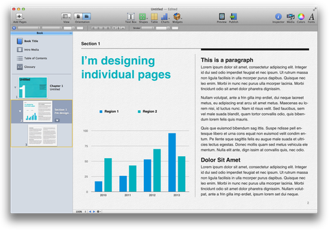
This (typically) doesn't apply to automatic pagination, where page breaks are chosen in a way that can't be predicted by the author, but it does apply in many other situations. If you use iBooks author, you design individual pages that perfectly fit the iPad's screen. This means that you can ensure that paragraphs that belong together are on the same page. You can make sure that illustrations and pictures are next to the text they belong to. And your users can identify things by their position: "look at the image at the bottom left of page 35!"
Pagination isn't just an artifact of paper books. It actually has real advantages over scrolling.
Dr. Drang continues:
I read shitloads of stuff on scrolling web pages—as I’m sure Michael does—and I don’t get exhausted doing it.
Similar sentiments were expressed in a lot of the feedback I've received. I'm sure scrolling doesn't feel like a particularly problematic or burdensome interaction to most readers of this website. But we are not good approximations of the average user. I've seen too many iPhone users, holding the phone in their left hand, painstakingly scrolling with their right index finger. For most people, scrolling on a touch device isn't as easy and automatic as it is for us (and on a PC, it's even worse).
This may change. Today, many children are growing up with iPads. Maybe in 20 years, everybody will have such well-developed fine motor skills that they can easily and precisely interact with any touchscreen, without consciously thinking about it at all. On the other hand, mice have been around since the 60s, but if you've been to a few usability tests with a wide variety of participants, you've seen people struggle with lining up the mouse cursor to a link on a web page, or to a window's close button.
It's certainly easier to become proficient with a touchscreen than with a mouse, but as of right now, a lot of people still are not.
If you require a short url to link to this article, please use http://ignco.de/491


