iTunes 11
iTunes desperately needs a complete rethinking. iTunes 11 isn't that. It seems as if Apple tried to hide iTunes' complexity under a shallow veneer of simplicity. Unfortunately, a new coat of paint won't fix the leaning tower of Pisa.
Sure, iTunes 11 looks as if it was way more friendly than previous versions of iTunes. But while those previous versions were at least honest about their complexity, iTunes 11 isn't. iTunes' user interface used to promise a complex application, and then deliver one. iTunes 11 promises a simple app, but delivers the opposite.
One of the main problems introduced in iTunes 11 is the new bar atop the iTunes window. This tiny thing combines a vast number of features that were previously served by many different UI elements in iTunes. Sure, the bar seems simple and friendly. How much damage could this tiny thing possibly do? Well, you can't cram so much stuff into such a small UI element without causing problems.
Here's an example. I'm in the App Store and want to go back to my music.

Do I click on the "Music" tab? Nope, this goes to the iTunes Music Store. On the right-hand side of this bar, I click on "Library". This opens a menu where I can select "Music":
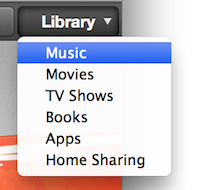
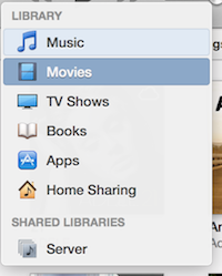
Now I'm in Music, but I want to switch to my movies. No problem, just click on the same "Library" menu again, and select "Movies", right? Nope, the menu is gone:

To get from "Music" to "Movies", you have to click on "Music" (yep) on the exact opposite end of the screen from where "Library" used to be.
To reiterate: if I'm in the store section, I don't click on "Music" to go to my music, I click on "Library". But if I'm in my music section, I click on "Music" (which is on the opposite side of the screen from the previously-clicked "Library" button) to go to my movies.
Let's go back to music. By default, iTunes 11 shows your albums. But I'd like to see a simple list of songs again. This is usually under "View":
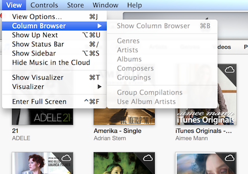
Nope, not there. Instead, you have to go back to the tabs, and select "Songs".

Now let's jump to the books section. Again, iTunes 11 shows my audiobooks as a list of covers. Again, I want to jump to a pure list view. Can I do the same thing here, click on one of the tabs?

Nope. The exact same UI element that was just used to jump between different views of the same data is now used to jump between entirely different sections. Actually, now that I go back to my music, I notice that the tabs there also have entries that open entirely different sections of iTunes.
The best part: jumping between different areas of iTunes, and selecting the view of these areas, used to be simple in iTunes 10. Sure, the UI looked more complex, but it actually reflected how iTunes works.
In order to get all of iTunes' features to fit into this tiny bar, Apple had to completely overload all of the UI elements inside that bar. Its very difficult to form a correct mental model of an application that exposes the same kind of feature in very different ways (there are at least four different ways of jumping between different sections in iTunes), and uses the same kind of UI element for very different features (the exact same tabs, sitting side-by-side, are used to change how the current screen is shown, and to jump to an entirely different screen).
Compare this to how iTunes 10 used to work. To jump to a different screen in iTunes, select it from the sidebar. To change how the screen is shown, select one of the options in the toolbar. The basic organization of iTunes 10 can be explained in two sentences.
You can't make a complex application simple by adding a veneer of simplicity on top of it. in fact, that will just add to the confusion, because now you're sending the user misleading signals about what's really going on. Apple promised a "dramatically simplified new interface". They were right; the interface does look more simple. Unfortunately, this just makes the rest of iTunes all the much worse.
Note: I know that you can bring back the sidebar. The people who are confused by this kind of convoluted UI design, on the other hand, do not.
Update: Here's a follow-up.
If you require a short url to link to this article, please use http://ignco.de/498


