Information Density and Android's Calendar
Recently, Google replaced Android's Calendar app with a redesigned version. Now, admittedly, I've never liked any of the calendars on my phones, with the possible exception of the one on WebOS. But if I had to rank all of the calendar apps I've ever used from "almost acceptable" to "terrible", the new Android calendar app would sit firmly at the "terrible" end of this spectrum.
I think there's a reason why printed planners typically use the two visible pages to show a week.
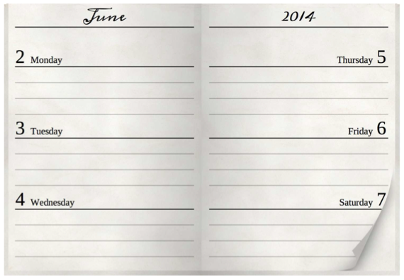
Weeks are a good unit of time when you're planning meetings and appointments. They're big enough for you to see a useful measure of time, and they're big enough so that you can easily move one or two months forwards or backwards, which is all you typically need. But on a printed planner, a week is also small enough that you still get a reasonable amount of space for each individual day.
As a result, I typically default to the week view on phones, too. The day view means that even just knowing what I'm going to do tomorrow requires me to jump between different screens, while the month view doesn't show enough information to work for most use cases.
Now, a phone is much smaller than a printed planner, so it can't show as much information in its week view. But that's okay; as long as I can get a quick impression of when I'm busy and when I'm free during the week, I'm fine.
The old Calendar app's weekly view used to do a reasonable job. There was a lot of room for improvement, but it worked well enough.
The new Calendar app does not. Its information density is so ridiculously low that the week view doesn't even deserve that name anymore. It's now a "5 Day" view, because it only shows five days. This is confusing, because it means that the starting day in this view changes. Instead of always being Monday (or Sunday in the US),1 it's now a random day. So in order for me to figure out what I'm looking at, I first have to take a second to recalibrate my brain. Okay, the leftmost day is now a Wednesday...
And I don't even see the individual days fully. I only see seven hours of each day, effectively about half of what I'd need to see to get an impression of what I'm doing that day.
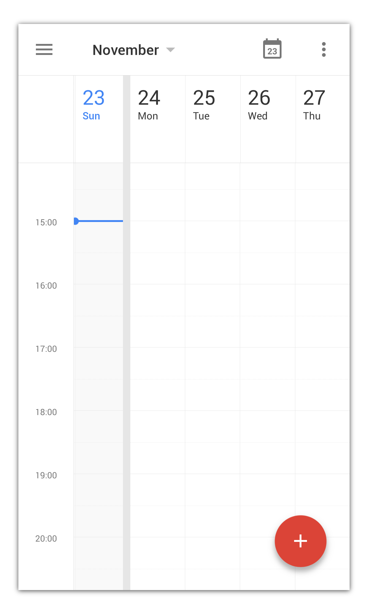
Now, I wouldn't complain if that was the view on a dinky 3-inch-phone. But this is the view on a Galaxy Note 3. Surely, there's plenty of space on that screen to show a usable week view.
There's always a need to balance simplicity and information density. It's very difficult to convey a lot of complex information in a simple, usable user interface — hence the fact that I never really liked any calendar app.
But if you're designing a user interface that is explicitly intended to convey a lot of complex information, just not showing that information is never an acceptable solution.
Addendum: When Do Weeks Start?
Further up, I noted that weeks start on Mondays in Europe, but in the US, they seem to start on Sundays. Wrong. Dr. Drang points out that weeks start on Mondays in the US, too:
Weekly calendar/planners in the US start on Mondays. You can look at Day Runner, Day-Timer, At-A-Glance; They all start on Monday and have for the 30+ years I’ve been paying attention. Monthly calendars in the US do start on Sundays, but never weekly calendars. (At this point, I’d normally make a cutting remark about how Europeans think they understand American culture from watching movies and TV shows, but I’m taking the high road today.)
So where did Lukas get the idea that Americans like to start their weekly calendars on Sunday? Probably from the poorly designed calendar software we’re forced to use.
That's right. I always set my devices' language to English. This typically has a bunch of side effects. One of them is the date format. If you set the language to English, devices often also set the date format to US-English. I've noticed that one of the things the US-English date format typically entails is that it changes the week's start date to Sunday — hence my assumption about when weeks start in the US.
A Good Week View
A few people asked me whether there was any mobile calendar app that offered a good week view. Is it even possible to show a good week view on such a small screen? There is, and it is. Business Calendar on Android is not the prettiest app in the world, but it does offer a week view that allows me to see seven days a week, 14 hours a day, all in portrait view. Calendar entries contain enough readable text for me to identify what each entry is, and the app has a smart layouting algorithm for overlapping entries.
-
Turns out I was wrong about that. See note at the end of this article. ↩︎
If you require a short url to link to this article, please use http://ignco.de/639


