Jolla
Being the first to create a new kind of device has many advantages. You get a lot of recognition, and a temporary monopoly on a market. But entering that market later also has advantages. Not only do you get to learn from your predecessors' mistakes, you also have a much better understanding of what makes a product work, what people want out of a product, and what kinds of features a product needs to offer. This knowledge allows you to be much more considerate in how you design your product.
Take the iPhone. When it came out, it didn't have an app store, or an app switcher, or push notifications, or a large screen. Apple added these features later, but in many ways, they still feel tacked on, not a fully native, fully thought through part of the OS.
Devices that came later — most notably webOS — already knew that they had to offer app switchers and a way to manage notifications, and thus created systems that integrated these features into the OS in a much tighter, more natural, more powerful, more versatile way.
Jolla1 is another system that took many of the lessons of iOS and Android, and rethought how a mobile system should work. Since Jolla's tablet crowdsourcing project ends tomorrow, this seems like a good time to talk about some of the things Jolla does really well.
One-Handed Operation
Phones have become humongous recently, and much of the screen is not easily accessible with one hand. But phone operating systems are still designed as if people used small phones where every part of the screen could easily be reached.2
Jolla knows this and uses gestures to work around this. There's still a "back" button in the top-left corner that allows you to move back inside an app, but swiping from left to right does the same thing; it moves you back. Swiping from right to left moves you forward, if you're in an "assistant"-like user interface, where you move through multiple consecutive screens.
Even better, dragging down opens the menu. For example, this is the notes application:
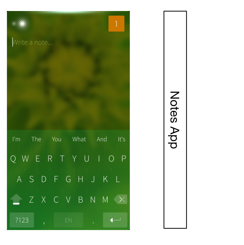
This app, like most Jolla apps, has very little UI chrome. So what do you do if you want to create a new note, or send this note to somebody? You simply drag down, which moves the UI down, and shows a menu sliding in from above, similar to the "pull to refresh" gesture. Except that, depending on how far you drag down, a different menu entry is selected.
Spatially, the menu is a part of the Notes UI that's hidden above the edge of the screen, until you drag it into the screen.
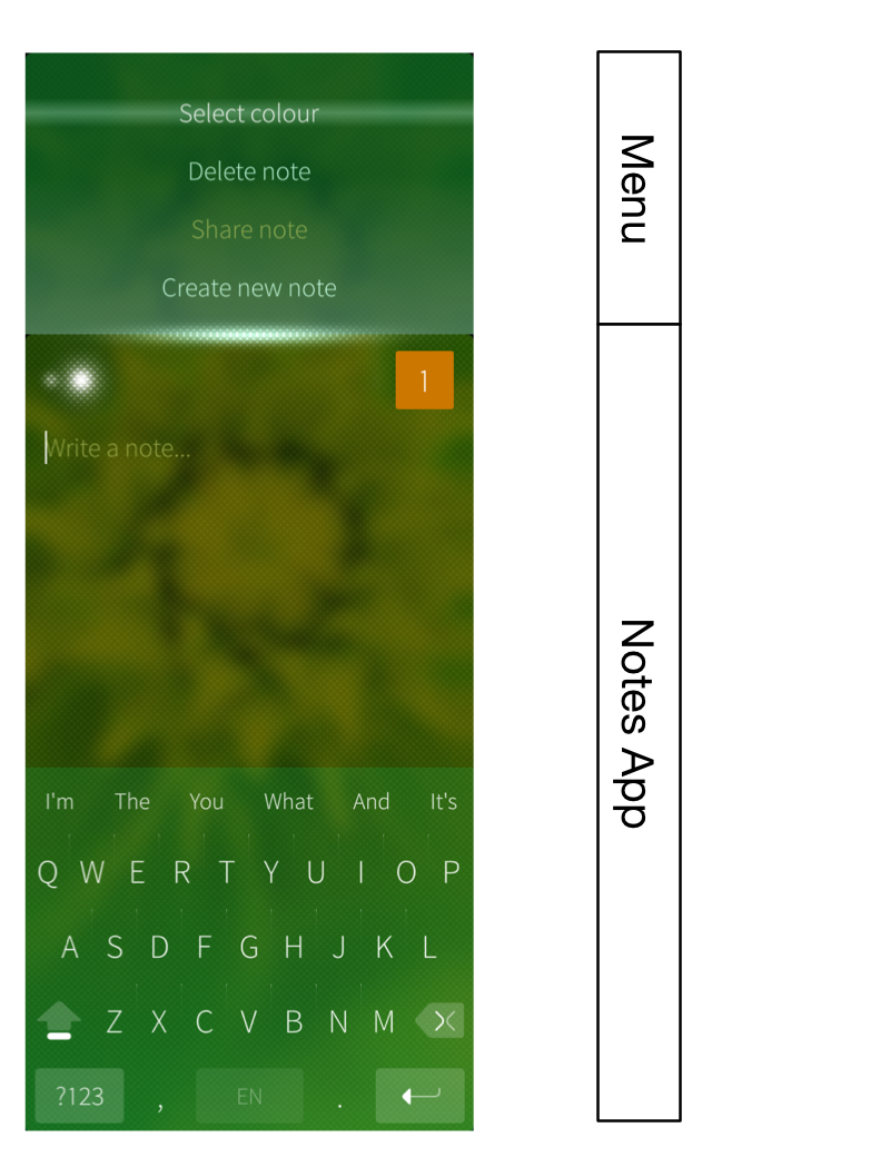
So, to send a note, touch the screen anywhere, start dragging down until "Share note" is selected, and release. It's a simple, quick gesture, it works with one hand, and it doesn't matter how large your screen is.
Spatiality
The way the Notes menu is arranged above the edge of the screen in the Notes app hints at something else that Jolla does really well: it arranges things spatially. While features in iOS and Android are tacked on seemingly at random, without any real logic about how they appear, or where they would be located if iOS was a physical "thing," the people at Jolla took great pains to think through how Jolla's pieces fit together.
Take the way Jolla's lock screen, home screen/app switcher, and app screen fit together. On iOS and Android, these are three disparate things that aren't really connected. On Jolla, they're three different sections of the same virtual space, and you can move between them by dragging up or down.
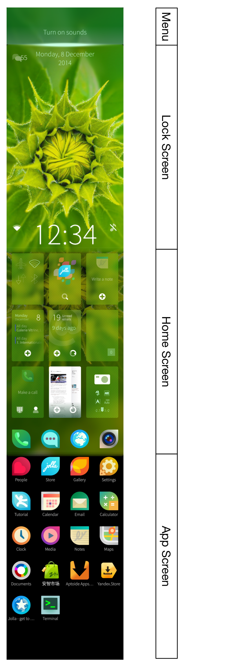
When you turn on the Jolla device, you see the lock screen. Drag down to reveal the lock screen's menu. Drag up to reveal the home screen, which combines the app switcher and a dock. Drag up again to reveal the app screen. To go back to the app switcher, drag down from the app screen, and to lock the phone, drag down from the home screen.
You only have to see this once to immediately understand how each of these pieces fits together, and how you're supposed to switch between these screens. That's the power of a system that is designed as a whole, rather than starting out simple, and growing over time.
In this video, Myriam Joire shows some of the Jolla UI:
Additional Notes
The Jolla hardware itself is nice. It's a bit thick, but it looks good. The hardware buttons (volume and power) are all arranged on the right side of the device, which prevents the problem where you're trying to change the volume, and accidentally turn off the phone, because the power button is on the exact opposite of the volume button, and pushing one makes you accidentally also push its counterpart on the other side of the phone.
The grid of running apps allows you to get quick access to your running apps, and doesn't force you to scroll through apps until you find the one you're looking for.
Jolla even runs Android apps, though not always perfectly.
Amongst all of the fringe phone operating systems (Sailfish, Firefox OS, Ubuntu Mobile), Jolla's Sailfish is easily the most mature. Firefox OS is interesting, but a Jolla phone is something you could actually use — and even something you could genuinely prefer over Android, iOS, or Windows Phone.
-
Technically, the Jolla OS is called Sailfish. ↩︎
-
Which, by the way, was never actually true, even with the original iPhone. ↩︎
If you require a short url to link to this article, please use http://ignco.de/644


