Windows 10: Re-Crappifying Windows 8
People don't like to lose things. In fact, people hate losing things so much that economists have a special term for it: loss aversion.
In economics and decision theory, loss aversion refers to people's tendency to strongly prefer avoiding losses to acquiring gains. Most studies suggest that losses are twice as powerful, psychologically, as gains. (...) This leads to risk aversion when people evaluate an outcome comprising similar gains and losses; since people prefer avoiding losses to making gains.
In any transaction — including installing a new operating system — people tend to focus on what they lose, and ignore what they might gain.
Microsoft is no stranger to this, and, historically, has avoided triggering their users' loss aversion. Microsoft is famous1 for only adding things to Windows, never taking them away. The result of Microsoft's approach is plain: Windows is an operating system that has accumulated 30 years of crap.
Windows 8 was a bold attempt to fix this, and to throw out much of that accumulated debris. And, surprisingly, it has worked to a pretty respectable degree. Windows 8, particularly when running Metro2 apps, is an operating systems that is much simpler than any other desktop OS. And Windows 8, unlike iOS, has managed to achieve this without losing much, if any, of the power of a traditional desktop operating system.
I love using Windows 8 on my Surface. I'm writing code in IntelliJ on my desktop with a keyboard and mouse, then I'm sitting in a meeting jotting down notes in OneNote, then I'm sketching a new UI while riding home in a train, then I'm reading a comic book at home on my sofa — all on the same device.
This is not to say that Windows 8 is perfect, of course. It has plenty of problems.
The default way of switching apps in Windows 8 is quite atrocious, and putting in-app search into the charms bar can lead to confusing results.
Another issue with Windows 8 is that it works better on touchscreen devices than on mouse-driven devices, yet most people still use it on devices that don't sport touchscreens.3 Charms, for example, are simple to access on a tablet, but less so using a mouse.
What's more, there are a bunch of problems that Windows 8 should have solved, but did not, or not entirely — file management comes to mind.
And then there's the Desktop-Metro dichotomy. The two systems are poorly integrated (and, to its credit, this is one thing Windows 10 improves).
Windows 8 is also uncomfortable at first. In part, Windows 8 manages to combine simplicity and power by introducing a few new user interface concepts. New user interface concepts are never easy, because people have to learn them, and get used to them, and learning is uncomfortable. Asking people to learn new things is fine if you're introducing a new product, like the iPhone, but less so if you're introducing a new version of a product that literally hundreds of millions of people use.
In short, Windows 8 is far from perfect. But it is a courageous step in the right direction.
Windows 10 shows that Microsoft has lost that courage, pummelled into submission by the same kinds of vocal users who, back in the 80s and early 90s, decried Windows itself, and demanded that people keep using DOS. In hindsight, I doubt anyone still thinks that this would have been a good idea.4

A few days ago, while setting up an iPad Air, I was once again reminded of how limited iOS is. Installing my apps made it plain just how poorly iOS works for anything but the most basic tasks. Logging into all of the accounts the different apps use required me to constantly switch between 1Password and the app in question, copying and pasting the login credentials — a tedious process made necessary by iOS's lack of any kind of window management.
When I was done configuring the iPad and picked up my Surface, I felt relief, knowing that the same task would have been simple on that device. I could have simply kept 1Password visible in a split-screen view. To me, that's Windows 8: the power of a desktop operating system, combined with the simplicity of an iPad. The Surface is an iPad without the drawbacks of the iPad.
That's what Windows 8's strength is. It's also what Microsoft needs, in order to remain relevant. Any update to Windows should acknowledge that fact, and support that premise.
Here's the problem: Microsoft achieved this combination of simplicity and power by getting rid of, or hiding, much of the quintessential things that made Windows Windows. In fact, when using the Metro UI, the very thing that gave Windows its name — the window — is gone. If you're working with a user interface originally conceived in 1995, you can't make progress without breaking a few windows, I guess.
And that brings us back to loss aversion. A lot of very vocal people didn't like Windows 8.5 I suspect many didn't like it not because they had given Windows 8 much of a chance, and had, after careful consideration, found it to be wanting, but simply because it didn't have much of the stuff they had gotten used to. It didn't look like Windows anymore.
To be clear, the point here is not to blame Windows users for not liking Windows 8, or to undermine arguments against Windows 8's design. There are valid reasons for not liking Windows 8, particularly on a mouse-driven system.
Instead, the point here is to show how Microsoft caused this problem by its mismanagement of Windows' design, and, if you're a designer, to learn from Microsoft's mistake.
Because this is Microsoft's mistake, of course. The introduction of Windows 8 is a prime example of how not to manage change. Microsoft made plenty of technical and tactical mistakes with Windows 8. You can't just take away all of people's stuff and not expect them to get angry. Of course they get angry. Microsoft should have known that.
Microsoft mismanaged the transition to a new, modern OS with new, modern interaction patterns. And now they are in damage control mode.
I actually had pretty high hopes for Windows 10. Just a few months ago, I wrote:
After the backlash against Windows 8, I was afraid that Microsoft would backtrack from its Metro design language, but this concept video [showing how Windows 10 switches between tablet and desktop modes] makes a lot of sense to me, and seems to mesh well with how I use my Surface.
But instead of fixing the things that are genuinely wrong with Windows 8, and providing some additional amenities for people who came from earlier versions of Windows, and improving the experience on mouse-driven systems, Microsoft took away many of the things that made Windows 8 work, and brought back Windows 7's UI clutter wholesale.
This is particularly egregious on touchscreen devices. There's a reason why Windows Mobile, which basically brought the full Windows UI to a tiny phone with a resistive touchscreen and a pencil, never set the world on fire. Windows 7's interaction patterns don't work well on touchscreen devices like Microsoft's own Surface. And since I use a Surface, much of my criticism is going to focus on design issues on touchscreen devices.
But while the issues caused by Microsoft's design decisions are most obvious on touchscreen devices, they also apply to mouse-driven desktop systems. I don't buy the idea that mouse and touchscreen have to be at odds. You can design user interfaces that work for both, and mouse-driven systems profit from many of the UI changes that make for good touchscreen user interfaces — a clean, simple interaction design and large click targets, for example.
With that in mind, let's look at some of the changes Microsoft has made.
Charms
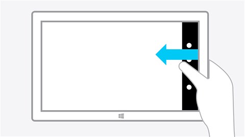
In Windows 8, swiping in from the right shows a bunch of globally applicable actions, and some status information: the battery level, time and date, and your wifi reception.

Want to quickly send an email containing whatever you're currently working on? Want to search for something, either in your app, or in Windows? Want to go to the start screen? Want to see how much battery you've left? Simply swipe in from the right.
Note how the interactive UI appears under the thumb you've just used to swipe in from the right. When I use my Surface as a tablet, I usually hold it in both hands; the charms UI appears where I can easily access it, shown below using Microsoft's own illustration of the concept.
In Windows 10, you instead get notifications, along with a bunch of interactive features across the bottom, and a tiny "Expand" button that allows you to show more of them.
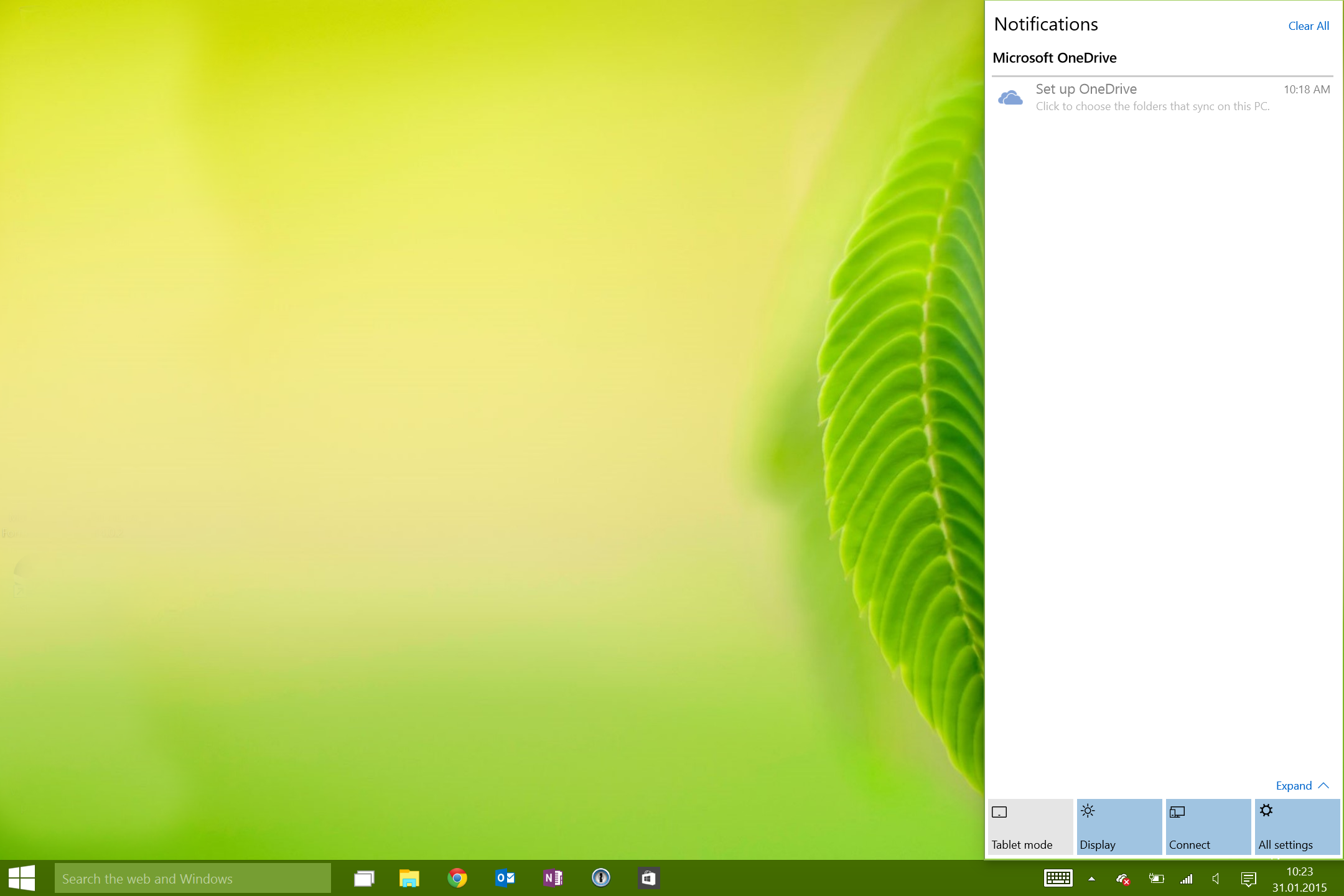
Notice how the interactive stuff is far away from where your fingers are likely to be. Notice how tiny the "Expand" button is, clearly intended to be clicked with a mouse, not touched using a finger. Notice also how, even though there is plenty of room, Windows 10 only shows four of the nine widgets my notification sidebar has. Worst of all, though, is that most of these buttons don't really do anything. Tapping on them opens the Settings application.
I guess we could discuss the utility of a notifications panel in Windows; personally, I don't really need to know that my Settings app was successfully updated, and that Dropbox has just synchronized two files.6 The fact remains, though, that the things I used to use the charms bar for most of the time — accessing the start button, sharing something I'm working on, searching something — are gone, and that the layout of the whole sidebar has been changed in a way that makes no sense on a touchscreen.
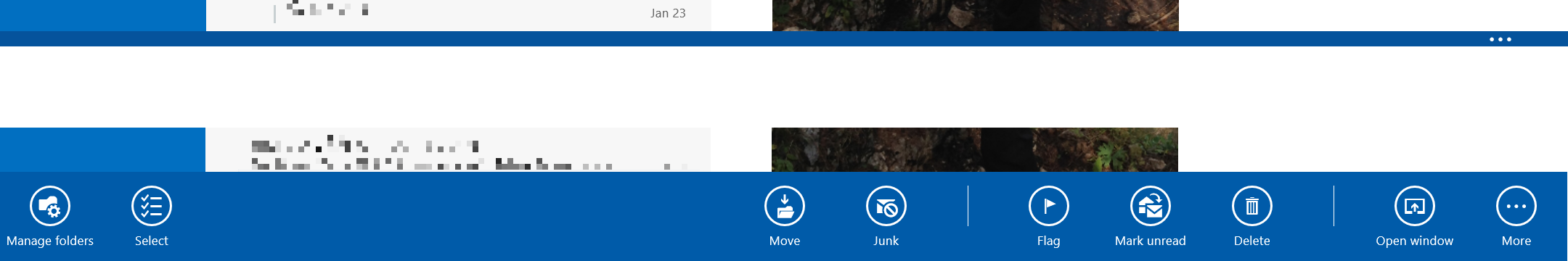
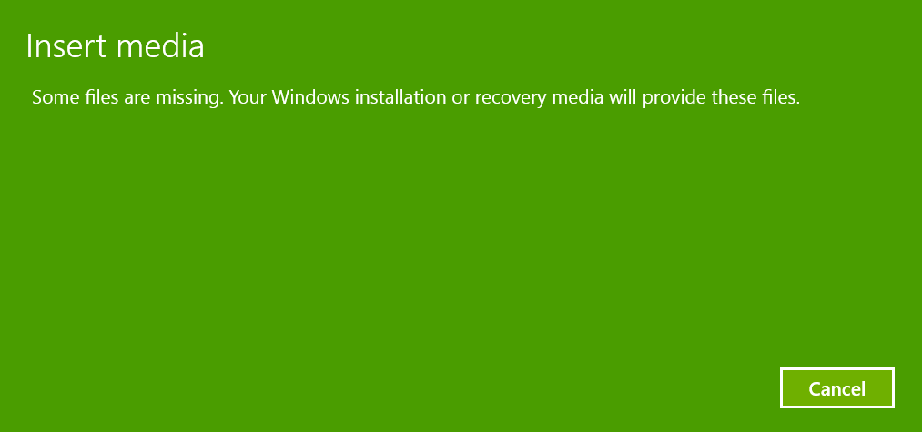
I'm not sure where the other stuff is, but the start button and search now both reside in the taskbar. Since I've had to disable my hardware start button, this means that going back to the start screen is now extremely inconvenient. Also, this is what search now looks like:
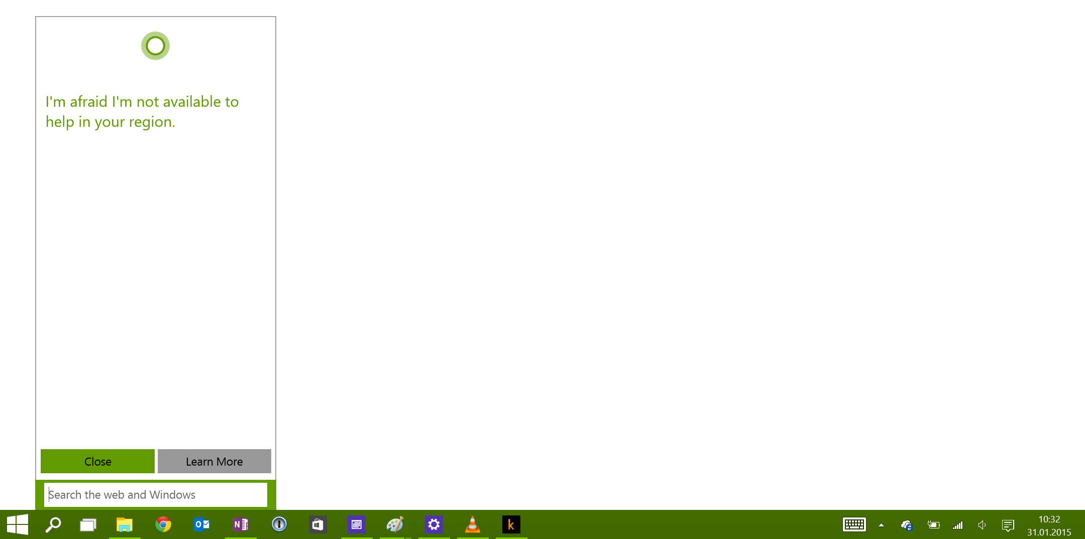
To be clear, I'm not complaining about the error message, but about the design of this thing. Why would you replace a clean, spacious UI element — the sidebar overlay — with a messy, dinky little popup window?
In the end, it's just not clear to me what Microsoft hoped to achieve by removing charms, and scattering the functionality in all kinds of hidden or inaccessible places. If notifications are so important to Microsoft, why not just put them in the charms bar?
Switching Tasks
Windows 8 supported the traditional Ctrl-Tab task switcher. In addition, you could swipe in from the left, and (after changing this setting from the default, weird app switcher, to the sidebar panel), pick one of the running apps.
Again, notice how the interaction design works. You swipe in from the left, and then pick a running app from a list that appears right where your thumb is.

Tap on an app to select it, drag it into the screen for a split-screen view.
This is the task switcher in Windows 10:
To be clear, this is not the task switcher you get when you Ctrl-Tab. This is the task switcher you get when you swipe in from the left. The touch targets are no longer where you can actually reach them, but scattered all over the screen.
The only positive thing here is that Windows finally supports multiple desktops as a native, first-level concept.
App Commands
In Windows 8, swiping up shows some lesser-used features for the current app. A small tab at the bottom of the screen indicates which apps support app commands.
App commands are no longer directly accessible. Swiping up now brings up the taskbar, which offers features that are mostly redundant.
Start Screen
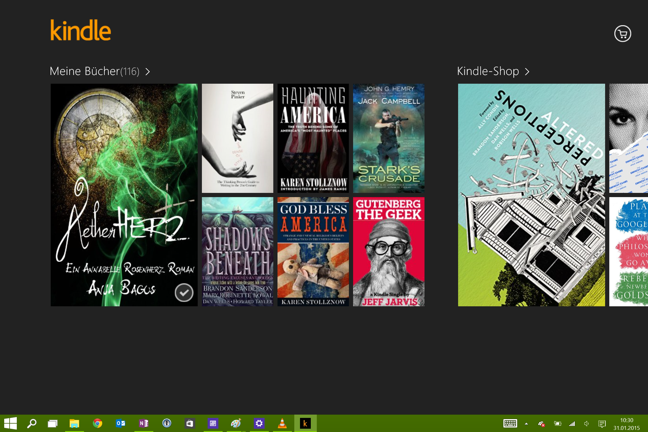
The start screen is probably the worst offender. This is what it looked like in Windows 8.
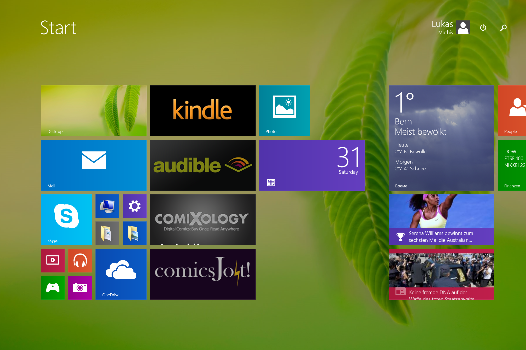
It's simple, focused, looks good, and provides the features you want from an app launcher.
This is the start screen in Windows 10.
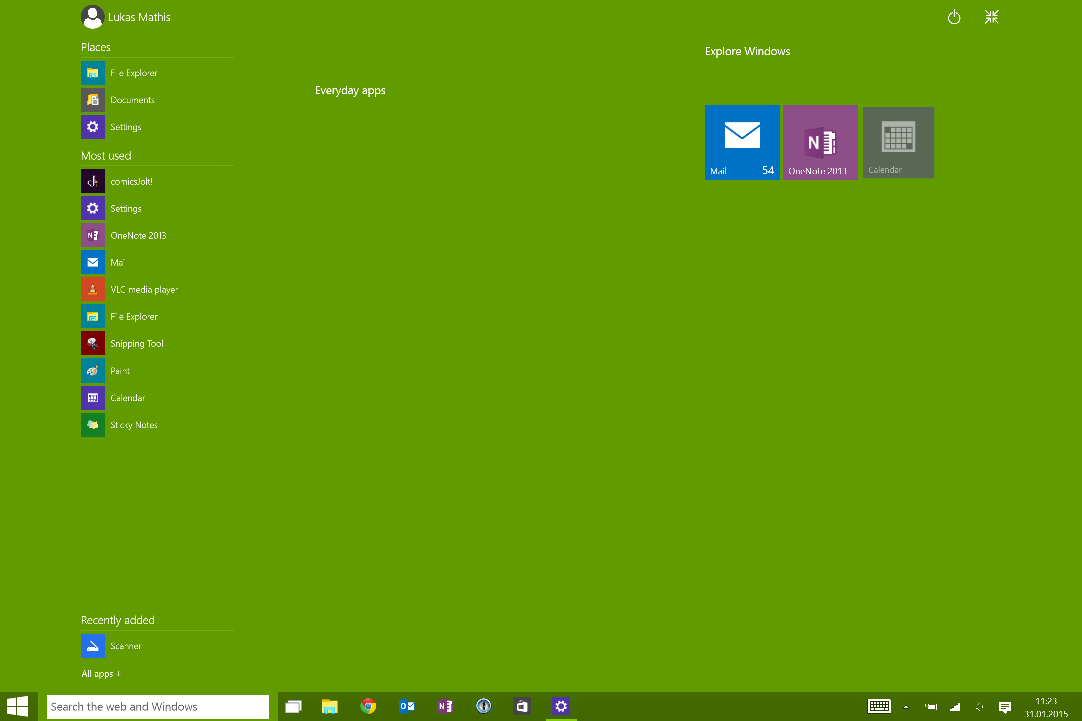
This is the kind of designed-by-committee let's-add-every-feature-we-can-think-of mess that made Windows terrible in the first place.
Instead of providing a clean, spatial, organizable, zoomable, user-configurable set of tiles, and a simple search field, Windows 10 adds everything. List of "places" you might want to access? Great idea! Automatically generated list of most used apps? Got you covered. List of recently added apps? Why not. Link to more apps? Sure. List of "Everyday apps"? Need that. Weird "Explore Windows" button? Let's add it. Area for tiles? Why not. Power button? Weird star button? I'm sure we can find a place for that. Start button when you're already in the start screen? Search field? List of running apps? Bunch of widgets? Current time? Eh, it's already in the taskbar, so let's throw that in, too!
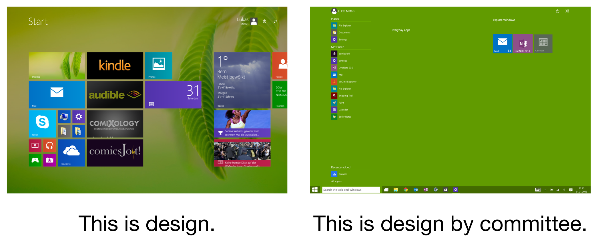
It's like the Windows 7 zombie invasion, where pointless UI elements from older Windows versions suddenly rise from their graves, shamble over to my Surface, and leave body parts all over what once was a beautifully designed, pristine bit of software.
There's More
These are just the most obvious issues with Windows 10. About an earlier build of Windows 10, Mary Branscombe wrote:
This isn’t hybrid Windows. This is Windows nailed back onto the desktop as if we'd never had Windows 8 and Windows 8.1.
Unfortunately, this is still true for the current build.
The saddest part, though? Removing charms, screwing up the app switcher, replacing app commands with the taskbar, crapping up the start screen — none of these changes were necessary in order to improve Windows' mousing experience. Microsoft destroyed Windows' touchscreen experience for nothing.
If you liked Windows 7 and want to see Windows move back to that, Windows 10 is for you. It's not for me, however, and I don't really see anything positive about going back to an interaction design originally devised in 1995. Windows 95's interaction design helped Microsoft stay relevant during the desktop PC era of computing — I just don't think it's what Microsoft needs in order to remain relevant during the next 20 years.
Here's an example. I think one of the things we've learned between 1995 and now is that launching applications and managing files are two different things. Back in 1984, when people had half a dozen applications and 20 or 30 files for each, maybe it was okay to just throw everything into the same bucket. But today, this no longer works.
Managing files requires dedicated features, which is why we've gradually moved file management into dedicated apps like iPhoto or iTunes. Launching apps also requires dedicated features, which is why it makes sense to have our mobile phones' home screens dedicated to the task.
Desktop operating systems, meanwhile, stubbornly refuse to learn this lesson. Windows 8 took a step in the right direction, and started to draw clear lines between "file organizer" and "app launcher" features. Windows 10 reverses that step.
Yes, introducing Windows 8 was painful for Microsoft. Continuing the transition to a more modern user interface would have continued to be painful for at least a few more years. But becoming increasingly, and, eventually, irreversibly irrelevant will, in the end, be even more painful for Microsoft.
It's important to keep in mind that, while users loved Windows 7, it didn't exactly halt Microsoft's slide into irrelevance. Yet, Windows 10 is more of the same. You can't keep doing the same thing that brought you to this point if you want to reverse your course.
What I'm Not Saying
I'm not saying that Windows 8 is perfect. It has plenty of problems.
I'm not saying that Windows 10 doesn't fix some of Windows 8's issues. It fixes a bunch of them — things that should have been there from the start. Allowing people to mix desktop apps and Metro apps is much needed, for example.
I'm not saying that Windows 8 works as well on mouse-driven devices as it did on touchscreen devices. It does work, but not as well.
What I Am Saying
I'm saying that Windows 10 is not Windows 8, plus a bunch of fixes. It's Windows 8, plus a bunch of clutter from Windows 7.
I'm saying that improving the desktop experience can't — and doesn't have to — come at the expense of the touchscreen experience. But right now, it does.7
I'm saying that Microsoft could — and should — have fixed Windows 8 without just going back to Windows 7.
The changes Microsoft made to Windows 8 are not the best possible solutions to what ails that system. Instead, they are the ones most likely to get vocal Windows users to stop complaining. Instead of fixing Windows 8, Microsoft made it more like Windows 7. Which is fine for people who loved Windows 7, and think that operating systems should continue to work that way.
But it's not fine for me, because I never liked Windows 7's user interface. It's not fine for the people who aren't Windows fans, don't frequent online forums to complain about Microsoft, and only use Windows because it came on the new laptop they bought at the local mall.
And I think it's not fine for Microsoft. Bringing back Windows 7 is not going to magically make Windows relevant again.
Epilogue
I'm sure Microsoft will clean up Windows 10, and restore some of the tidy visual design, and thoughtful interaction design, of Windows 8. But until then, I'm going back to Windows 8. Or, rather, I'm trying to.
-
Particularly in contrast to Apple. ↩︎
-
I know it's not called that anymore, but there's no usable replacement name for it, so I'm still calling it Metro. ↩︎
-
Touchscreen computers are in the minority now, but I don't think they'll remain in the minority. Kids are growing up on iPhones, Android phones, and iPads. A computer without a touchscreen will seem increasingly anachronistic to them, so designing against that trend is an increasingly backwards-looking strategy. ↩︎
-
I think that medium-term, the transition from mouse-driven devices to touchscreen devices is quite similar to the transition from command-line devices to mouse-driven devices. The mouse, like the command line, will stick around, and be used in specialized cases, but most people will gradually move away from it. ↩︎
-
Yes, I realize that I'm also suffering from loss aversion, because I don't want to lose the things that make Windows 8 such a great tablet OS. ↩︎
-
I've never intentionally opened the notifications panel on my Mac. ↩︎
-
By the way, I'm not the only one noticing this. Read the comments on this article, for example. ↩︎
If you require a short url to link to this article, please use http://ignco.de/673


