Input Masks: Violating User Expectations
When designing forms, there's a pretty deep chasm between the needs of the developer, and the needs of the user. Developers want structured, normalized data. Users want to enter data in whatever format suits them best.
Forcing people to enter structured data causes usability problems.

What do you mean, it's not a valid phone number? Looks valid to me - except that the backend wants just numbers, no special characters, and isn't smart enough to strip out all of the characters that the user has entered.
Commonly, designers try to solve this by telling people what kind of format data needs to be in. This can be done using placeholders that show example data in the correct format.

The problem here is that the placeholder disappears as soon as people start typing, so exactly when they actually need this information, it's no longer visible.
Another approach is to try to be as liberal as possible when accepting input values. So maybe the backend strips out all special characters, and only retains the numbers. But that's difficult to do; what if I enter an international phone number?

Stripping out the plus sign results in an invalid phone number. So getting the backend right can be hard, and getting it wrong means that the form accepts (or produces) invalid data, which is never a good idea.
Worse, people have become so accustomed to inconsiderate text fields that they may be confused when they encounter a text field that doesn't offer any guidance about how its contents should be formatted.
Yet another attempt at solving this problem is to use input masks. Instead of showing a simple text field, the field is split up into multiple fields, or contains logic that applies correct formatting while the user is entering text.

As the user starts entering text, that text is automatically formatted correctly, and the mask is changed to indicate what kind of text remains to be typed.

This satisfies the needs of backend developers by forcing people into entering data in a very specific format, and also help users by providing clear, interactive guidance.
These fields are quite common on web forms. Because they are not part of many widely used UI libraries, but are implemented with custom JS code, there are few commonly accepted UI guidelines. There are no standards outlining how they should work, and as a result, most of these input masks work differently in slightly perfidious ways.
In order to implement input masks, designers have to make a lot of small interaction design decisions that don't have universally accepted correct answers. Regardless of which decisions designers make, there will be users who will be surprised by these decisions.
So whatever you do, you'll end up annoying or confusing some of your users.
In fact, I think I've never encountered an input mask that didn't annoy me.
Let's take a look at some examples.
Input masks for serial numbers often split the one field up into multiple fields.

Once the user has entered the first four letters, focus is automatically shifted to the next field:

Unfortunately, no other text field works like this. If you do usability tests on these fields, you'll find that a large portion of your users won't notice that the caret was moved to the next field, possibly because they're typing a serial number that's printed on a physical card, and aren't paying much attention to what's happening on the screen. They'll hit tab...

...enter the next four characters, and end up with this:

Clearly, that's not the intended outcome.
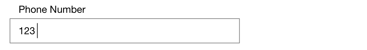
A similar problem occurs with single-field input masks. Let's go back to the phone number example. Let's say the user enters the first six letters. At this point, the input mask will automatically type the dash, so that the user doesn't have to.

However, the user might not notice that the dash was typed automatically, and might type the dash, resulting in this:

Now think about deleting. Let's go back to the previous situation:
If the user hits the delete key, what should happen? The field (probably) filled in the dash, so a lot of input fields ignore the dash, and delete the character before the dash.

But this is kind of crazy. No other text field on your computer deletes two characters if you hit delete once. In fact, the user probably hit delete twice quickly in succession, thinking that it would take two deletes to get rid of the one character before the dash, and thus inadvertently deleted two characters instead of one.

Clearly, not what the user wanted.
Conclusion
Avoid Magic
Because there are no standardized, widely accepted behaviors for input masks, it's best to avoid "magical" behaviour (e.g. automatically entering characters that the user did not type), or, if you do need magical behavior, also account for user behavior that does not expect magical behavior.
For example, if the field auto-tabs to the next field, and the user also tabs right after filling in a field, it might be best to ignore the user's tab.
If it looks like a duck, make it walk and quack like a duck
if there's a UI element that looks pretty much like a text field, has the same function as a text field, and behaves very similarly to a text field, maybe it's best not to change how basic features like the delete key work.
If you create a new control that kind of looks like an existing control, the new control should not violate people's expected behavior of the existing control. In other words, text fields with input masks' behavior should be as close to a normal text field's behavior as possible.
Don't be clever
Don't be too clever for your own good; if a simple, easy to understand interaction works, it's often better to go with that than to go with a clever, possibly hard to predict interaction.
Do no harm
Follow the principle of least harm. If there are multiple ways a user interface can behave, pick the one that does the least harm (e.g. deletes the fewest characters when the user starts a destructive action).
Test it
To find out how users actually expect your user interface to work, it's always best not to be too smart, but to run some usability tests, and find out.
If you require a short url to link to this article, please use http://ignco.de/751