Start Me Up
We've reached a point where it is obvious that spatial user interfaces no longer work for file management. Our files are scattered over too many different places and services, and we have too many of them.
For application launchers, though, a spatial view is still the preferred approach. This is why Windows 11's Start menu is so confusing to me.
This is what my Start menu looked like in Windows 10:
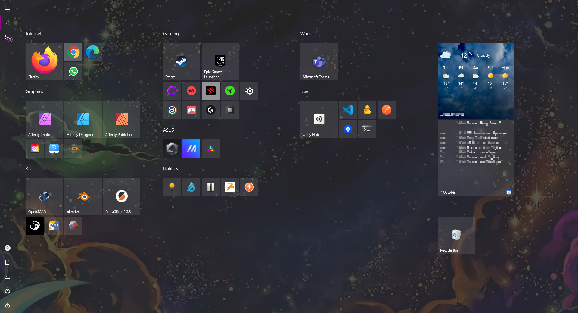
This is by far the best home screen experience any operating system currently offers. Better than the app launcher on OS X, better than Android, better than iOS, better than any Linux distro I've seen.
It's fantastic.
This is what it looks like in Windows 11:
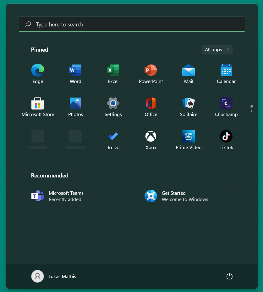
I guess I'm not really angry. I'm not even disappointed. I'm a bit sad, but mostly I'm confused, because I truly do not understand what the purpose of this change is.
I like a lot of the changes in Windows 11. I think the visual design is nice. I love the improvements for WSL. Snap Layouts are great, and the way Windows 11 supports restoring windows on multiple screens is a welcome improvement.
But the Start menu, and everything related to it, including the way the Start icon itself dances around the screen and is always in a different place, never allowing you to develop a habit for clicking it, is just odd.
If you require a short url to link to this article, please use http://ignco.de/786


