MDIs on the Mac
Way back when the first graphical user interfaces were created, Apple and Microsoft went similar ways. Both used the desktop metaphor with files and folders, both had overlapping windows which showed documents and folder contents. However, they also took different paths for a few fundamental UI concepts. Apple had the "always on top" menu bar, while Microsoft put the menu bar inside windows. Apple went with an application-centric model, where each application could only be launched once but have many windows, while Microsoft went with a document-centric approach, where applications would sometimes launch multiple times.
The Multiple Document Interface
Apple very strongly went with the idea that each document corresponds to exactly one window, while Microsoft introduced a concept called the "Multiple Document Interface" (MDI), which allowed applications to have hierarchical windows: document windows reside under a parent application window.
MDIs have some advantages; they naturally help reduce clutter by grouping windows. They make it easy to hide all windows for a given application. If you tend to use applications in full-screen mode, having a MDI makes sure you really only see the active application and no other application.
Either way, Mac applications never had MDIs.
The times, they are a-changing
Mac applications used to have many windows. Recently, this has started to change, mainly due to Apple's influence. Mac applications such as iPhoto, iTunes, iMovie, Aperture or iDVD tend to only have one window.
However, these applications do not have MDIs. Neither of these applications are multi-document applications. They are either media managers (iPhoto, iTunes, Aperture), or they are typically used to open only one document at a time (iMovie, iDVD).
MDIs on the Mac
Unfortunately, some companies have taken Apple's new one-window-approach to UI design as a hint that they should introduce MDIs (or an MDI-like approach to UI design) on the Mac. Nolobe's Iris, otherwise a very capable program, is such an application:
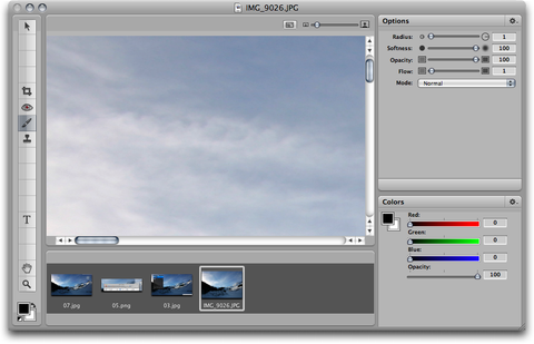 Note the list of open images in the bottom row of the single window.
Adobe's CS4 applications will also use MDI on the Mac (albeit only optionally - one can only hope that it will not be the default choice):
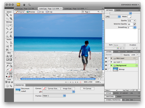 Note the tabs above the image.
MDIs on the Mac are generally a very bad idea.
So why are MDIs on the Mac a bad idea?
Glad you asked. There are many reasons why MDIs are a bad idea; some of them generic, some of them due to how the Mac normally works.
Why MDIs are bad in general
Please note that these lists are not exhaustive; also, not all of these points apply to all MDI applications. To name one example, Adobe has gone to great lengths to make sure their MDI would work around almost all of the issues in this list.
- Most modern computers support multiple screens, and a lot of people make use of this feature. MDIs don't support multiple screens; since all of your documents are inside one window, you can't put one document on one screen, and another document on another screen. Note that in the CS4 UI, it's possible to pull document windows out of the main window, so this criticism does not apply.
- MDIs often make it hard to compare several documents belonging to the same application, or to view them side-by-side. CS4 supports tiled views to allow for this.
- MDIs make it hard to drag from one document to another inside the same application. In Photoshop, dragging layers between documents is something I do daily. MDIs make this hard (or even impossible, depending on the implementation), and force the user to copy-and-paste instead. Adobe's CS4 UI supports spring-loaded tabs, which isn't quite as good as direct drag-and-drop, but should be a workable solution.
- Some implementations of MDI make it hard to remove palettes from the main window. This is bad because in a multi-screen environment, a typical setup is to move all palettes to one screen, while keeping documents on the other screen. Again, the CS4 UI allows for this, so no complaints here
- MDI takes away space on larger screens. After your screen reaches a certain size, it doesn't make much sense to maximize windows anymore. Having an MDI means you always waste space with a ton of application chrome around your documents - space which could be used by other applications running at the same time. Again, CS4 has a solution for this; hitting tab removes the application chrome (although I wasn't able to get it back easily - hitting tab again did nothing at all). Unfortunately, the application chrome is not hidden if the application is put in the background while in MDI mode.
Why MDIs are especially bad on Macs
As if these reasons were not enough, there are a few additional reasons unique to Macs:
- MDIs break Spaces. You can't have one document in one space and another document in another space if all documents must reside inside the same window.
- MDIs (including tabbed browsers) break Exposé. This is what happens when you activate Exposé in Fireworks when the MDI is active:
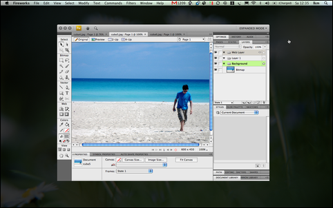
Obviously, it's entirely useless. This is what happens with the MDI turned off:
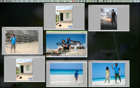 Much better.
By the way, Adobe, "zoom to fit" is currently broken and maximizes windows instead of zooming to fit their content - yet another Windows behaviour that has no place on the Mac. Also, the little "this document contains unsaved changes" dot in the close button does not work, which is probably another result of the MDI; UI elements don't need to look the same in all apps, but if they look similar, they need to behave the same so as not to confuse users.
What Adobe did right, and what they did wrong
Adobe actually implemented workarounds for most issues I list. However, they are often non-obvious. Furthermore, if other applications with MDIs try to fix these same issues, they will most likely find different solutions, creating an inconsistent user experience.
Since there is no history of MDI applications on the Mac, and since Apple doesn't have anything similar to these applications, there are no established UI guidelines. Hence, MDI-based applications confuse users since they behave inconsistently with each other.
Replacing an obvious, consistent solution to a problem with a non-obvious, inconsistent solution is generally a bad idea, unless the new solution is shown to be considerably better than the old solution (as an example for this, check out the Ribbon UI in new versions of Word for Windows - it's non-obvious and inconsistent with other Windows apps, but it's so much better than earlier versions of Word that the change is worth the issues it causes).
In this case, consistency with the host OS and its applications seems a lot more important than consistency with different versions of the same application.1 In my opinion, the Mac version of Photoshop should look and (especially) behave like a Mac application, rather than like the Windows version of Photoshop.2
I should point out that I don't have access to Adobe's UI test results. One would hope that they did usability tests and found that the new UI is much more usable for Mac users than the old one before deciding to go with the MDI UI on all platforms. If so, changing to the new UI is the right thing to do.
Apple is to blame, too
Apple itself has at least one document-centric MDI application, too: Safari. The fact that Apple has an application which uses tabs to switch between several documents inside one window is probably partially to blame for the recent third-party enthusiasm for MDI apps on the Mac.
Originally, tabs were not meant to switch between documents. They were meant to organize "things" (such as settings) into groups of similar "things", or - at most - to switch between different views of the same document. Not so switch between different documents.
It is kind of unfair to blame Apple for introducing tabs in Safari - after all, users demanded the feature, and Safari's tabs are turned off by default (something other developers should copy if they insist on bringing MDIs to the Mac). It's just very unfortunate Apple's choice helped usher in a new era of MDIs on the Mac.
Conclusion
MDIs are bad news on the Mac because they break a lot of behaviours Mac users are used to. They should be avoided.
Addendum: John Nack replies to my blog post (scroll down to the comment linking to this post). He points out that most of my criticism of MDIs doesn't apply to the CS4 UI since it's possible to have (tabbed or single) windows outside the main window (Admittedly, I noticed this while trying the Fireworks prerelease, but actually thought it was due to a bug because I wasn't exactly sure how I ended up in this state).
He furthermore thinks that it's Apple's fault for not giving developers a way of supporting Exposé for tabbed windows, with which I agree; still, Apple doesn't force anyone to create interfaces which don't support Exposé :-)
I've updated this post to reflect the fact that CS4 provides solutions for most issues MDIs normally cause.
Addendum 2: I mistakenly claimed that Final Cut Pro was a one-window application. This is false: I have not used FCP in a while and misremembered how its UI works. While FCP looks like a one-window application, the different areas of the UI are actually individual non-standard windows. Thanks to Ben De Rydt for pointing this out to me.
Addendum 3: Mike Lee, the world's toughest programmer, disagrees with much of what I write, essentially saying that the concept of an MDI is not in itself flawed, but that it's a question of context (how is the application in question used?) and implementation. He makes some good points, and furthermore calls me "chef," so I recommend that you read his post. Also, who wants beef with the world's toughest programmer? Not me!
I do have to take exception with two things he says, though.
He claims that it is false to differentiate between media managers and document-based applications. He does not, however, explain why this is false, except for pointing out that both Photoshop and iPhoto work with "media." However, iPhoto is not a media manager due to the fact that "the documents in question are media." iPhoto is a media manager because its main use is in managing your data. Faulting a media manager for having multiple documents in one window would be akin to faulting the Finder for allowing more than one file in a folder: In the application's model, you are typically working with representations of your documents, not with the documents themselves.
Then, just after writing that "nobody likes Adobe," Mike claims that I did not use Photoshop as an example "because people like Photoshop." This is not why I used Fireworks. I went with Fireworks instead of Photoshop because I do not have access to a Photoshop beta, only to a Fireworks beta. The two share the same user interface, so any criticism I have made applies to both applications equally.
-
The fact that even Windows users who are used to inconsistent UI dislike CS4's UI should tell Adobe something. Writes Scott Gilbertson: "Regardless of whether or not you agree with that, the results are apps that look out of place and behave differently than what users are accustomed to. And in the long run that may alienate many new users." ↩︎
-
John Welch agrees, but puts it slightly differently, writing: "Okay, so while I have to, and will have to, support Adobe applications, I don't feel like re-learning how to use my friggin' UI just to have the glory of their application icons in my Dock." ↩︎
If you require a short url to link to this article, please use http://ignco.de/25

