You really, really need to do Usability Tests
I often write articles where I complain about specific user interfaces. You should not believe anything I say in those articles. User interface design is nothing that can be reduced to a bunch of rules which create a good user interface if followed1. User interface issues can't be found by staring at a user interface and picking out the mistakes.
User interface issues can only really be found by doing usability tests.
Okay, admittedly there are some issues you can pick out by just thinking about a UI or trying it out yourself. It's easy to see when a UI for a touch-based phone has buttons which are too small for a human finger. It's easy to see that CS4's MDI doesn't work well with Exposé. However, fixing these obvious issues doesn't give you a usable interface. It just gives you an interface without some of the most obvious issues.
Unless you find a bunch of "naïve" users (as in: people who don't know your application) and put them through a usability test, your UI probably sucks.2 Because you really, really need to do usability tests to find the issues in your user interface.
Why you need to do UI tests
So why can't you just test the application yourself? Because you've either designed the user interface, or used the application extensively. That means you got used to its flaws. You won't even notice things which will become insurmountable stumbling blocks3 for your users.
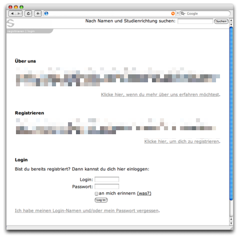
Here's an example. This is a prototype for a (now pretty much defunct) social networking site. I did usability tests for this site about four years ago; we tested with German-speaking users, so the on-screen text is in German. I've removed parts of the image which are unimportant for the eventual usability error many users encountered.

A lot of thought was put into designing this page. Since people who wanted to log in typically had seen the site before and thus know how it worked, the site's homepage was designed to be easily understandable for first-time visitors. It starts out with a short "About Us" section explaining what the site is all about, then it encourages the user to register. Finally, for returning (and hence experienced) visitors, there is the login form.
And yes, when we tested the site, first-time visitors could easily figure out what the site was all about and how to register. Unfortunately, they couldn't figure out how to log in. The login form ended up being just below the bottom border of the screen, below the fold, and a lot of user never tried scrolling down. The designers actually anticipated this and put a "login" link at the top of the screen, but the text was too small and too low-contrast, so users never saw the link.
Even though these users were returning visitors, they had not yet learned how to use the site and could not figure out how to log in.
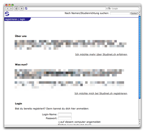
This simple redesign fixed the issue; after the color of the header was changed to be more prominent and provide more contrast, and the text size was increased slightly, all test subjects were able to log in:

As you can see, the designers of the site's homepage actually anticipated most of what could go wrong and tried to fix it even before any tests were done. Yet they still got it wrong.
How to do usability tests
Hopefully I have now convinced you that you should do usability tests with your application. If so, surely you're wondering how to do that.
First of all, this blog entry assumes that you can't afford to hire an actual usability expert, and have no usability expert on your staff. If you do, consult with them instead of reading this.
If you ask ten usability experts how to run a valid usability test, you'll get about twenty different answers. The truth is, it really doesn't matter too much, as long as you get users to use your application, get out of their way, and record all issues they encounter.
It's great to have a usability lab with two-way mirrors and recording equipment. These things help a lot, and you can rent such labs in most larger cities. But you don't have to! You can just sit somebody down in front of your computer, tell them which app to use, be quiet and look over their shoulders while they give it a shot.
Eventually, your guinea pig will make mistakes, become confused, or even get stuck. And if he does, don't chalk it up to his stupidity. It's always your fault.
How many users do you need to test?
If you're going to rent a usability lab, it makes sense to test a few people each round - five seems to be the sweet spot, but in my experience you will find plenty of issues even when testing with only three users. An advantage of having more test subjects is that you can test different versions of the same user interface to see which one works best.
If you're not going to rent a UI lab, it's enough to test one person at a time. Even when testing with only one person, you'll probably find a ton of things to fix.
Just don't stop after the first round; keep going with new people until you've eradicated at least the most atrocious issues (and use different test subjects each round, of course - otherwise they will learn your UI).
How to choose test subjects
In my experience, it really doesn't matter too much. While expert users are more confident with new interfaces and will be more likely to try different things, eventually figuring out how your UI works, they are actually quite likely to become confused by the same things as inexperienced users.
Even so, it's a good idea to try your UI with a wide variety of users. There are some things which confuse certain types of users, but may not confuse others.
How to prep users
It's extremely important that users don't think they are being tested. Make sure to tell them that you're not testing them, you're testing your application's user interface. It's good for you if they get stuck: every mistake they make helps you improve the application.
It's okay to explain what the application is all about. You should not, however, actually show them your application. At most, launch the application for them, but then hand them the mouse and get out of their way.
Should I encourage users to talk?
Some users are more comfortable when they don't have to talk. You should probably tell them that it's okay to talk about what they're doing, but don't imply that they're required to talk. You don't want the user's opinion of your application or its user interface. Instead, you want to know why he's confused so you can more easily figure out what's wrong with your application.
Task-based or freeform?
Typically, usability tests are based on a set of tasks testers want users to complete. While this is a valid way of testing applications, sometimes just letting the users figure out what to do by themselves can offer interesting insight, as well. You could start out by not telling users what to do, and then guide them into doing specific tasks if they don't do it themselves. It depends on the application you're testing, and on what you want to get out of the usability test.4
How to observe users
First of all, shut up. It's very tempting to guide your test subjects to the proper solution every time they hesitate. Don't. After your application ships and is in your user's hands, you won't be there to guide them, so test subjects must be able to figure out how to use the application without your help. You should only help your subjects if they themselves announce that they have given up and require your help. Typically, you should only interact with test subjects if they request it or if they're obviously stuck in a way they can't get out again.
The key to good listening lab moderation is to stay quiet, except in those moments where intervention is necessary (Mark Hurst)
Second, your test subjects are not stupid. Yes, they will struggle with the easiest tasks. No, it's not their fault, it's yours. Keep telling yourself that: It's your fault, and it's your job to fix these issues. If one person doesn't get something in a usability test, thousands of your users won't get it after you've shipped your application! Think of the support cost you can save by fixing this issue once instead of answering all those support calls. Never assume mistakes are the user's fault!
Third, if you can, you should record the session - the screen itself, what is spoken, and - if possible - the test subject as well. It's useful to record the test subject because his facial expression and gestures will help figure out what exactly he was doing.
You will miss a lot of issues while the test actually happens. It's important to keep a record of what happened so you can go back and check out what issues the user encountered and what specifically triggered the user's confusion. Also, modern usability labs may be able to do eye tracking so you can see what the user was actually looking at; this is tremendously helpful.
Sometimes, watching the recorded session together with the test subject can provide further insight on why something confused him (although users will often be confused as to why they were confused - if this is the case, it's your job to figure out what confused them and how to fix it).
If you can't record the test, at least make extensive notes while it is running. If you don't, you simply won't remember all the issues the user encountered during the test. In most cases, even if you don't have any external way of recording a usability test, it should at least be possible to keep some kind of screen capture application running which can also record input from the computer's microphone. Keep minute track of what happens during the test.
After the test
Sometimes, we hand out little questionnaires after tests, asking users what they liked or disliked about the application, what features they expect from such an application, whether they would use such an application and if not, why not. These often make for interesting statistics, and sometimes provide additional insight into why users behaved the way they did during the test. If you're doing a one-on-one test, you can do this in person. However, always leave this for after the test, never ask questions like these during or before the test; you will only confuse your users and distract them from actually using your application.
Furthermore, you should not rely on these results too much, or base any decisions on them. People often don't know what they want. It's better to observe than to listen; what people actually do is much more useful data than what they say.
What to do with the results
Fix the issues, then test again. Most likely, your fix won't be much better than the original UI. This is an iterative task. Find an issue, try to fix it, test the fix, repeat.
When to test
Simple answer: Whenever you change something which affects the application's users, even if it doesn't change the application's user interface. It's important to remember that users build a mental model of how your applications work, what rules apply inside the black box. Even if you "only" change something in the back end of the application, that change may break the user's mental model, creating confusion and doubt.
What about existing users?
In certain cases, it may be a good idea to test new versions of your application with existing users of your application. These users will behave differently from naïve users; changes which are easy to understand for users new to your application may confuse existing users because these changes don't match their mental model of your application.
Conclusion
The main thing I want you to take from this is that you have to test. You can't do flawless user interfaces without testing. Even just sitting somebody in front of your application and observing how they interact with it can be tremendously helpful, bringing many potential issues with your application to light. Just don't forget that it's always your fault. Never blame the user.
-
This is not to say that usability rules are useless. Such rules can help when designing user can interfaces and when trying to find out why users don't understand a particular interface. Rules are a tool you use when designing user interfaces, but they don't allow you to avoid doing actual usability tests. ↩︎
-
Maybe I should write "potentially" instead of "probably", but that would be even weaker voice. ↩︎
-
Wait, isn't an insurmountable stumbling block actually a good thing because it means you will never be able to stumble over it? I guess I accidentally mixed some metaphors there. ↩︎
-
Mark Hurst has an article on this topic called "Asking customers for what you don't already know" ↩︎
If you require a short url to link to this article, please use http://ignco.de/28


