Consistency
When people talk about an application's usability, they'll often discuss the application's "consistency." The more consistent an application, the more usable it is, it seems. But what exactly is consistency, and is it really always a good thing?
The relevant definition from Merriam-Webster is probably the one which says that consistency is
agreement or harmony of parts or features to one another or a whole
When people say that an application is "consistent" with its host system, they usually mean that the application "agrees" with its host system by being "similar" to other applications on that system. This is good because knowing how to use other applications helps users of the new application understand this new application.
However, not all forms of consistency are good, and not all forms of consistency are important. Let's have a look at what consistency is and when it's important.
Visual Consistency
Applications are often said to be inconsistent with their host system if they look differently from other applications on that system. However, look alone doesn't really matter. As long as users are capable of easily identifying the different UI elements, applications don't have to look like their host system.
Here are a number of different buttons from different Mac OS X applications:

While some of these buttons may be downright ugly, they're all immediately identifiable as buttons. The fact that they don't look exactly like each other does not harm usability.
People see all kinds of different user interfaces while surfing the web. A different look doesn't harm usability, as long as the individual widgets are easily recognizable, and as long as they behave the way the user expects them to.
Behavioral Consistency
From a usability standpoint, behavioral consistency is a more meaningful type of consistency than visual consistency. Being behaviorally consistent means that an application behaves in the same way as other applications, and thus in the way the user would typically expect.
The more consistent the look, the more important behavioral consistency becomes. Visual consistency can hurt usability if it gives a false sense of behavioral consistency, telling the user that a given widget will behave like something he already knows when it does not.
If an UI component looks exactly like a standard UI component, every little behavioral issue can confuse the user tremendously, essentially killing his suspension of disbelief and thus his trust in your application. This is the uncanny valley of UI design, and it is probably one of the issues people have with Firefox: because it gets the Mac OS X UI almost right, the remaining issues seem all the more jarring.
Some Examples
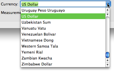
Combo boxes combine the features of a text box and a dropdown menu. Here's what combo boxes look like in Mac OS X:

Clicking once on the blue arrow will open a menu from which the user can select a predefined value:

This is a combo box from OmniFocus:

Even though it looks differently from normal combo boxes, it is immediately recognizable as a combo box. Unfortunately, it doesn't quite behave like a normal combo box. For example, if the focus is on the text box, clicking on the little arrow will open and immediately close the menu. If the text inside the combo box is not selected, the menu will remain open (as it always does for the normal combo box).1
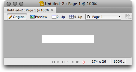
Here's another example. This is a window from a Fireworks beta,2 sporting Adobe's new CS4 user interface:

This looks pretty much like a normal Mac OS X window with a bunch of color changes. It doesn't behave quite like a normal Mac OS X window, though. For example, clicking on the "zoom to fit" button will maximize the window. In most cases, Mac applications should not maximize windows when this button is clicked. Instead, the window should be resized to fit the exact size of its content.
Another discrepancy to "normal" windows is the fact that you can't resize this window by dragging the bottom-right corner. Or, more specifically, you have to hit the actual border of the window with your mouse, instead of the empty area inside the corner.
Finally, the CS4 windows don't show the "this document has unsaved changes" dot in the close button, which can be confusing if you make changes to the document and don't see these changes acknowledged by the application.
Details such as these are incredibly frustrating to your users. It's okay to introduce new concepts that don't already exist on a platform. It's not okay, however, to ignore the things your users have already learned while using other applications, or to actively go against the things your users already know by mimicking user interface elements they recognize while making them behave slightly differently.
An extreme example of this are applications which abuse existing UI components for something else than what all other applications use them for.
False Friends
Before I explain this next and final example, I want to say that I'm not actually sure VectorDesigner is doing anything wrong as per Apple's HIG. I do, however, find what they're doing quite confusing.
Mac OS X supports something called a "toolbar." This is the list of icons many applications show at the top of their windows. Here's how they look in Apple's Keynote:

Clicking on some these icons will start an action. The "Play" icon starts the presentation, the "Text Box" icon adds a text box to your active slide. Clicking on others will open a dropdown menu, and clicking on one of the entries will, again, start an action. These toolbar icons have no active state; clicking on them will not activate the icons.
However, Toolbars can have icons with active states. Apple calls them "Selectable Toolbar Items" and writes:
This is often used in conjunction with an NSTabView that is configured to have no visible tabs.
Apple writes that this is "often" used in conjunction with an NSTabView, but in fact, tabs is almost the only use of selectable toolbar items I've ever seen. Here's an example for selectable toolbar icons used as tabs; it's Safari's preferences window:

In fact, I have never seen this look described as anything other than "tabs." For all intents and purposes, users don't see these "selectable toolbar items" as toolbar items at all, but as tabs. Clicking on them does not select tools, but changes the windows contents in almost all applications which use them.
Vector Designer is probably my favourite vector drawing application. I'm using it every day. Yet its toolbar still regularly throws me off.
Admirably, Vector Designer goes for an iWork type of user interface. It has a toolbar similar to Apple applications like Keynote. However, while Keynote's toolbar icons start actions, Vector Designer's toolbar icons are selectable tools. Clicking on them changes the tool you're currently working with. This means that Vector Designer uses Apple's "Selectable Toolbar Icons," which look like tabs in Leopard:

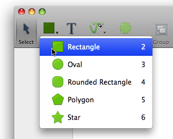
Clicking on the icons with the small triangles opens a dropdown menu:

The fact that I'm clicking on something that looks like a tab to select a tool or open a dropdown menu seems terribly strange.
In Vector Designer's defense, selectable toolbar icons used to look different in earlier versions of OS X, but it seems since most developers use selectable toolbar icons only for tabs, Apple abandoned the "button" look and went with a tab look pioneered by Panic's Coda.
Perhaps it was a bad idea to mix the concept of selectable toolbar icons and tabs in the first place, but now that these things look like tabs, and most devs use them as tabs, using them as selectable tools is starting to feel terribly inconsistent. People are used to seeing selectable toolbar icons as tabs, and that's what applications should use them for.
If anyone knows other applications which use selectable toolbar icons to select actual tools, please drop me a line.
Internal Consistency
So far, we have discussed consistency with the host operating system. However, there is a second kind of consistency: Consistency within the application itself. This is especially important if you decide to forego consistency with the host system for certain aspects of your application. Think about the rules and conventions that should apply, then apply them everywhere. Also consider the mental model your user will build of your application. Are the rules at work in this mental model always consistent?
Conclusion
You don't need to make an application that looks like every other application. But you do need to make sure your application behaves the way the user expects. If you can't use or mimic existing widgets, it's better to look entirely inconsistent with the host OS, hence influencing the user's expectations. Inconsistency can be a good thing: If your widget's behaviour is inconsistent, make sure its look is inconsistent, too.
Don't be visually consistent for consistency's sake. Be consistent when it helps usability.
-
I want to make it clear that I have nothing at all against the Omni Group. They make tremendously cool software for Mac OS X - in fact, I own several licenses for most of their apps, including OmniFocus. What's more, the Omni Group is incredibly responsive and show great attention to detail. I simply picked OmniFocus because it has a lot of custom UI widgets, and since it's a new program, not all details have been ironed out. In other words, I picked it because it's an easy target :-) ↩︎
-
Yes, it's a beta, so hopefully these issues will be fixed for the release version. As with OmniFocus, I picked the Fireworks beta because it's an easy target for UI complaints. ↩︎
If you require a short url to link to this article, please use http://ignco.de/21


