Temporal User Interfaces
Humans mostly use two dimensions to organize and identify things: Space and Time. I've talked about how people use space to organize and identify things in my article on spatial thinking. So let's talk about time now.
While you may use the space of your desk to organize files you're currently interested in, you don't do the same with files you're not likely to be interested in for quite some time, if ever again. You probably store these things sorted by time. Perhaps you have folders for each year, and you search the documents inside these folders by their position, because the position inside the folder is determined by the exact time you put the document into the folder. So when you're looking for a particular document, even if it's years old, you have a pretty good idea where to start.
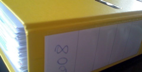
Here's another way you use time: When looking at something, you identify its relevancy by how old it looks. For example, the more yellowed a piece of paper is, the older it is, which may make it either more or less relevant to you, depending on what you're doing at the moment.

All humans constantly use temporal aspects when interacting with things. People are pretty good at thinking in the dimension of time. We can take advantage of this ability when designing human interfaces. Here are a few examples.
Ordering Items by Time
This is the simplest possible way we can take advantage of temporal organization: Simply let users sort their files by time. Here's an example of Mac OS X letting users sort files by their modification date:

Note how Mac OS X says "Yesterday". Computers love dates, but for humans, it's easier to think in time spans (a day ago, a last weekend, a few months ago, last year) than in precise dates.
This view has two advantages: It shows files people are more likely to be interested in at the top, and it lets users browse through files in a way which makes sense to them. Most people probably have a pretty good idea of the order in which they actually used files.
One problem with this view is that files are visually sitting next to each other regardless of how far apart their dates are. Another problem is that each file only appears once; if you've used a file a year ago, but again yesterday, only the more recent date will be visible
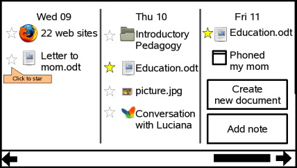
A possible solution to these issues would be to display all file accesses in a linear scale. live.gnome.org has a mockup of Gnome Journal which aims to provide such a file management system:
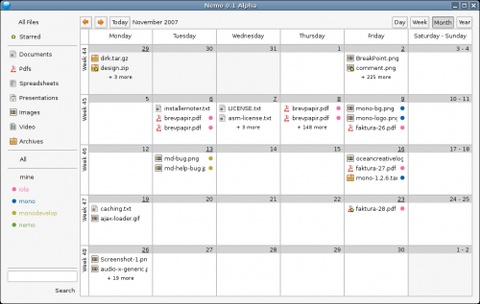
Another solution would be to show them in a calendar. Nemo does this:
If your application stores any kind of data, it's worth thinking about how you can show this data to your users in a time-based view.
Showing the Age of Things
Instead of providing a new time-based view, it's possible to incorporate temporal aspects into your existing views. This first example is from Microsoft's Canvas for OneNote which provides a spatial view of documents. By dragging the time slider at the bottom of the screen, different documents which match the selected time span are highlighted, while the other documents are dimmed out:
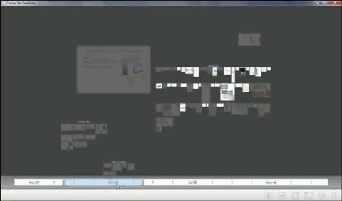
This way, users can access temporal information without leaving the spatial view.
Keith Lang points out another option: Files and folders themselves could show signs of aging, giving the user a more visceral idea of how old they are.

Chris Clark notes that an unintended side-effect of this could be that users would create new files and folders to replace (and thus "clean out") the "dirty" ones. This is actually one of the reasons why I went with a similar system in my employer's workflow management system. Part of what a workflow management system does is hand out tickets (or work items) to people. The system can show these tickets in various different ways, one of which is as actual images of tickets.
If our users get a list of tickets they have to handle, it's extremely useful for them to see which tickets are older and which are new. Tickets can be sorted by time, of course, but that doesn't really help, because such a list doesn't immediately tell you whether you got ten new tickets today, or whether you're looking at the same ten tickets you got a week ago.
To get around this problem, tickets age visually. New tickets look fresh, while older tickets become more yellowed and wrinkly:


In this particular case, Chris Clark's observation is a bonus, since we usually actually want people to handle older tickets first.
Conclusion
People think in time. Whenever possible, provide explicit temporal views of user's data, and incorporate time into other views. This helps people search for files, and puts currently visible files into a temporal context.
Whenever possible, use time spans and fuzzy dates like "yesterday" or "a year ago" instead of precise dates.
Updates
Keith Lang has more on the subject, including interesting mockups showing how Mac OS X's sorted-by-date file list could incorporate temporal aspects.
If you require a short url to link to this article, please use http://ignco.de/74

