Fun
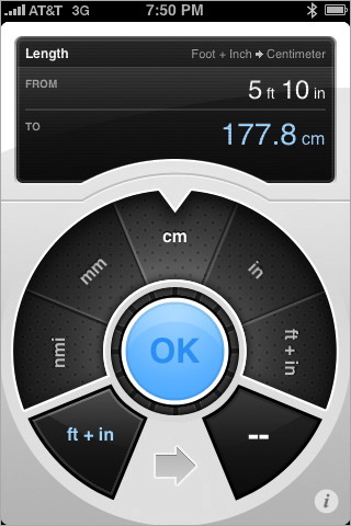
This is Convertbot:

It's a beautiful unit conversion application for the iPhone (iTunes Link, video of the user interface). Tapbots' user interface designer Mark Jardine recently explained his reasoning behind the Convertbot UI.
We've had a few complaints about [the 3-Step Unit Selection Process] and I knew this would be a an issue for some the moment I asked Paul to implement it. But I have good reason for it (in my opinion anyways) and I have no plans to change it. Our primary goal for Convertbot wasn't for it to be the most efficient unit conversion app there is. If that's what you are looking for, there are plenty of nice conversion apps that get you from point A to point B in the shortest amount of clicks. Our goal was to make unit conversions fun and enjoyable.
(...)
There is a slight learning curve in using Convertbot, but we don't see that as a bad thing. Our apps are designed more like a game. Whenever you play a new video game, you need a little time to learn how the game works and how it controls.
Chris Clark takes exception to this, writing:
Mark's stated goal with Convertbot had nothing to do with efficiency, and I can respect his single-minded drive, but I think it was the wrong choice.
Games are immersive and are played for great gobs of time, sometimes hours on end, where a one-time tutorial is fully justified. My favorite games are the ones where the learning is a natural part of the gameplay. But the casual use case – firing up an app once a week or once a month to figure out how many kilometers per hour you're doing on a California freeway (112, though it's more like 129 in practice) – seems utterly at odds with TapBots' design philosophy of immersive, game-like experiences. Casual and Immersive couldn't be at farther ends of the interface scale.
Chris is right. For most people, Convertbot won't be something they use daily. It'll be something they fire up occasionally. This will prevent most people from getting used to Convertbot's UI, which turns the application's learning curve into a problem.
More importantly, though, I think Mark's original article is based on a false dichotomy. He points out that the goal of Convertbot is to be fun, rather than efficient or easy to learn. But I don't think these two things are exclusive, and I doubt that having a more complex unit selection process makes the application more fun to use. In fact, I would assume that it makes the application less fun.1
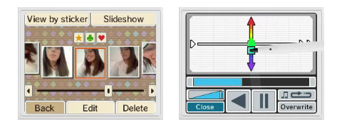
I've been playing around with Nintendo's new DSi, which contains a few new "utilitarian" applications, among them a camera application2 and a sound application. Both applications are very fun to use, but they're also extremely straightforward. Even though they offer some advanced features (such as morphing between faces in the camera application, and independently changing the pitch and speed of music in the sound application), there's little learning required, and all of the features are obvious and easily accessible.

These applications - as well as most games - aren't fun because their design ignores efficiency and learnability. They're fun because they embrace these concepts. Humans have fun when they feel in control, and they become frustrated when an application makes them feel stupid, when it makes them feel that they are not in control, when it makes them feel that they're forced to jump through unnecessary hoops.
Fun matters. Making an application fun is part of truly utilitarian interaction design. People are happier working with applications they feel good about.
But fun isn't something you can sprinkle on top of your application, or treat as an autonomous concept. Fun is a result of a usable design, not something that exists independently of it. People aren't having fun while they're frustrated by your application. When people feel in control - whether it is in an application or in a game - they have fun. Predictability, learnability, efficiency - those are all ingredients which are required for a fun application.
Fun and usability aren't enemies, they're two sides of the same coin. You can't have one without the other.
When designing your application, it's probably not a good idea to start out with the premise that you want to make the application "fun." It's better to start out with the premise that you want to empower the user, to give him or her a great experience with your application. Fun is a natural result of this.
-
Although I might be wrong in this particular case. To find out whether the application's unit selection process makes the application more fun to use, somebody would have to do user testing and measure the effects using tools my psychologist friends love, like PANAS scales and Likert scales. ↩︎
-
Which, by the way, has an awesome temporal calendar-based image browser. ↩︎
If you require a short url to link to this article, please use http://ignco.de/88


