Kindle International
Roughly two years after the original Kindle, Amazon has released an international version of its e-book reader last month. It's not a localized version of the device; it connects to Amazon.com instead of local versions of the site, and even then only allows access to a subset of the books available to US customers.1 It comes with a US plug; it's simple enough to charge it using an adapter (the Kindle accepts everything from 100 to 240V) or by plugging the USB cable into a computer. However, plugging it into an iPhone charger causes problems and should be avoided.2
Wireless works, but web browsing is disabled except for Wikipedia. Even the Kindle's predefined bookmarks can't be accessed, which is pretty disappointing.
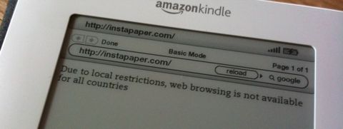
Instapaper at least offers a feature which allows you to receive articles via Amazon's document conversion service, but this is expensive, and there is currently no offline solution3. I would have written an application to synchronize articles to the Kindle myself, but Instapaper has no API. Fortunately, local download is coming.
Some news sites can be synchronized to the device using an application like Calibre. Wired has an article titled "How to Un-Cripple Your International Kindle" which has some additional ideas, but unfortunately doesn't really un-cripple very much. None of these solutions replace an actual working web browser.
Hardware
While the screen is a bit on the small side, the device itself is too big. It's impossible to comfortably hold it in one hand like you would hold a paperback. The screen is nice; it seems to be lower contrast than actual printed pages in a paper book, but it works well in both low-light and sunny situations. The buttons on the side of the device can only be pushed down on their inner edge, so you're less likely to accidentally push them when holding the device on its edge.
The keyboard is a bit of a mess. All keys look exactly the same and are arranged in a perfect pattern. Without reading the text on the buttons, it's almost impossible to figure out where exactly each letter is.
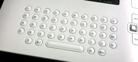
Even a simple change like marking "F" and "J" in some way would help users get their bearings more quickly.
Finally, since the international version of the Kindle is the same as the one sold in the US, this is obviously a keyboard with a US layout. The keys are arranged in a QWERTY layout, and as far as I can tell, it's not possible to enter umlauts, accented characters or similar non-US letters.
Home Screen
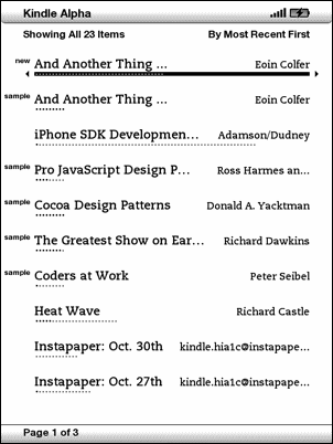
By default, the home screen is a linear list of books, sorted by last access.

This is almost never what I want. If I want to continue reading the book I was reading the last time I had the Kindle open, it's already open when I turn the device on. For books below the most recent three or four, the list becomes essentially random. There is no indication of time; perhaps I've last opened the book on the second screen yesterday, or perhaps a year ago. I'm essentially forced to read through the list until I find the book I want.
It's possible to sort the list by title or author, but that doesn't solve the problem; it just results in the same linear list with a different sort order.
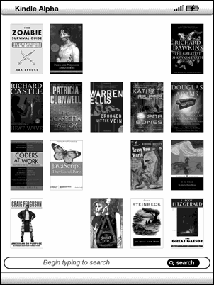
A more useful and beautiful home screen would show book covers, and let me manually arrange them the way I want.4 Here's a mockup showing how this might look:
This would allow me to see twice as many books as the linear list, yet would still allow me to reach each book on the screen with ten controller moves. And it would show the books where I expect them to be, instead of in random locations. Finally, the images would allow me to easily identify books; this would not force me to read through the list of book names to find the one I want.
Buying a book
Amazon allows users to download the first few pages of a book. On the final page of the book preview, you get this notice:
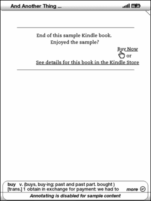
It even helpfully explains what "buying" actually means.5 Given how well this is integrated within the sample book, you'd expected that buying the book would replace the sample book with the full version, and send the reader right to the paragraph where the sample version ended. However, this is not the case. Clicking on "Buy Now" yields this screen:
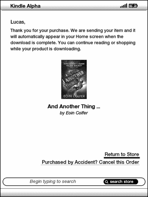
At this point, the default action is "Return to Store", which makes no sense at all, since I was never in the store to begin with. Eventually, the book shows up on the home screen, right next to its sample version; the small "new" tag on the left of the name is the only difference between the two books:
I'm sure this process could be greatly improved.
Unlike the Kindle DX, which is not yet available internationally, the plain old Kindle 2 doesn't support PDF files natively.6 Instead, you have to send your PDF files to Amazon, and they will convert them to a file you can put on your Kindle. This often doesn't work particularly well, and tends to mess with images. Here's an example PDF, and Amazon's converted version:
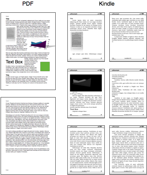
Amazon removed pretty much all of the layout. One image made it through the process okay, another one was messed up, and the green square disappeared altogether. "Text Box" now appears in the middle of a sentence.
It's a workable solution for some cases, but certainly not satisfactory.
Conclusion
While the Kindle is a neat device that does its job well enough most of the time, it is by no means the final word on e-book readers. Especially in the international market, the Kindle still leaves a lot to be desired.
-
More than half the books I was looking for were not available for the international Kindle. If you like to browse for books and read whatever strikes your fancy (and don't mind wading through lists that consist of 90% self-help drivel), the Kindle is great; however, if you typically want to buy specific books, chances are the selection on the Kindle is too small for you. ↩︎
-
At first, I thought my Kindle was broken. It was extremely sluggish, and text-to-speech didn't work properly. A bit of experimentation showed that using the iPhone charger to charge the Kindle had caused the issues. Christopher Phin found similar problems when trying to replicate the issue, so at this point, while in theory its power output should be okay, I would avoid using the iPhone charger to charge the Kindle (or, presumably, other non-iPhone devices which charge via USB). ↩︎
-
Update: There is now a way of downloading Instapaper articles to the Kindle. ↩︎
-
Greyscale images look quite beautiful on the device. Turning the Kindle off puts gorgeous pictures (mostly of authors) on its screen. There's even a picture viewer on the Kindle, although it's not enabled by default. ↩︎
-
Moving the Kindle's cursor shows definitions of the word below the cursor; since the cursor is on "buy" if you want to buy a book, the Kindle kindly explains what the word "buy" means. ↩︎
-
A software update has rectified this problem. The Kindle 2 can now display PDFs natively. ↩︎
If you require a short url to link to this article, please use http://ignco.de/212
