iPad Springboard Breaks Spatiality
When I wrote about spatial thinking, I pointed out that the iPhone does a really good job of presenting applications in a spatial way, and preserving their position. On Twitter, Bjango points out that the iPad breaks this.
Let's say you want to open the App Store on your iPad, and you know that you've put this icon at the bottom right of your apps. Turning the iPad rewraps the positions of your icons. The App Store now suddenly jumps to the middle of the second row:
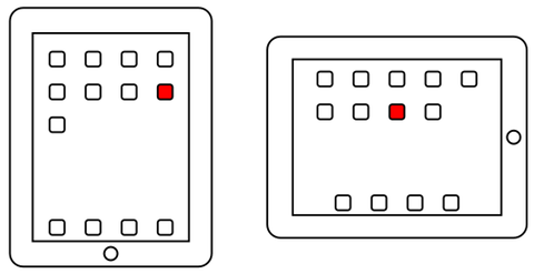
The App Store can no longer be found where you expect to find it.
I believe Apple is following its own Human Interface Guidelines a bit too closely here. Apple writes:
Users often rotate their devices to landscape orientation because they want to “see more.†If you respond by merely scaling up your content, you fail to meet users’ expectations. Instead, you should respond by rewrapping lines of text and, if necessary, rearranging the layout of the user interface so that more content fits on the screen.
While rewrapping is fine for text, it's not okay for things the user has intentionally arranged in a specific way. Instead, Apple should make sure that the arrangement is preserved. Since there is so much space between individual applications, this could possibly be achieved without shrinking the actual icons, simply by moving them closer to each other.
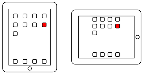
This way, the App Store icon would be the bottom right icon regardless of how the user holds the iPad.1
Some applications use the additional horizontal space to show more UI elements. There are several ways Apple could use the space here. For example, they could show old notifications. But I think a better idea would be to use the space to reinforce the spatial arrangement of apps, by showing some apps from the previous and next screens:
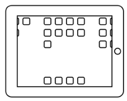
This would also serve as a subtle hint for new users, telling them that they can get to additional screens by swiping to the left or right.
Another solution would be to simply keep the applications positioned as they are, and only turn the actual icons and labels.
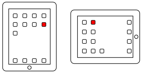
While the App Store is now no longer at the bottom right, it's still in the same position. What has changed is the user's perspective, not the arrangement of the icons. Humans are dealing with changing perspectives all the time and should still be able to identify individual applications based on their position.
-
Jason Alderman points out that the Android home screen preserves spatiality when changing screen orientation. ↩︎
If you require a short url to link to this article, please use http://ignco.de/266

