Numeric Keypads
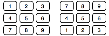
Chris Clark on which arrangement of keys works best for numeric keypads:
To this day we’re stuck with two numpad layouts that are incredibly similar, but just different enough to slow you down when you switch between them.
It's really hard to predict which of the two layouts work better for any particular application; people might expect to see one or the other, depending on the application's context, or even depending on whether they just used a PC keyboard or an ATM. I think this is a case where it might make sense to implement both, and do some A/B testing to measure how well the two perform. It's possible that one of the two is on average more efficient than the other.

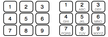
It might also make sense to see whether adding letters to the keys changes how users perform. Numeric keypads with a top-left-to-bottom-right key arrangement often have letters below each number; adding these letters might improve the affordance of the keypad, and help people immediately understand that they are using a keypad with this arrangement.

Of course, adding the letters could also be confusing, or distracting.
If you require a short url to link to this article, please use http://ignco.de/288


