The Strange Case of the TouchPad's Home Button
Here's something that happens to me all the time. I pick up my iPad and open Safari. I go to some blog and start reading.
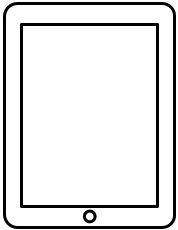
Then, the blog links to a video, so I turn my iPad to watch the video.
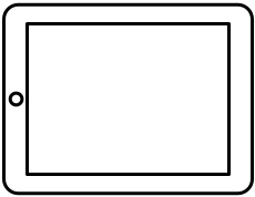
When I go back to the blog, I turn the iPad again.
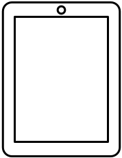
Now I'm done reading and want to play some Minotaur Rescue. Except that... between the time I picked up my iPad and now, the home button has magically disappeared! It is now suddenly at the top of the device, rather than where I expected it to be.
The Home Button Is Not Necessary
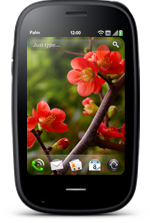
Devices like the iPad don't actually need a home button. The Palm Pre 2, for example, doesn't have one. Instead, it has a touch-sensitive area below the screen. Simply touching this area causes the Pre to jump to the "card view". Swipe up from the touchable area, and you get an app launcher.
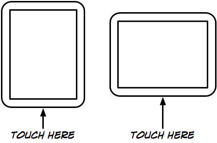
So when HP announced the TouchPad, their own webOS-based tablet device, it seemed obvious that it would not have the problem of the strangely disappearing home button. The solution seemed clear: make the whole bezel of the device touchable, but only make the bottom area (as determined by the orientation of the screen's content1) actually receive touches. That way, it wouldn't matter how you held the device; the bottom of the device would always be where you'd touch to go home.
This would also allow other neat gestures. For example, swipe in from the left or the right border to jump to the next or previous application without going through the card view.
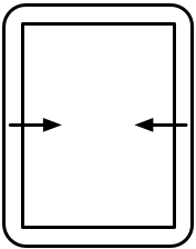
The touchable bezel would even be great for gaming, where you could interact with a game without covering the screen with your fingers.
Of course, there are disadvantages. If you don't have a home button, you can't use that button to wake the device. What's more, the TouchPad has a camera on the front, so you'd have to find a way to have both a camera as well as touch-sensitive areas. And then there's the danger of accidentally activating something by touching the device's bezel, though I think most people don't hold their tablets at the bottom. If accidental input really turns out to be a problem, the home button could be replaced by a small gesture, such as swiping up from the bottom bezel into the screen area.
And finally, a touchable bezel would be more expensive to produce than a simple button.
Snatching Defeat From the Jaws of Victory
HP apparently thinks that the disadvantages outweigh the advantages. The TouchPad has a physical home button, and sadly does not feature the Pre's touchable areas.2
(I should note that it is entirely possible that HP first went with the touchable bezel, did some user testing, and figured out that people found it confusing, couldn't remember how to use it, or had some other issue with it. So it's possible that I'm very wrong in thinking that a touchable bezel would work better than a physical home button.)
Update
The TouchPad actually lacks the familiar (and brilliant) Pre / Pixi ‘gesture area’, which lets you swipe left or right and up to respectably go forward or back in navigation or open the launcher for opening apps. Several employees familiar with the matter told me that in the development phase of the TouchPad, the gesture area (or having even four of them on each side of the screen) didn’t hold up as a usable solution.
(via cvaucher)
-
Clearly, when the device's screen content is oriented in one way, but the device itself is oriented in another way (for example, when the rotation lock is engaged), the screen content orientation should take precedence over the physical orientation when deciding where to put the "home area". Having the screen content oriented in one way but the touchable area in another would just be confusing. ↩︎
-
guywy notes that while the TouchPad won't have a touchable bezel, the BlackBerry PlayBook will. So we might soon find out how well the idea really works. ↩︎
If you require a short url to link to this article, please use http://ignco.de/346

