Gnome 3
Most open source products have rather horrible user interfaces. Very likely, this is because the people making the user interface decisions are the same ones writing the code. To them, obtuse user interfaces full of options and obscure features make perfect sense.
Some open source projects have noticed this issue, and are working hard to change it. One of these projects is Gnome. It seems their work is paying off; Gnome 3 looks pretty neat. Here are some of my favorite aspects of the new release.
Activities
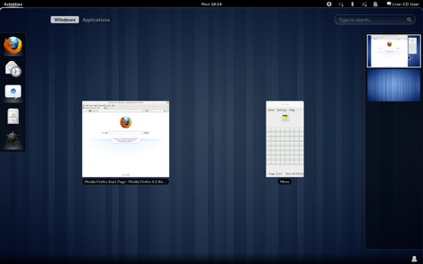
Clicking on "Activities" or moving the mouse to the top left screen corner switches Gnome into a mode that combines application launching with window and virtual desktop switching. Windows are zoomed down à la Exposé on Mac OS X.
Launching Applications
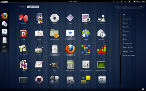
Clicking on "Applications" shows a simple grid view of your apps. It's possible to only show apps belonging to a specific category.
Search
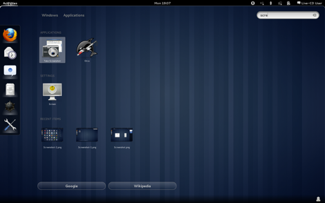
Type a search term, and Gnome 3 will show matching applications, files, and settings. From here, you can also directly jump to Google or Wikipedia.
Managing windows and launching applications has always been a weak spot of modern desktop operating systems. Fortunately, Gnome, Mac OS X, and Windows are all making strides towards solving the problem.
(Via Jochen Wolters. Ars Technica has more on the topic.)
If you require a short url to link to this article, please use http://ignco.de/351


