Windows Phone 7
If you take a look around the Internet, you'll be forgiven to think that nobody actually owns a WP7 phone. Microsoft's phone platform is practically invisible, despite selling reasonably well, and having high customer satisfaction numbers. One of the reasons for this discrepancy is that WP7 offers no way to take a screenshot. Sites like First & 20 could not exist for WP7.
Dear Microsoft. This stuff is really not rocket science. If you want people to talk about your platform, the first thing you do is to give them the opportunity to actually do so.
So this essay won't have many screenshots. With that out of the way, let's take a look at Windows Phone 7.
Synchronizing with Macs
I don't like iTunes. It does too much. I realize that it is hard for Apple to break up iTunes. What would you remove? If you put, say, the iTunes Store into its own application, wouldn't that make using the whole thing even more complicated, because now people would have to jump between two different applications to buy songs?
It's true that breaking up iTunes is not an easy task, but as it currently exists, iTunes is a mess. Apple could at least remove books and phone synchronization from the app. After all, there's precedent for this. Pictures aren't stored in iTunes, they're stored in iPhoto. Contacts aren't stored in iTunes, they're stored in Address Book. So why do books need to be stored in iTunes?
And since the synchronization part of iTunes already synchronizes things that aren't part of iTunes, why not put it into its own application, the way it used to be in earlier versions of Mac OS X?
At any rate, none of this is easy. Adding more applications may make the situation worse, rather than better, especially for new users.
But if you're using a WP7 phone, you're in luck: you don't have to wait for iTunes to launch just to synchronize your phone. The Windows Phone 7 Connector app launches a hell of a lot faster than iTunes. It also looks a lot cleaner, because it only does one thing: synchronize WP7 phones.
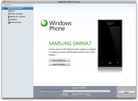
Of course, Windows Phone 7 Connector only offers a fraction of the features of its Windows counterpart,1 but it offers everything you really need.
At first, it would seem as if the lack of iTunes support for WP7 would be a disadvantage. I disagree. Not having to rely on iTunes for syncing is really, really nice.
Home Screen
Like Android, WP7 has two different ways of accessing apps. On Android, you can either use the five spatial Home Screens. They contain widgets, and a subset of your applications. Or you can switch to the Launcher, an alphabetical list of all of your apps.
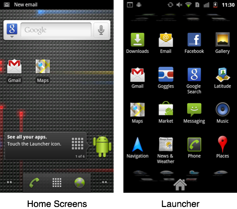
WP7 offers a similar solution. There's the Start Screen with the "Live Tiles". It contains a small list of apps you've pinned there. Swipe your finger to the left, and you'll find an alphabetical list of all of your installed applications.
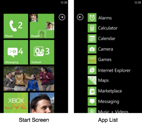
This solution feels more consistent and better thought out than Google's approach, but it also has disadvantages. It's not made for people who like to install hundreds of applications. Neither of the two WP7 screens are capable of managing too many apps, and it's not possible to search for installed apps.
WP7 is clearly not meant to be an iPhone-like app phone, where people collect and display apps as if their phones were tiny sports trophy cases.
The Home Button
You get to the Start Screen by pushing the phone's Windows button. Unlike the iPhone's home button, the Windows button is a truly idempotent reset button. It doesn't matter what you're currently doing, or how often you push the button; pushing the Windows button always resets the phone to the same known state. It always opens the Start Screen at the top scroll position.
Which is pretty cool.
If an iPhone user gets confused about what's going on, it's never quite clear how to get the phone back into its default state. If you've just opened a folder, the home button will close it. If you're in Springboard, but no folders are open, the home button will move you to the first screen. If you're on the first screen, it'll move you to the Search screen. And so on. The home button does different things, depending on the current state of your iPhone.
I love the idea of having a "panic button". If the people get confused, they can just push the panic button, and the phone will reset into a known state. WP7's Windows button does exactly that. The iPhone's home button doesn't.
The Other Two Buttons
Apart from the Windows button, WP7 phones have two additional hardware buttons: "back" and "search". Fortunately, WP7 avoids the absolute failure that is Android's menu button.

Of the two remaining buttons, "back" works great, while "search" is a bit of a mixed bag.
Let's look at "back" first. Apart from some exceptions (like the browser, where the physical back button takes the place of the browser's back button), animations indicate "back button checkpoints", so you always have a pretty good idea of where the back button will take you. Unlike on Android phones, you can go back into an app; so if you open an app, hit the Windows button, and hit "back", you're back inside the app. This is great, because it makes pushing the Windows button essentially undoable and thus non-destructive.
Being able to go back between applications also has another advantage. If you use a Twitter app on an iPhone, and you tap a link in a message, the Twitter app will typically open the link in its own WebKit view, not in Safari. Because if it opened Safari, it wouldn't be obvious to people how to get back to the Twitter app. WP7 doesn't have that issue. If you tap on a link in a Twitter app, it'll open the link in the Internet Explorer app. Hit "back", and you're back in the Twitter app.
This is a much better solution than iOS's "let's put a custom browser inside every app" solution. The WP7 browser always looks and works the same, always offers the same features, and always uses the same history, tabs, and bookmarks data.
Let's move on to the remaining hardware button.
The search button doesn't work quite as well as the back button, since it isn't supported consistently. Some apps just don't offer a search feature. If you hit "search" in those apps, Bing opens. This has probably caused some users to stop trusting the search button. As a result, many apps that do support the search button also have an on-screen search button which does the same thing.2
This is the problem with hardware buttons: they're there all the time. You can't turn them off, or otherwise indicate when they're active. So if a button only works in some situations, like the search button, or Android's menu button, people can't trust it.
Live Tiles
If you pin an app from the app list to the Start Screen, it'll turn into a tile. Some apps have tiles that can display information; those are called Live Tiles. It's a pretty cool concept. Done right, it allows you to get the information you need without even opening an app.
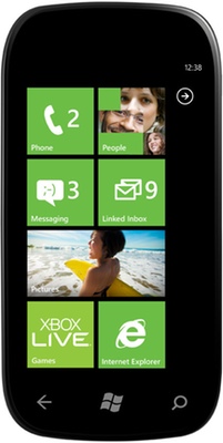
For example, the calendar app shows your next appointment right on its tile. The mail, phone, and text message apps show how many messages or calls you've received since you last opened them. Weather apps could use Live Tiles to show the current weather forecast, apps like Skype could show who's online, and RSS readers could show new headlines.
Live Tiles can be animated, but the animations typically happen rarely, and aren't too distracting. While I'm not too happy about needless animations, in this particular case, they don't seem particularly harmful, and they're confined to the Start Screen.
A few of the Live Tiles concepts carry over to the phone's lock screen, by the way. You don't need to unlock the phone to see your next appointment; it's right on the lock screen. While this could be a bit of a privacy issue, it's also really useful.
Notifications
It almost feels like WP7 doesn't have a real notification system. But even so, it's better than what iOS offers.
Basically, a WP7 alert is a rectangle that covers the upper part of your screen. Some of the rectangles have buttons (like "snooze" and "dismiss" for calendar reminders). Others don't; for those, just slide them out of the screen to get rid of them, tap them to jump into an application (if it's something like an alert for a text message), or wait a few seconds for it to disappear.
There doesn't seem to be any way to get a list of missed or old alerts. If you don't look at one before it disappears, it's gone.
What's more, these alerts sometimes cover user interface elements. If you get a text message while you're in the web browser, you can't tap on the address bar without first dismissing the text message's notification.
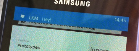
This is still an area where webOS is so far ahead of the competition, it's not even funny. Still, while notifications in WP7 aren't great, at least they're not modal popup windows.
App Design
WP7 does something pretty clever with applications. On most mobile systems, you drill down into an app. This paradigm exists on WP7 as well, but apps can also extend horizontally. Rather than drilling down, you scroll from screen to screen, accessing different areas of an application.
For example, in the Games app, you can switch between your collection of games, a list of news, information about your account, and friend requests by swiping through screens horizontally.
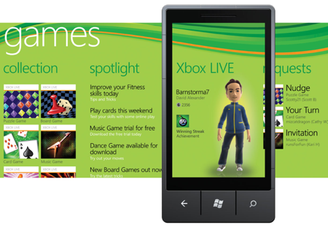
Here's how this works in a different app, Microsoft Office:
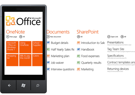
Some of the content of the next screen bleeds into the current screen, so you always know when this option is available to you. Once you reach the last screen, you wrap around the the first screen, something that confused me at first.
Generally, this system looks beautiful and works well. It means that the screen doesn't get cluttered by tabs, or other navigation elements.
WP7 generally does a good job of getting rid of these kinds of extraneous UI elements. Most apps use the whole screen for content. In fact, WP7 doesn't even show status icons like reception bars. You can turn them on temporarily, but they disappear after a few seconds. There is no chrome. There's just content.
The Hub Concept
Another neat concept found in WP7 is the idea of "hubs". A hub is an application that collects and displays information from different applications and services. For example, there's a People hub, which collects information about your contacts from Google, and from services like Facebook. There's a Pictures hub, which also ties into Facebook, and shows pictures your friends have uploaded.
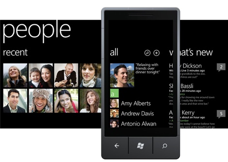
Applications can support these hubs. So a flickr app could use the Pictures hub to display its pictures (and register itself as an app that can share pictures, so that every other app potentially gains the ability to upload pictures to flickr).
In theory, this is a great idea. In practice, it doesn't really live up to its promise. Partly because few apps support it, and partly because the apps that do support it do so poorly.
For example, there's a "Music + Videos" hub, and I want this hub to contain my podcasts. I also want an app on my WP7 phone that downloads podcasts directly, because the idea of first downloading podcasts on my Mac and then synchronizing them to my WP7 phone seems like a ludicrous waste of time.
So I found an app which downloads podcasts, and ostensibly ties into the Music hub. However, the way it does this is mainly by putting its name into the Music hub. So I can open the Music hub and tap the podcasts app's name, but then I'm taken out of the Music hub, and into the podcasts app. The downloaded podcast episodes do show up in the Music hub, but again, if I actually want to listen to one of them and tap it, it doesn't play right within the Music hub. Instead, the podcasts app starts and plays the episode. Which isn't merely confusing, it also doesn't really work, because there's no multitasking in WP7. So when I quit the podcasts app to, say, write a text message, the podcast episode stops playing.
Another issue with the hub idea is that it's unclear to me where my data is actually stored. If I download a podcast episode with an app, and then delete the app, will the episode be deleted from the hub? Where do I have to go in order to delete things?
It's also not clear to me if I'm accidentally sharing things. For example, the people hub collects data from services like Facebook, Google, and Windows Live. Which is awesome, because it means that the information is always current. But what happens if I replace a contact's image (that was taken from her Facebook account) with a picture I've taken? Will that picture now be synchronized with Facebook? If a contact's notes were taken from the Google account and I change those notes, will they be synchronized back to Google? And where can I set whether they will or won't be?
The hub system is a great idea. If done correctly and supported well enough by large enough number of apps, it'll be great, and vastly superior to iOS's idea of app silos, where every app is stuck inside its own sandbox and can't communicate with anything else. But the way hubs exist right now, they're a mess.
Built-In Apps
A lot of the built-in apps seem kind of half-baked. There's tons of tiny things that just don't seem quite right. For example, when you start to write a text message, then go back into the conversations list view, and then go to the edit view again, the text of your message is gone without any warning.
Tapping on the same thing can produce different effects, depending on where exactly you tap it. In the mail app's list view, tapping the left-hand side of a message makes a checkbox with a checkmark appear. This allows you to select several messages at the same time. Tapping anywhere else opens the message. This feels slightly awkward, and I often accidentally check a message when I want to open it. Of course, this might be something I'll eventually get used to.
I also have problems with my Google Calendar account. WP7 manages to download updates to my schedule just fine, but if I make changes on the phone, they never get synchronized back up. And while I'm on the topic of calendars, it doesn't seem to be possible to synchronize calendars automatically, but synchronize mail manually. You get one setting for each account, rather than individual settings for the individual services of each account.
The calendar app itself doesn't offer a view that really suits me. There's no weekly view, only a monthly view and a daily view (though the zooming animation from monthly to daily is pretty cool). The monthly view doesn't tell me much, and the daily view uses too much room to display hours where I'm not doing anything. There's also an agenda view, which shows all appointments as a list, but what I really want is some non-linear view of my day. Something like what webOS does, a view that shows both my appointments and my free time, but doesn't take up too much empty space for the free time.
Entering new appointments takes a lot less time than on iOS (where entering new appointments is just ridiculous), but again, it's not as neat and efficient as webOS.
Many apps use floppy disk icons for the "save" button. I don't really mind using that icon, but it does seem slightly out of place on an operating system that was released in 2010, especially since it seems completely unnecessary. In its place, something like a check mark would likely have worked just as well.
The web browser3 also has some weird icon issues. The middle icon shows a star. In most apps I know, a button with a star actually stars something. So I expected that button to add the page to my favorites. It doesn't. Instead, it opens the favorites. The button which adds pages to the favorites is a star with a small plus sign.

While I'm on the topic of the button bar: many applications have such a button bar. On the very right edge, it has an ellipsis. But tapping the ellipsis doesn't always do the same thing. Sometimes, it shows labels for the buttons. Other times, it shows labels for the buttons and additional, hidden commands. I'm not entirely sure what to think of this. I acknowledge that it's useful to be able to show button labels, but if that option did not exist, then the ellipsis would always indicate that an application had additional commands. As it is now, you don't know what the ellipsis does, and you don't know if the app has more commands, until you try tapping it.
The Maps app is rather horrible. For example, it has a search feature, but hitting the hardware search button won't activate it. Instead, it'll pull you out of Maps and bring you to Bing.
What's worse, the maps are nowhere near as good as Google's, at least in Switzerland. Good luck searching for all restaurants near your current location. In fact, good luck even figuring out the name of the street you're currently standing in; in the Maps view, only larger streets are labeled.
Dear Microsoft, this is not a good experience. It's stressful, and it's stressful exactly when your users are already stressed out because they're lost, perhaps in a foreign city, perhaps in a place where they don't speak the local language. This is the kind of situation where you can turn your users into your biggest fans, or into your worst enemies. Get it right.
Most of the time, WP7 does a pretty good job using animations appropriately. They're typically used to guide people through the system, and reinforce correct mental models (for example, to indicate places a back button will take you to). Some of the animations are a bit overdone, but generally, they work well.
There are, however, many instances of small, needless animations. For example, touching the address bar in the browser will make it slide out of the screen, and slide back in. Why? I have no idea. If you don't believe me (and I wouldn't blame you, because it sounds kind of crazy), here's proof:
Another somewhat strange animation occurs when you drag a list further than it can go. On iOS, it simply jumps back, as if it was attached to a spring. On WP7, the icons are actually squeezed, which is okay. But the squeezing happens everywhere on the screen uniformly. Everything gets squeezed. In the real world, only the stuff between your finger and the edge of the screen you're dragging towards would get squeezed. So WP7's squeezing feels odd. It breaks the user's suspension of disbelief.
Third-Party Apps
People creating iOS apps had a huge advantage. By March 2008, when they finally got the iOS SDK, most of them had been using an iPhone for almost a year. Months of experience using Apple's apps had made it easy for them to design apps that followed Apple's design philosophy. Immediately, they were able to create apps that fit right in on the iPhone.
WP7 developers don't have that advantage. In fact, looking at many WP7 apps, you'd think that these people were designing apps for the iPhone, and accidentally releasing them on the wrong platform. Many WP7 apps don't make use of WP7's horizontal scrolling paradigm, instead opting for iOS's list view drilldown philosophy of app design. Many apps don't support Microsoft's hubs properly, instead opting for Apple's "each app is a silo" approach to handling data.
Which is sad.
But apart from these problems, there are other issues with third-party apps on WP7.
Scrolling often doesn't work properly when the keyboard is shown. Some of the screen's content remains hidden behind the keyboard. iOS apps sometimes also exhibit this issue, but (it seems to me) less often.
There's no multitasking. If you start downloading a podcast in your podcasting client, and switch away to the web browser, your download stops, or is discarded altogether.
Many apps don't offer ad-free, for-pay versions. This is probably okay for many people, but I just don't want apps with ads on my phone. I'd rather pay a few bucks than look at an ad every time I want to know next week's weather.
Performance (including launch performance for games) is generally okay, except for scrolling. There are many scroll views that are jerky. This shouldn't happen. Smooth scrolling is important. It makes applications feel like real, touchable, physical things, rather than glowing pixels on a screen.
Lots of apps seem crashy. This used to be a problem on iOS, but I'm seeing app crashes on my iPhone a lot less than I did a few years ago. It's probably something that will sort itself out once WP7 apps become more mature, but for now, it's not good.
What is good, however, is that there are demos for all apps. When people talk about the possibility of having demos on iOS devices, the response is often along the lines of "these apps cost a few bucks. Your phone probably cost hundreds of dollars. Surely, you don't need to try a demo of each app just to make sure that you're not wasting a buck?"
This argument makes some sense, until you think of a concrete scenario. Let's say you're looking for a weather app. There are quite a few of those on iOS. So which one should you pick? Should you download all of them and keep the one you like best? Suddenly, that doesn't cost just a few bucks anymore. Now, it costs something like 50 bucks to find a weather app. That's why demos are important.
Keyboard
I really like the WP7 keyboard. In fact, I think it's better than the iPhone's. It does all of the behind-the-scenes things virtual keyboards are supposed to do: auto-correction, dynamic key resizing, support for different languages, multitouch, and so on.
And it does a bunch of additional things. For example, punctuation keys sound different from regular keys, and it makes yet another sound if it auto-corrects a word. So you don't have to keep looking at the text, you can keep your eyes on the keyboard. If WP7 changes a word and you have to make sure it actually did the right thing, it'll tell you.
Auto-correction feels less aggressive than the iPhone version, which is nice. It doesn't seem to have the iPhone's duck problem at all. And if auto-correction does get something wrong, replacing the word is an action that is almost instantaneous. On an iPhone, replacing a word requires the following steps:
- Double-tap the word.
- Select "Replace".
- Select the word.
It's only three steps, but they all require you to hit rather small targets, and for some reason, the iPhone tends to respond quite sluggishly to these particular actions.4 The whole thing typically takes a few seconds.
On WP7, you just touch the word (no double-tapping required), and then touch the replacement word. It's instantaneous. There's no lag. It takes less than a second.
Even better, you can manually force WP7 to learn words. Just tap the replaced word, and tap the "+" entry in the word list to add it to the dictionary.
There's one glaringly obvious problem with the keyboard, though: it doesn't always appear in the same place. Sometimes, the keyboard is aligned with the bottom edge of the screen (like in the Bing app). But some applications put buttons there (like the text messaging app); in those cases, the keyboard appears above the buttons.
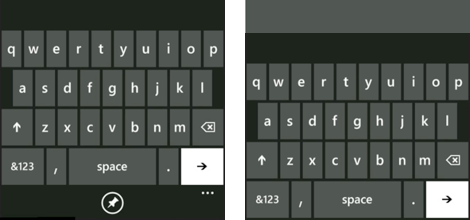
This completely screws up my muscle memory. Suddenly, none of the keys are where my fingers expect them to be. What's worse, WP7 puts potentially destructive buttons where benign buttons used to be. So instead of hitting the space key, I'm now hitting the "Send" button. This is another one of these "how did people ever think this was a good idea?" moments. Of course it's hard to find a place to put these buttons. But that doesn't mean it's okay to screw up the keyboard!
Text Selection, Copy & Paste
While we're on the topic of text, WP7 is also pretty good at text selection, and copy and paste.
Moving the caret works similarly to iOS, but instead of a loupe, a text insertion point indicator appears above the finger. When you let go of the screen, the caret is moved to where the indicator was.
Selecting text on iOS seems slightly nondeterministic. After an arbitrary amount of tapping on text, you eventually get the text selection handles. It's easier on WP7: touch a word. The word is selected, and the text selection handles are right there. This makes it harder to get rid of the selection, because tapping somewhere else will just move the selection, but that's probably only an issue for a certain type of user. Other than that, it works really well.
When text is selected, a copy button appears on screen. Tap it to copy text.
Unlike on iOS, the paste button is tucked away in the "replacement words" panel above the keyboard. Again, this works well.
Hardware
I bought a Samsung Omnia 7. I generally like Samsung. To me, Samsung feels like Sony felt in the 80s: they make solid, generally well-designed products at acceptable prices. The Omnia 7 is probably not one of these.
Let's start out with the good parts. The Omnia 7 has some really neat features that I wish the iPhone had. For example, there's a little sliding door that covers the USB port. So when it's sitting in my pocket, the Omnia's port doesn't collect any pocket lint, unlike my iPhone's.
It also has a dedicated camera button. This is neat because when the phone is locked, I can just hold the phone button, and it'll go directly into a "take pictures" mode. No need to unlock the phone and search the Camera app (though weirdly, the feature doesn't always work).
During my usage, the battery easily lasted a day, but never two. Of course, if you're a heavy user, you can buy a second battery.
I also like the phone's form factor. It's essentially a flat piece of glass. That's how phones are supposed to look.
Let's talk about the things that aren't so great.
The screen is big and bright. This is good. But it's also a PenTile OLED screen. Which is horrible.
Something else I don't like is how the power and volume buttons are arranged: They're on opposite sides of the phone. Which means that it's impossible to press the power button without also changing the volume. If you press the power button, you're squeezing the phone, thus pushing on the "volume up" button.
The capacitive buttons are also a really, really bad idea. Seriously, I thought we had all agreed not to do that around 2003. It's such an obviously bad idea that it's hard to imagine how it found its way into the final product. Did they never play a game in landscape mode, and accidentally back out of the whole game by merely holding the device wrong?
The camera itself is kind of poor. Pictures are often blurry, the flash turns on even in situations where it shouldn't be required, and it almost always overexposes images. Turning it off doesn't stick; the next time you open the camera app, it's turned right back on. And finally, the camera is too slow. Focusing takes seconds. It really, really shouldn't.
There's no mute switch. This should be an obvious feature for a mobile phone. There's also no "you received a text message or missed a call while you were away" notification LED, something the iPhone unfortunately also lacks.
Oh, and yes: my Omnia 7's bootloader has a bug. Which prevents the phone from going into the mode required to install software updates. Which means that the phone will never receive an update. Yes, the problem can be fixed. It requires a hardware solution. Seriously, how did something like this ever make it through quality control? Does Samsung even have quality control? It's completely ridiculous.
Which OS Wins?
About a year back, I switched to a Palm Prē for a few months. I love webOS. In many ways, it is better than iOS. Going back to the iPhone was painful. The iPhone's notification system felt intrusive and rude, and the multitasking system (or lack thereof) felt awkward and limiting. Palm's designers, having had the advantage of seeing how people reacted to iOS, managed to fix a lot of the things Apple didn't get right, and since they could incorporate things like multitasking right from the get-go, it all feels consistent.
Double-tapping the home button to get a row of recently used apps on the iPhone feels tacked on. Hitting the Prē's button to zoom out and see all active apps just feels right, like it was meant to be that way.
I also really love having a physical keyboard. If you regularly write text in a language that has no formal spelling rules, virtual keyboards just don't work.
And yet, going back to my iPhone 4 was really a no-brainer. The Palm Prē was woefully underpowered, its screen felt too small, and most importantly, it didn't have the iPhone's ecosystem of applications.
Now that I've used a WP7 phone for a few weeks, I'm asking myself the same question: should I go back to my iPhone? After looking at the clean, ascetic visual language of WP7 for such a long time, iOS suddenly seems garish, overdone, and kind of ugly. Looking at iOS 4 feels like looking at a screenshot of a pinstriped Mac OS X Cheetah from 2001.5 So I really don't particularly want to go back to that.
Two of the issues I had with the Palm Prē don't apply to my WP7 phone: speed and screen size. WP7 runs great on my phone. Scrolling feels smooth in almost all cases,6 apps launch instantly. It's usually about as responsive as my iPhone. And the screen isn't small; in fact, it's larger than the iPhone's screen. It makes the iPhone's screen look positively tiny in comparison.
But there's still the ecosystem issue.
WP7 is doing quite well when it comes to games. It's not surprising; many Xbox titles have companion titles on WP7. But for other things, it doesn't look too great. There's no timetable app for the Swiss train system. The timetable website works on WP7's Internet Explorer, but not well. There's no Audible app. One might be coming at some point, but there's no official word from Audible. There's no good podcast downloading app. There's no really great Instapaper app. Soulver, Tweetbot, Kinetic, TaskPaper, Screens, Prompt: none of these apps exist for WP7.7
Some of these issues will eventually be fixed. The next WP7 update, Mango, may introduce native support for downloading podcasts directly. And Audible will probably do a WP7 app sooner or later. But right now, these things don't exist.
I'm still not sure what to do. Maybe I'll just give Android or webOS another try.
At any rate, it's good to see another serious entry in the mobile phone market. We now have three mobile operating systems that have a heavy focus on a great user experience, have a strong, consistent, thoughtful design language, and are generally just designed well: Windows Phone 7, webOS, and iOS.8
This is good news for everybody.
-
Which looks awesome, but I haven't used it enough to comment on it. ↩︎
-
Apparently, in Mango, the search button will always open Bing. Native apps will get an on-screen search button. This fixes the problem, but makes me wonder what use the hardware search button still has. ↩︎
-
Whose rendering engine is based on an older version of IE, but is otherwise a really competent mobile browser. ↩︎
-
As Kelsey Higham notes, if you notice a false correction immediately, you can hit delete, wait for the popup to appear, and replace the word with the one you actually typed with one tap. ↩︎
-
In fact, just like Mac OS slowly moved away from garish things like pinstripes and candy buttons to a more subdued appearance, so will iOS. Windows Phone 7 is at the extreme end of this spectrum. During the next decade, iOS will probably slowly move towards a more "Metro" look. ↩︎
-
Except for some third-party apps, as mentioned above. ↩︎
-
Justin Williams lists some of the great apps that do exist for WP7. ↩︎
-
In order of how much I like them. ↩︎
If you require a short url to link to this article, please use http://ignco.de/363

