Invisible Scrollbars
In Lion, Apple has replaced the regular old scrollbars with iOS-like scrollbars. Most of the time, they're invisible. This means that you're missing out on some information you used to see. Most importantly, it's not always obvious if you can scroll at all.
Jon Whipple proposes adding a small "compass" to each window, indicating what direction you can scroll in. This would solve the problem, but as John Gruber notes, "an abstract indicator — no matter how small and unobtrusive — is still another layer of abstraction."
Fortunately, if you're developing software for the Mac and want to fix this problem for your users without showing scrollbars at all times,1 it's pretty easy to do so. Look at how a Pages window looks in Lion:
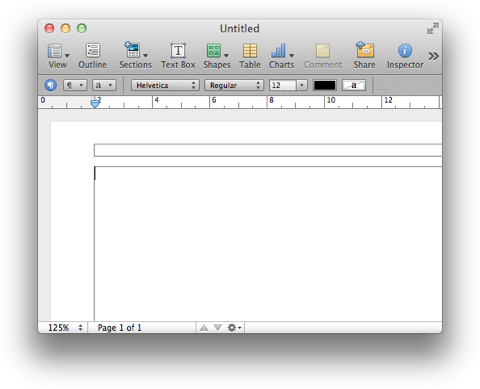
Even though there are no scrollbars, the page borders allow you to see that you can scroll.
This doesn't just work for windows that contain individual pages; if you're willing to sacrifice a few pixels of your window content, you can add this affordance to any window.
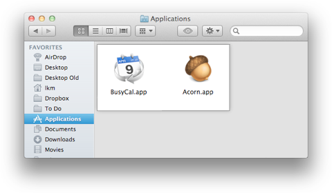
Here's how this might look in the Finder. First, a Finder window where everything is visible, and scrolling isn't possible.2
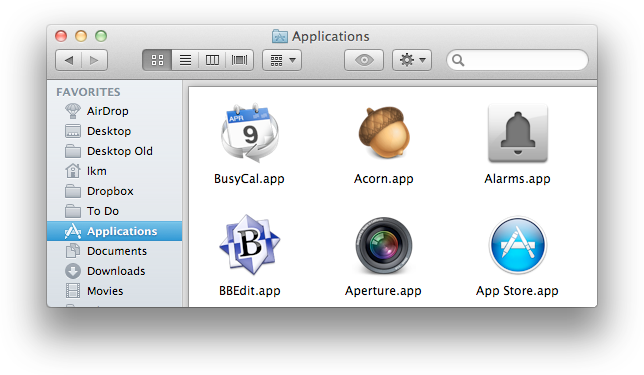
And now a window where some content is hidden and can be accessed by scrolling.

This won't work well in all applications, and it doesn't solve all problems. But it does solve the most important one: it makes it clear whether there's more content hidden beyond the window border.
James Russell offers a similar solution.
Given the drawbacks of the current situation, I'm wondering whether it would have been better for Apple to do something along the lines of what Ubuntu is doing, rather than just moving the iOS scrollbars to the Mac. Apparently, the new Ubuntu scrollbars did well in user tests.
-
Why not just show them all the time? That would work. But given that Apple has essentially deprecated scrollbars, your application will soon look "old", compared to apps that don't show the scrollbars. ↩︎
-
In this particular case, it might be better to expand the "page" to the scrollable area's border, so people understand that they can drag icons to the whole window, and not just to the "page" area. ↩︎
If you require a short url to link to this article, please use http://ignco.de/400


