The Growing User and the Perennial Beginner
When you read a lot about UI design, sooner or later, you'll encounter two goals that seem at odds. The first goal is simplicity. In Getting Real, the guys at 37signals put it like this:
Take whatever you think your product should be and cut it in half. Pare features down until you're left with only the most essential ones. Then do it again.
The second goal is depth. It's explained by Bruce Tognazzini in his essay on Apple's flatland aesthetic:
Properly-designed interfaces scale, so that they support the new user as well as the expert.
As you gain more experience with an application, you access more of its depth.
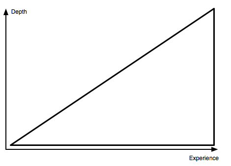
The two goals — simplicity and depth — are at odds. Adding depth also adds complexity. So, what should you do? Go for depth, or go for simplicity?
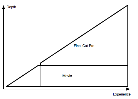
Look at something like iMovie. It doesn't offer much depth, and it doesn't need to. Why? Most of its users are perennial beginners. They use iMovie to cut holiday movies. How often do they need to do that? Maybe twice a year. So every time they fire up iMovie, they essentially start as beginners.
Now compare this to Final Cut Pro. There's a lot of depth there, and its users need it. Why? It's used by professionals. People who spend all of their day inside this one application. They learn how to use it, and they get better with time. Their knowledge grows, and as it does, they access more of the application's depth.
There's very little depth to iMovie, and once people understand the basics, they don't get much better. But the basics are reasonably easy to learn.
There's very much depth to Final Cut Pro, but it's much harder to figure out how to use it; it offers more to its users, but it also requires them to bring some experience to the table.
Together, the two applications cover the whole user base.
But couldn't you create an application that, by itself, covers all users? In some cases, yes. But it's hard, and the results are often not particularly compelling. Consider word processing. At the very low end, you have something like Apple's Text Edit, which only offers very few features, but can be used without any experience. A little bit up the chain, there's Pages, which requires some experience, but also offers some room for growth. At the very high end, you have something like DocBook, which requires a tremendous amount of investment, but in return offers incredible depth.
Microsoft Word attempts to cover the whole user base. It's trying to be welcoming to new users, while at the same time offering all the depth required by professional users.
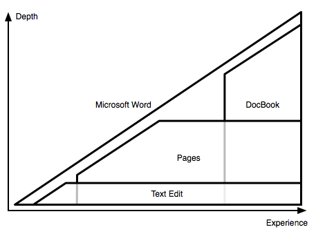
Even though Word does a pretty good job, it's still a product that very few people really love. Covering the whole user base is hard, and in the best case, you'll probably create a product that can be made to work for everybody, but isn't loved by anybody.
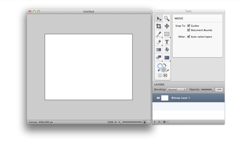
What does this mean for you? You need to decide where your product belongs. For an example, look at Acorn and Pixelmator. Ostensibly, they're very similar applications. Both are pixel-based picture editors running on Mac OS X. Both support filters and layers. Both offer similar tools: a drawing tool, a cropping tool, a select tool, and so on.
But when you look a bit more closely, you'll notice that they are actually very different. Acorn looks simple. This is Acorn:
Pixelmator, on the other hand, looks a bit like Photoshop. This is Pixelmator:
![]()
There's a reason for this difference.
Gus Mueller, Acorn's developer, writes:
Acorn is for people who want to quickly touch up or adjust their photos for when iPhoto isn't cutting it. Yes, it is going to be slow with your 21 megapixel RAW image created on your professional grade Canon 5D Mark II. Acorn isn't optimized for that case and if you own a $3,000 camera, you probably already have Photoshop. Use that. But if you have a point and click camera without some insane resolution- then you're probably going to be happy with Acorn.
Pixelmator, on the other hand, has a very different goal. On its website, it is described like this:
Pixelmator, the beautifully designed, easy-to-use, fast and powerful image editor for Mac OS X has everything you need to create, edit and enhance your images.
It's "fast and powerful" and has "everything you need to create, edit and enhance your images". In other words, Pixelmator is going for a more advanced audience than Acorn. Pixelmator's developers are going for the high end, for the people who want a replacement for Photoshop, and already have some experience with an application like Photoshop.
![]()
Acorn and Pixelmator do very similar things, but they aim to cover very different areas of the user base. As a result, they are very different applications.
In other words, who you decide your audience is matters.
Of course, some apps don't give you a choice. There's only going to be one version of Skype, only one Gmail, only one Amazon.com. And this one version has to work for everybody. But unless you have to, you probably don't want to cover the whole growth curve of every possible user of your product.
How you balance simplicity and depth depends on who you want your audience to be.
This essay was originally planned as a chapter of my book. It was cut when I went through the whole book, and removed everything that didn't offer any immediately applicable, concrete piece of information, tip, or technique. But I still think it's interesting, so I've published it here.
If you require a short url to link to this article, please use http://ignco.de/379

