Yosemite's Visual Design
My biggest complaint, personally, is that this fresh coat of paint does a poor job on visual contrast. Interface elements are often so light in color and/or so close to one another in color that they “bleed†into each other all the time. The effect is a blown-out look, as if a novice photographer stepped up the exposure on her camera well beyond advisability. In previous versions of OS X, it was common to use dark, sometimes hard edges to help delineate where one piece of UI ends and another one begins. Apple’s designers have seemingly restricted themselves from employing that very basic technique throughout Yosemite, or at least have sought to dial back its use significantly.
Some UI elements, particularly windows, feel washed out and vague. The problem is particularly egregious on non-retina displays, but it also exists on retina displays. Yosemite needs a lot more contrast in some areas.
In other areas, there's too much contrast. One problem I have is that it is difficult to see where the focus is, since there's so much saturated blue in the UI. Look at this screenshot, with all of its competing blue areas. Where's the focus?
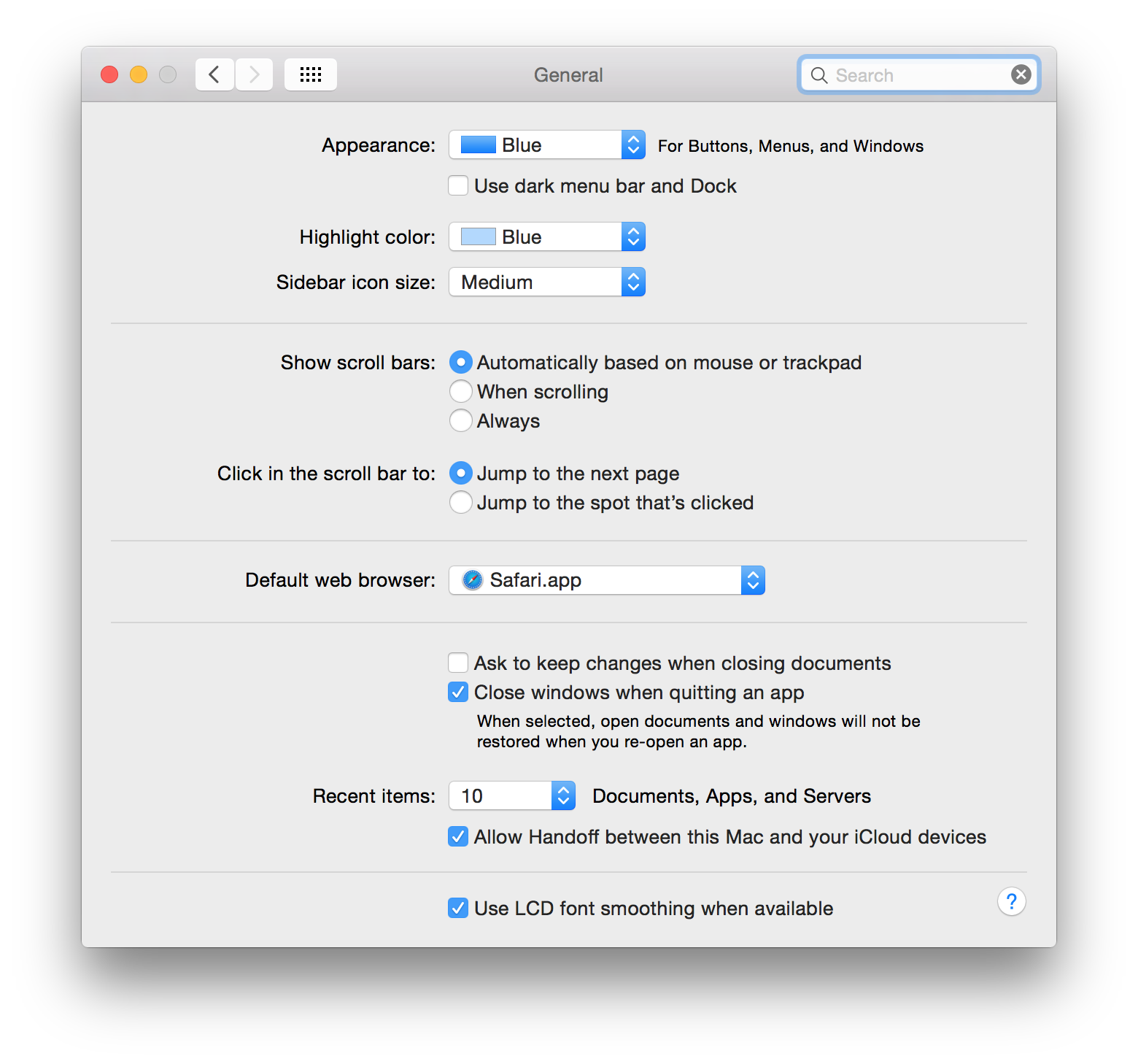
It's in the search field, but there's a lot of blue to go through until you find the one you're looking for.
While not perfect by a long shot, the difference between a normal UI element and an active one was more obvious in earlier versions of OS X.
Translucency
I do want to push back a bit on one particular bit of criticism: the translucency. I've seen a number of people complain about Yosemite's inconsistent application of translucency. You see through some windows sometimes, but not always, and some windows behind other windows are not taken into account when drawing the translucent areas.
I think these complaints are missing the point.
This is not about the physics of light. It's not about how windows are stacked. It's not even really about translucency. This is about personalization.
I don't think it's a coincidence that Apple is running an ad showing how people personalize their Macs.
Personalization is important. All the way back to early Macs, Apple allowed users to personalize their computers. Here's a screenshot of System 7's Color control panel that allowed you to change the color of your windows.
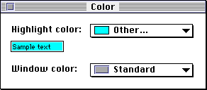
Yep, changing the color of your windows was a thing Apple allowed you to do back then. Meanwhile, today's Mac don't allow you to customize a whole lot of their user interface. You can change the desktop background, but that's about it. And changing the desktop background is uniquely pointless, since you're always covering it up with windows. You never actually see it!
Apple's translucency fixes that. This is not about seeing through your windows. This is about personalizing your computer. Yosemite's translucency allows you to see a bit of the color of your desktop background, for the first time giving the desktop background an actual point.
Here's a screenshot from Apple's website that shows how translucency allows the calendar app to take on a bit of the color from the desktop:
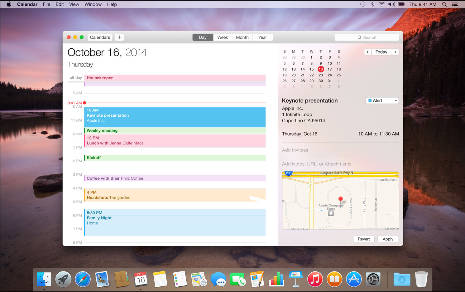
This is not there so you can see what's behind the window. This is there so the calendar looks like your calendar, not just like any calendar. You like red? Cool, use a red desktop background, and your Mac's user interface takes on a red hue.1
All in all, this feels a bit like what happened to Windows 8, but on a smaller scale. It's a step in the right direction, but it has lots of poorly executed, poorly thought through details. Still, between the two, it's hard to deny that Windows 8 is the more daring, more interesting take on what a modern desktop operating system should be.
Yosemite's Finder is still the same basic Finder Apple shipped in the first Mac. The world has changed around the Mac, but the Mac has remained the same.
Perhaps now that Apple has rethought the visual design of OS X, it's time to also rethink its functionality on a more basic level.
-
I think the blurring is strong enough that this doesn't really cause any readability issues, by the way. Apple really got it right on their first try this time, unlike some earlier attempts at incorporating transparency into OS X. ↩︎
If you require a short url to link to this article, please use http://ignco.de/617

