Ephemeral Undo
Undo on mobile devices has always been problematic. Shake to undo never really worked well, and most mobile apps don't have a permanent menu bar where they can stick an undo icon.
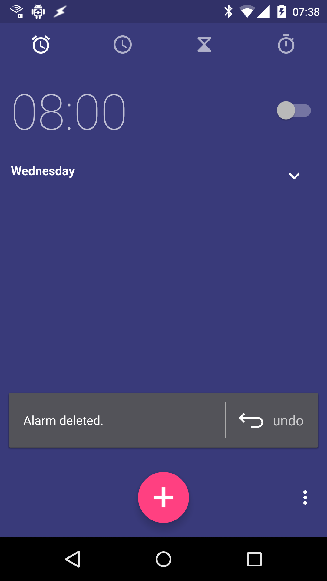
In Android, Google has started using a kind of ephemeral undo. When you execute an action that can be undone, Android temporarily shows an undo button. Here's what you see when you delete an alarm in the Clock app:

If you want to undo the action, you can tap on the button.
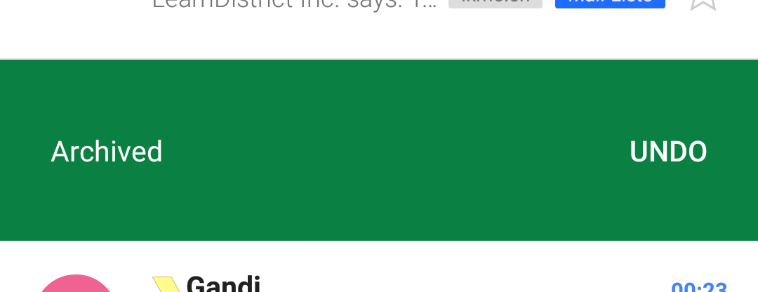
The Mail app works in a similar fashion. Archive a message, and it gets replaced by an undo button:

I think this works well for applications that don't have a single, well-defined undo stack (e.g. a text editor or an image editor).
However, Google's specific implementation of the feature effectively breaks undo for me. The problem is that these undo buttons can easily be dismissed. Tap anywhere outside of the Clock app's undo button, and it disappears. Scroll the list of messages in the Mail app, and the undo button is removed. Pretty quickly, this behavior has trained me to automatically tap outside of the undo button immediately after removing an alarm, and to automatically scroll my messages immediately after archiving a message. Archiving a message and removing the undo button has become one single, seamless, automatic action for me.
As a result, undo now effectively does not exist for me anymore.1
I'm not entirely sure what has caused me to develop this behavior. Perhaps it's because the undo buttons look so out of place, and just tempt you to get rid of them. Or perhaps it's because it feels like the action hasn't been concluded properly as long as there is still a visible undo button. Perhaps it's similar to the common behavior of automatically dismissing modal error or confirmation dialogs as soon as they pop up.
Whatever the reason, I wish Google would change the behavior, and either remove the undo button after a preset timeout, or only remove the previous undo button once the next undoable action is triggered.
-
Update: I'm now intentionally trying to retrain myself, and stop myself from getting rid of the undo popup. I've had some success doing that, but it really shouldn't be necessary for me to do this. ↩︎
If you require a short url to link to this article, please use http://ignco.de/718


