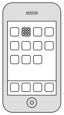
iPhone OS 4.0
Apple has recently previewed iPhone OS 4.0. It contains a number of interesting new features, most notably folders, and services which allow applications to execute some simple tasks while not actively running in the foreground.
I Like the Folders
I know I complained about folders earlier, but I think Apple's implementation of folders in 4.0 is really well done. Hierarchies are typically a bad idea because they make things invisible. People forget or do not understand where they put their items, and can't easily find them. Apple's implementation solves this problem by doing two things:
- Apple's folders show their contents
- Apple doesn't allow nested folders
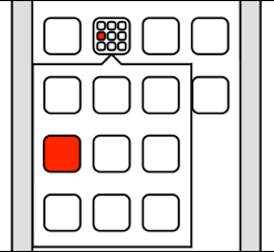
As long as you don't put more then nine apps into a folder, folders pretty much act like zoomed-out screens.
There's no confusion; you still see all of your apps without having to drill into a hierarchy.
I do think that it would have been cool if an opened folder would show apps using the same spatial arrangement as the closed folder, though. Instead, it switches from a layout that is three apps wide to a layout that is four apps wide, messing up the arrangement of the individual apps.
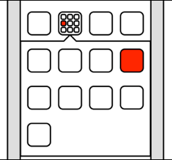
So I think Apple should have limited the number of apps in a folder to nine, and made sure that an open folder kept the same arrangement shown in the closed folder. I also wish opening a folder would show the open folder above the other icons, rather than shifting them out of the way. Other than that, though, this is a really neat solution.
I'm Not Sure About the Task Switcher
I'm not convinced that the task switcher needs to exist. Since apps in the task switcher aren't really running, the task switcher isn't so much a task switcher as it is a list of recently used apps. That might make some sense if you could actually see the state of the applications in the task switcher user interface, but all you see is a row of icons.

Basically, the task switcher is a tiny version of the Springboard that shows what amounts to a random selection of your apps in essentially random order.1
There are probably situations where you can save a few seconds by using the task switcher instead of going to the Springboard to switch applications. Say, you're writing an e-mail while referring to a Wikipedia article; the task switcher allows you to quickly jump between the two applications instead of having to go through the Springboard, which would take a few seconds longer. I'm not sure such situations occur often on a device like the iPhone. Since I haven't used iPhone OS 4.0, it's entirely possible that I am mistaken,2 but it seems to me that the few situations where the task switcher is useful do not warrant adding an entirely new way of opening applications.3
The task switcher seems to be a feature that doesn't offer anything that iPhone can't already do without it, and that most people will never use.4 Fortunately, it's mostly invisible if you don't know that it is there, although I hope that I can continue to use double-tapping to activate the music controls.5
What About Notifications?
Unfortunately, the notification user interface issues were not addressed in iPhone OS 4.0. This is an area where webOS is way ahead of the iPhone, and where improvements are much needed. The modal alert boxes are inconvenient, and it's easy to miss notifications, or to accidentally discard them.
Oh, and File Management
I think it's fair to say that most people involved in interaction design tend to agree that hierarchical file systems have largely failed their users. People don't want to deal with user-maintained hierarchies, and hierarchical file systems mainly succeed in helping people lose their data inside a huge mess of pointless folder structures. However, when we say "hierarchical file systems don't work", most of us end that sentence with "so we need to replace them with something better" in our heads. Apple, on the other hand, ended the sentence with "so we're not going to bother with this stuff, let's just leave this up to each individual application."6
As a result, the problem is now arguably becoming worse than it was before. Not only is the problem of file management still unsolved and extremely difficult, but now every application has its own, mutually incompatible and inconsistent attempt at a solution for it.
Some applications synchronize files on a local network with a desktop application or a small desktop client. Others let users add and remove files using something like FTP or WebDAV. Some use Internet services for synchronizing files. The iPad has its own file sharing system for certain applications, which is a complete joke. Some applications interface with systems like Box.net or Dropbox.
Most applications can't share files between each other. And of course, the user interface for accessing files is completely different in different applications.7
At some point, Apple needs to address this problem. Unfortunately, they did not do so in 4.0.
-
It's not literally randomized, although I think apart from the first two or three most recently used apps, it will be perceived as essentially random by most users. ↩︎
-
And some people do disagree with me, most notably Neven Mrgan, who writes: "I am finding the tray extremely useful myself - hunting for apps through multiple pages is also a lousy game, and it’s only going to get lousier on future iPhone OS devices (with bigger screens, more memory for more apps, etc.) The whole process is also less visually jarring." ↩︎
-
People have pointed out that the task switcher also allows you to quit applications. However, I think Apple would consider it a failure if you had to manually quit applications, so I'm not sure whether the ability to quit applications warrants the inclusion of the task switcher. The task switcher could serve as a reminder if you can't remember which music application is currently playing, though. ↩︎
-
On Hacker News, somebody points out that Android has a similar task switching feature that most users simply ignore. I think it is true that most people ignore that feature; I myself have only ever used it once, to see how it works. I'm guessing it will be used just as rarely on the iPhone. ↩︎
-
Justin Horn points out that double-tap-and-hold in 4.0 acts as double-tapping does in current versions (respecting the old settings for double-tapping). This will take a lot of getting used to. ↩︎
-
Of course, it's entirely possible that they know that they need to solve this problem, and have simply decided to give folders and multitasking a higher priority. ↩︎
-
Sometimes, it makes sense for an application to provide a custom view of its data, but it doesn't make sense to force every application to do this. ↩︎
If you require a short url to link to this article, please use http://ignco.de/271


