Window Management and Apple
The lack of split screen view has always been one of my major complaints about iOS. With iOS 9, Apple is1 going to add a simple tiling window manager to iOS.
Dr. Drang writes:
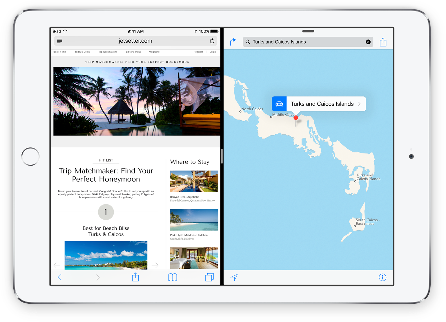
Unlike Mac users, iPad users won’t be dumped immediately into a multitasking environment. Those who prefer to use and see only one app at a time can continue to do so—the multitasking interface will stay out of their way and won’t confuse them.
But for those who need to refer to one app while working in another, Slide Over and (especially) Split View will be a godsend. And it’s seemingly eliminated one of the biggest problems with using Mac-like multitasking environments: window management. There are no windows in Split View, there are only parts of the screen, with one part wholly given over to one app and another part wholly given over to another. There’s no overlap and there’s no Desktop peeking out from behind. The only thing the user has to think about is the position of the dividing line between the two apps.
Here's a video of Craig Federighi, introducing the new feature.2
This is very similar to what Windows 8 does, but, in an odd way, seems to be less predictable, less powerful, and more complex. Notice how Federighi is on the home screen, jumps to the task switcher, opens Safari, and then swipes in from the right. This shows Messages, and Federighi acts as if that was exactly what he had expected to happen, but... why? Why is it Messages and not some other app? He just swiped in from the right, how does iOS decide which app to show?3 I would assume that, since there are dozens of apps you might want to see, and only one app that actually gets shown, the app you're actually swiping in will be the wrong one most of the time.
You can pull down from the top and change the app, but now you're doing some serious interface magic, where you have to know to swipe in from the right to show the app, then swipe down from the top to show the task switcher.4 There are no real affordances5 for either of the two actions.
Note that, so far, you're not actually in split view. You're still in "slide over" view. There are two different multitasking views in iOS 9 — another layer of complexity. To go into split view, you have to know about another piece of hidden interface magic: tap on the divider, and you turn on split view (unless you don't have an iPad Air 2).
Apple is also giving developers the ability to opt out from multitasking and they're saying that camera apps and hardware-intensive games should probably eschew multitasking.
This seems to add additional inconsistency to an already odd implementation of the split window feature.
This reminds me of 90s Internet mystery meat navigation, except that there's not even any mystery meat, and you're just randomly dragging around and tapping on things to trigger actions that might or might not be supported by the application you're actually trying to use. You could argue that split view is a power user feature,6 and power users can just go watch a YouTube movie that explains how the feature works, but I've now watched this section of the keynote twice, forgotten how it works once already, and I'm completely sure that I will have forgotten how it works again by tomorrow.
This is exactly the kind of magical user interface that people have faulted Windows 8 for, except it's even more confusing. In Windows 8, you only had to remember to swipe in from the screen edges. Once you did that, the UI was visible, and guided your actions. In iOS 9, it's layers of hidden UI magic. The one advantage Apple has is that you don't need to know any of it to use iOS, but still. I think we should expect better of Apple.
Because the thing is: it is not necessary to have all of this complexity.
Windows 8 has a more powerful split view that is also hidden from novice users, but still manages to be easy to learn and intuitive to use. Drag in from the left to show the task switcher. Tap on a window to activate it. If you're a power user, all you have to learn is that you can also drag windows from the task switcher. Now you can drag them into the screen and place them where you want them to be, either as new split views, or replacing windows already in split views.
No hidden secondary task switcher, no multiple split screen modes, no excluded apps.7
In conclusion, I'm extremely happy that Apple is introducing a split screen view on iOS, but it's difficult to understand why they decided to go with such a complex user interface. It all looks nice, but the interaction design seems, well, odd, and a little bit concerning.
El Capitan
At the same time, Apple is also starting to tackle window management on OS X. Here, Apple is trying to figure out the same kind of balancing act between the existing window management system, and a new, simplified one, that Microsoft has failed to solve with Windows 8, and is trying to improve upon with Windows 10.
There seems to be a new kind of hierarchical window management system for full-screen apps, where "inner" windows can be minimized into tabs at the bottom of the screen (kind of like tabbed folders in Mac OS 9). There's also a new split screen mode that shows windows side by side (and if you do that in the normal window manager, you seem to be put into the full-screen window manager automatically).
Putting all of this stuff on top of all of the existing window management cruft doesn't exactly make the Mac's window management system simple and easy to understand. I think Apple is trying to avoid Microsoft's mistake of having two completely separated window management systems on its desktop OS, but it's becoming clear that the alternative — one system that tries to accommodate vastly different kinds of usage — is no panacea, either.
Either way, iOS and Mac OS are taking another small step towards each other. Nobody can predict the future, of course, but it seems possible that, as iOS becomes more powerful, and Mac OS gains features from iOS, the two operating systems might eventually converge into two versions of the same product.
Natural Language
Apple also showed a nifty new natural language search. But if they have all of this data, and know when a user worked on a document, and with whom that user worked, I wish they'd just expose this data in a real graphical user interface. I'm never sure how to talk to natural language UIs, and if they fail, I'm never sure if it's because the system doesn't have the information to answer my question, or if I merely asked the wrong question. Just give me a visual UI for things like date- or people-based file management.
Progress
I'm not a fan of some of the UI decisions Apple has made, but I am a huge fan of the basic concept. I think that a lack of power in all areas is one of the reasons why iPad sales are shrinking. Unless your needs are very specific, and quite limited, the iPad is a poor choice of device for getting work done. With the split-screen view, Apple is starting to address one important aspect of this problem. Other aspects — lack of availability of professional apps,8 sharing files between apps, organizing documents by project instead of by app, and others — remain only partly solved, or entirely unsolved. There's still a lot of work to be done to make the iPad a viable desktop PC replacement for most people, but Apple just checked off an important item on this list.
I'm very happy that Apple is making a step in this direction.
Update
This article originally contained a section on partisanship and competition. I've put that into its own article.
-
BTW, I hope they improve the "keyboard as a trackpad" feature before it ships, because in the demo, Federighi doesn't seem to be able to easily select text without also typing gibberish at the same time. ↩︎
-
Maybe it's the last used app, but what if the last used app is not supported? What if you're starting from the home screen? It must often seem non-deterministic to the user.Apparently, it's the app last put into sidebar, which is logical, but mit not be entirely intuitive. Depends on how people will use the feature. ↩︎ -
But you can't swipe down to change the app on the left side of the screen. ↩︎
-
Apart from a small grey pill at the top of the "slide over" panel, that is presumably intended to tell you that you can swipe down to trigger some kind of action. All of this is exacerbated by the "flat" user interface, which lacks many of the ambient interaction hints that come from having user interfaces that are closer to what humans interact with in the real world. ↩︎
-
Though it seems a bit strange to assume that regular users would never want to see, say, a website and a Pages document at the same time. ↩︎
-
Though Windows 8 does have the "drag in to get a random app" feature, same as the iPad. Thankfully, you can turn it off. And you should. ↩︎
-
Perhaps in part because people are unwilling to invest a lot of money into developing an iPad app if they can't be sure it will be approved, which hurts sales of apps that are available, because you need an ecosystem of different apps for a platform to become viable. ↩︎
If you require a short url to link to this article, please use http://ignco.de/708


