Hierarchies
Today, Apple released a new version of Safari, and they finally fixed something which I always thought was a strange idea: They moved the tabs above the address bar. This is what Safari used to look like:
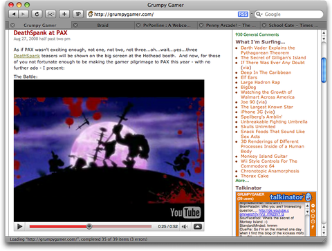
This is what it looks like now:
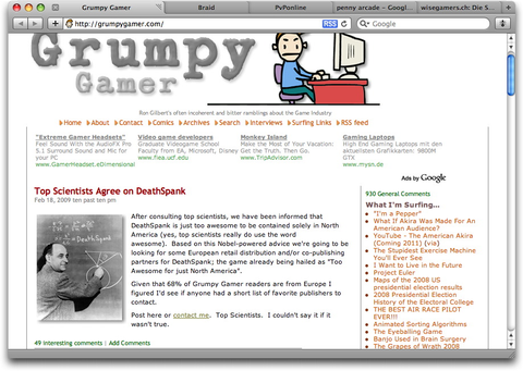
Leaving aside the terrible idea of putting tabs into the window's title bar,1 this layout actually does get one thing right: The window's content hierarchy.
Users have a mental model of how individual applications work. This mental model describes the internal logic the user assumes and expects from your application. It originates both from preconceived notions about your application's subject matter, as well as from experience with your application. Part of this mental model is a hierarchy of your application's entities.
In our example, the tabs should logically be above the address bar, because switching between tabs changes the address bar's contents. Safari's previous idea of putting the tabs between the address bar and the rendered page was thus confusing, because it contradicted the application's internal model, giving users false hints about its functionality, potentially disturbing their mental model of the application.
Another Example
I recently decided that I should replace my combination of BBEdit, the Finder and Interarchy with an integrated application for web development. After deciding that MacRabbit's Espresso prerelease was not yet usable enough for actual work, I downloaded Panic's Coda.
Looking at Panic's Coda site, I quickly figured out that Coda has a few different features. Its main features are a built-in documentation ("Bookshelf"), text clip management, and of course Site management. A site, in turn, is used to manage and edit files. Open files can be edited in a text editor, in a visual editor (for CSS files), or previewed (for HTML files).
In my mind, this resulted in a "feature hierarchy" looking something like this:
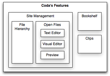
This is how I expected Coda's features to be presented, based on my preexisting idea of how such an application should work, and based on the descriptions found on Panic's website.
After firing up Coda and creating a Site, I was immediately confused by Coda's user interface. A site is represented by a single window in Coda. Okay, so far, this makes sense. But then, there's a tab called "Sites" in the "Site" window. That's weird. Sites aren't part of a Site. Next to the "Sites" tab, there are tabs for "Edit", "Preview", "CSS", "Terminal" and "Books." But "Edit", "Preview" and "CSS" should be functions of a file, not a Site, and the Bookshelf is a feature existing outside of a Site. Files can be opened as tabs with a tab representing the file, and tabs can be split, but different splits of a tab can contain different files.
This is how Coda's user interface looks:
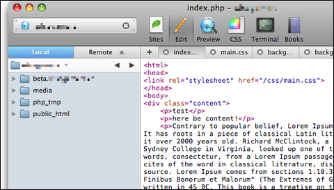
This is the hierarchy the user interface seems to imply:
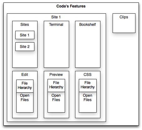
(I've left out splits and a few other things in both hierarchies.)
The dichotomy between my mental model and the actual user interface immediately creates issues. What happens when I open a file and switch to Preview? Will this preview my open file, or will this replace the content of the window with something entirely different since it seems to be at the top of the window's hierarchy? What happens if I select CSS or Preview and open files which don't contain CSS or don't have a preview? Since they're at the top of the hierarchy, they can't easily be disabled if they're currently "pointless."
The fact that my mental model of the application's features does not fit the visual display of those features means that I'm less likely to make correct guesses about how the user interface works.
Even though I eventually bought Coda and kind of got used to the dichotomy between the hierarchy implied by its user interface and its internal model, I still constantly make mistakes and get confused by its insistence on putting a CSS tab on top of PHP files, or a Preview tab on top of CSS files, or displaying different files in split views below a tab with the name of one specific file.2
Conclusion
Think about the hierarchy of your application's "entities." If you've been working on your application for too long, you've probably gotten used to its idiosyncrasies. Make a list of all "things" in your application and get somebody without any preconceived ideas to sort them into a hierarchy. Does this intuitive idea of how the parts fit together match your application's user interface and internal model? If it does not, your application may contradict your user's mental model. Make sure that your application's implementation, its user interface and your users' expectations of how everything fits together are consistent with each other. This allows users to make correct guesses about how your applications behaves.
Update: Panic's Steven Frank responds, writing:
If you've ever designed software, you're probably familiar with how an idea that seems to make sense on paper doesn't pan out once it's up on the screen and interactive. I think that's what happened here. However, the mere existence of our existing approach gives us a vocabulary that we didn't have before, which will make future refinements easier to approach than our 1.0.
The good news is we've been talking (and talking and talking some more) about relatively minor changes we can make to improve this particular bit of user interaction, and we have some really solid ideas that you'll start to see around the 2.0 timeframe that I think will sort this out without bringing too much disruption to the Coda users who've become accustomed to the way it works now.
This is great news! I truly love Coda's feature set, and I'm looking forward to what Panic is going to do with its user interface.
-
Or perhaps it's not terrible. Regardless, you can revert some of the changes if they bother you too much. ↩︎
-
And I'm not the only one who's confused. TidBITS writes: "Coda's interface has a way of subtly mixing metaphors that nearly always manages to surprise me - and not in a good way." ↩︎
If you require a short url to link to this article, please use http://ignco.de/69

