Columns on iPad-Sized Screens
About Wired's iPad app, Oliver Reichenstein writes:
The iPad portrait mode allows for a nice column width with enough white space left and right. The landscape offers even more white space. Why not use it? In a medium with infinite vertical space there is no need to create dense multi column layouts.—Yes, multi-columns look classy-classic but so do heavy black rotary telephones. In practice, multi column article pages are as useful as heavy dial disc cellphones.
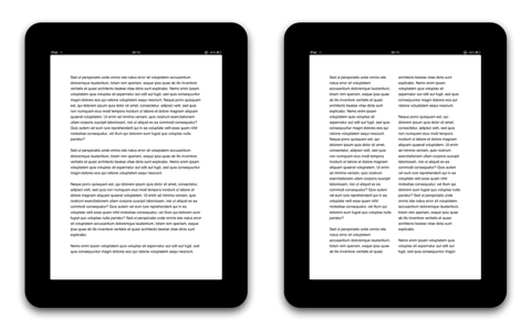
He points out a number of reasons why columns on the iPad are a bad idea. I tend to agree with him. When using font sizes comparable to what you would find in a printed book, holding the iPad in portrait size generates a column width of around 80 characters. Studies on this topic tend to be slightly inconclusive, but 80 characters is typically accepted as being around the right width for left-justified text.
Adding a second column in portrait mode changes the column width to around 30 characters. This looks almost comical.
You could make the font size smaller, of course, but this makes the text harder to read.
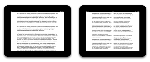
Landscape mode is a bit of a different story. Using the full width of the iPad, even including a generous amount of whitespace, results in columns that are around 100 characters. It's still quite readable; however, if you use a smaller font size, I would either make the single column less wide, or (if that is not an option) add a second column.
So, as a general rule, columns don't make sense on the iPad. The screen is not wide enough in portrait mode, and in landscape mode it is only wide enough if you use small font sizes.
Paper Did It!
I wanted to quickly touch on something else Reichenstein wrote. About the problems that columns cause, he says:
They force you into a paper metaphor and a defined page height
This is true in general, but it doesn't apply to the iPad. The iPad actually has a defined page height. This has nothing to do with some kind of paper metaphor, it's the physical reality of the device. In that way, an iPad app is different from, say, a website, where all of your visitors use different devices with different screen sizes and different window sizes. Your user can't resize their iPads. Unlike web design, it makes sense for iPad apps to be designed for this particular screen size.
There's no reason why we should force users to scroll when we know exactly how big their screens are. We should make use of this knowledge, and design for it. Scrolling is a way of showing content of random size inside a viewport of random size. What it generally is not, however, is a good user experience.
We shouldn't discard an idea simply because paper did it. Some ideas that made sense for paper, but didn't make sense for the web, actually do make sense again when designing for the iPad.
If you require a short url to link to this article, please use http://ignco.de/292


