Max Steenbergen
As part of an ongoing series of interviews with designers, I’ve talked to Max Steenbergen about his design process. Max Steenbergen is a graphic and UI designer working for a company that makes, of all things, automation and monitoring equipment for yachts. He writes a blog on user interface design at rock85.tumblr.com. After stumbling into the field, teaching himself as he went along, he fell in love with the trade, and is about to start a four year training in Communication and Multimedia Design. His Twitter handle is @maxsteenbergen.
Lukas: Tell me about your design process. Where do you start, and what kinds of techniques do you use at which stage of the process?
Max: When I get a request to design a new front-end for a client, the first thing I do is try and get as much info as possible. Requirements, expectations, which information is all-important and what is complementary? Using that intel, I try to find out just exactly what the front-end is really meant to show.
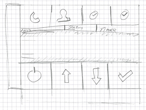
Once I know the real goal, I usually grab paper and pencil and start sketching. By finding out what information is more important in the first stage, I know which elements of the front-end I have to give more prominence. The front-ends consist of a load of buttons, text fields, dials and other controls--all of varying sizes and aspect ratios--so fitting it all together is a bit of a puzzle. By sketching on paper first I can identify problems (like too little space to fit all elements) beforehand.

I should clarify that, while we do have one application in which we show everything, this application is really more a sort of framework. This framework defines and renders the graphics on screen. However, every yacht has different systems and needs, so each install features unique front-ends.
Depending on the nature of the front-end, which can wildly vary, I have to figure out what kind of grouping would work best. Let’s say there are ten elements on the front-end, each with their own on/off button. Do I place all ten buttons in one group, or do I place each button next to its element? For example, do I sacrifice aligning to the grid for showing relationships better?
Most of the time I choose to group elements by type, as this makes it easier to remember the location of specific elements.
Tell me more about how you gather requirements. How do you interview your clients for that?
Most communication is by e-mail. Our clients are all over the world, and it would just be too damn expensive to have me grab a plane every time. I’d prefer to go on-site, but often the entire project is still "virtual"; not a single screw or bolt of the final yacht actually exists yet.
During the preliminary phases I ask some specific questions to find out just exactly what the client wants to achieve with the front-end. This is different from asking what they want to see, as the answer to that question is always either "everything" or "as much as possible".
Those answers, when placed in context with the multiple varying front-ends, allow me to work out the goal for that specific screen. Often the result of my sketches based on those answers differs quite a bit from how the client had imagined it, but usually in a positive way.
Yeah, given your domain knowledge, I guess you typically have a better idea of what your clients actually want than they do. If your design differs from what your clients expect, do you find it easy to convince them of your solution? Do you involve them in the design process, for example by getting feedback on sketches?
Well, given the amounts of money our clients spend on building yachts, they usually require (and give) constant feedback.
And they have every right to. So yes, after every milestone in my design-process, I mail some screenshots to the client for approval and comments.
Sometimes they make comments like "But in reality that element makes a turn to the right, instead of going straight on like you’ve drawn". In such cases I explain to them that simplifying such things makes the entire screen friendlier to the eye, while still being correct: i.e. Element A is still connected to Element B. I just eliminate the twists and curves that are unnecessary in a schematic.
Same goes for values that I omit altogether. Sometimes the brief states they want wildly different values (that are usually already present in a different screen) in a screen that has nothing to do with those values.

I think it kind of comes down to a fear of white-space. The general opinion seems to be that, roughly speaking, every single pixel needs to show information. Any free space needs to be filled. I try to explain that whitespace is equally important as filled space.
A few months back one of my colleagues sketched and agreed with the client on a screen design without my knowledge. Suffice it to say, not a single pixel was left unused. The amount of data I usually use three screens for was crammed into one. But, the client agreed on the sketch and had signed (read: paid) for it, so there was nothing I could do. I just had to make the sketch reality. Luckily, the client was equally disgusted by the final result as I was, and I got to re-do it.
It sounds like since you’re using a framework to define and render the user interface, you can move from sketching to actual implementation pretty quickly, and it’s easy to go back and fundamentally change things, even late in the process? This kind of system probably changes the economics of redesigning things quite a bit.
Implementing the sketches into the framework is not that big of a deal, correct. Using our own framework, creating new front-ends is as easy as dragging elements to the canvas and aligning and resizing them. Editing a front-end is equally easy, as it’s again the same drag-and-resize routine. I don’t have to code every single element with their dimensions and all that jazz in some fancy programming language. Our WYSIWYG-based framework is all I need to create and edit the front-ends. All I have to do is translate the elements I sketched to their digital counterparts with roughly the same dimensions and be done with it.

So yes, changing things in the front-end, no matter where in the process, is not hard at all (though it’s not to be taken lightly either). But that’s just for my part of the project. Some of my colleagues charged with the technical side of things are somewhat less happy with last-minute changes.
Once you’re happy with a design, how do you present it to your customers?
When I’m done with designing and implementing the front-ends, I give all files to one of my colleagues. He then makes the back-end of our system connect to the front-end.
This is the same guy who visits the client when all stuff (including the PCs with my front-end) is delivered. The UI is only a small part of our scope, the largest part of our work is making all hardware stuff work together. So it would make little sense to send a designer to deliver high-end technical systems. I do always ask my colleague how the front-end was received by the client.
Would I like to see it different? Sure, I’d love to spend a week or so on board a yacht to see how its crew would work with the system and perform some true usability tests. All I can do now is hypothesize from behind my desk and hope I got it right.
Let’s change gears a bit and talk about stuff that doesn’t work. Are there things you’ve tried to incorporate into your design process that didn’t work out the way you expected, or didn’t help the process?
When I just started designing user interfaces, I simply went straight to the final medium without so much as sketching or thinking things through. That went fine with the smaller projects we were doing at the time, but as the projects grew bigger, this approach eventually started to backfire. That’s when I started sketching and all that comes with it. Now I always make a sketch, no matter how big or small the project.
Unfortunately the bigger the project, the more people there are who think they have a say in the UI design.
That's a situation that probably sounds familiar to a lot of designers. Well, thank you very much for talking to me, Max! I appreciate you taking the time to answer my questions.
To find out more about Max Steenbergen, follow him on Twitter.
If you require a short url to link to this article, please use http://ignco.de/315


