Toggles Considered Harmful
I just read this post from Marcin Wichary's Unsung, where he points out a peculiar macOS dialog box that shows boolean toggles in four different shades of grey:
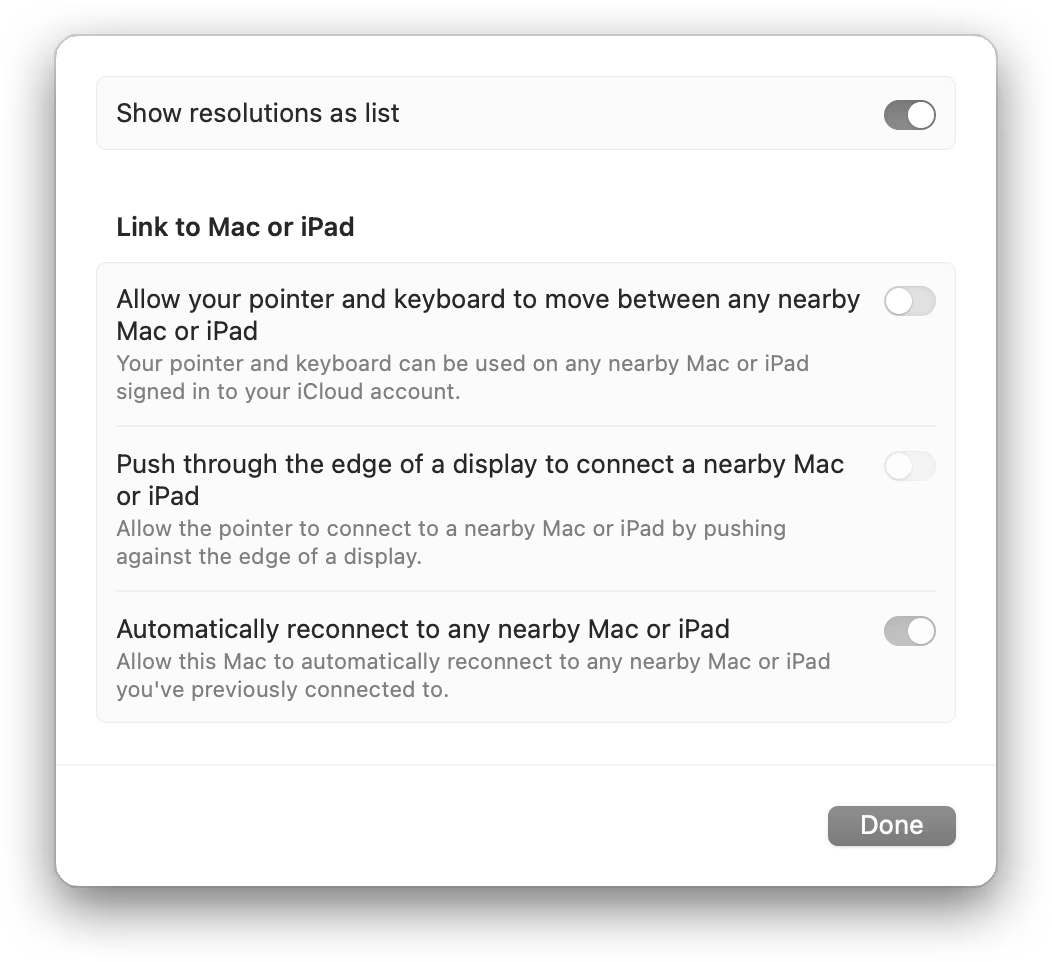
Marcin offers some improvements, but the actual problem is fundamental to macOS: these types of toggles are bad UI controls and should simply not exist.
I think toggles originated on iOS, where they replaced checkboxes. I suspect the reason is that they feel more tactile on a touchscreen, have a larger touch target, and resemble physical switches - Apple's original UI design approach for iOS valued this kind of skeuomorphism.
Toggles make sense in the real, physical world because of their mechanical properties. But even there, they need additional affordances to work. For example, this power strip has a toggle switch to turn it on and off:

Note that there are labels for each state, and a light to indicate the current state. That's because the toggle itself is symmetrical. There is no obvious way to tell whether it is on or off.
Now let's go back to the digital toggle:

Is this toggle on or off? If you don't already know that "left" means "off" and "right" means "on", you have absolutely no way to tell.
Apple's attempts to make toggle states more obvious ultimately created the confusing situation in the original screenshot. Therefore, the most expedient solution to the original UI problem is simply to use a control whose state is obvious.
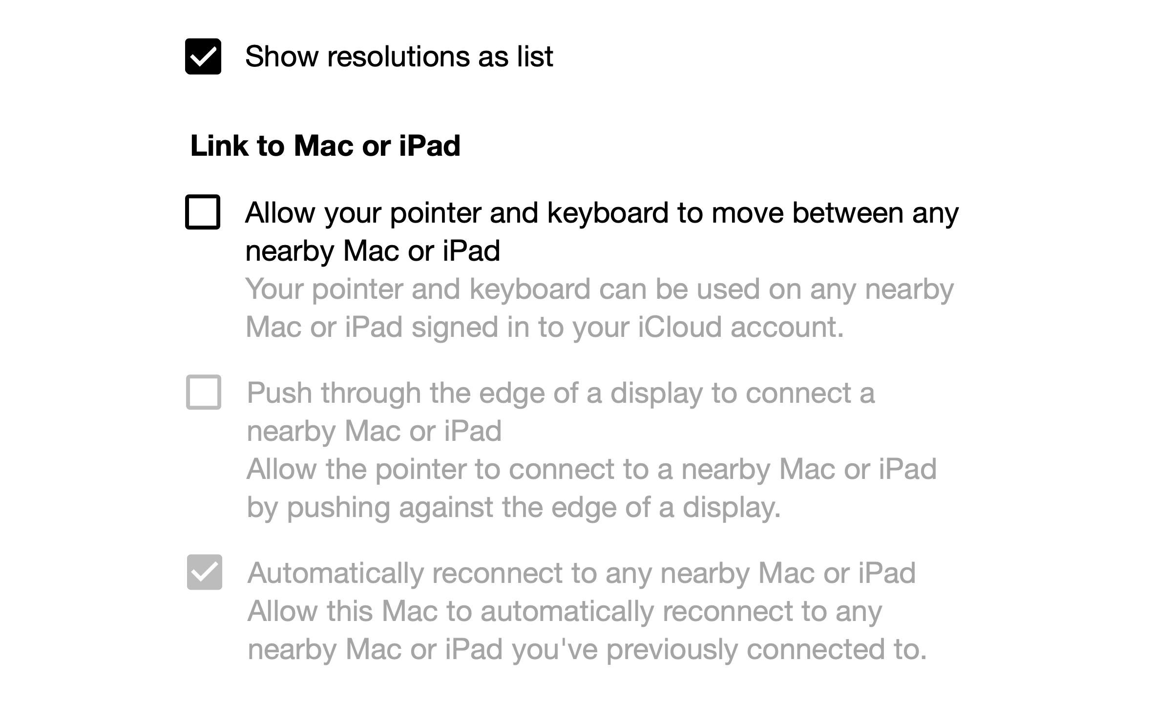
Update: Discussion on lobste.rs, including this point I wasn't aware of:
There is an accessibility setting on macOS named "differentiate without color", which does help by showing little on/off indicators on the toggles.
If your System Settings search field also doesn't work, it's under Display. Enabled.
If you require a short url to link to this article, please use https://ignco.de/818